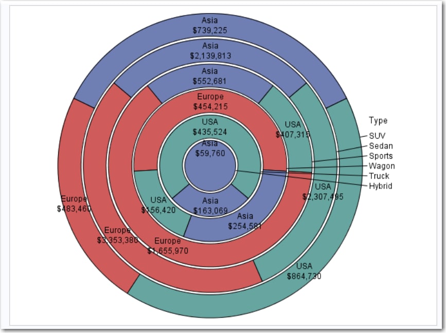
Example: Pie Chart That Shows Total MSRP for Each Car Type by Region
In this example, you
want to compare the manufacturer’s suggested retail price (MSRP)
for each car type grouped by region of origin. The resulting pie chart
consists of six rings—one for each car type. The rings are
then subset into the MSRP values for the three regions: Asia, Europe,
and USA. Using this chart, you can compare the total MSRP values for
each region. The ring for the SUV car type shows that the USA has
the highest MSRP and that Europe has the lowest MSRP.
To create this example:
-
TipIf the data set is not available from the drop-down list, click
 . In the Choose a Table window,
expand the library that contains the data set that you want to use.
Select the data set for the example and click OK.
The selected data set should now appear in the drop-down list.
. In the Choose a Table window,
expand the library that contains the data set that you want to use.
Select the data set for the example and click OK.
The selected data set should now appear in the drop-down list.

Copyright © SAS Institute Inc. All rights reserved.