Using Graphs to Display Results

Overview of the Graph Types

About Bar Charts

A bar chart consists of a grid and some vertical or horizontal bars. Each bar represents quantitative data.
A Bar Chart
A Bar Chart

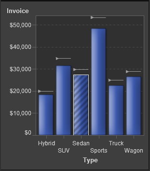
About Targeted Bar Charts

A targeted bar chart is a variation of the bar chart that has pointers to target values. In A Targeted Bar Chart, the pointers appear above each bar.
A Targeted Bar Chart

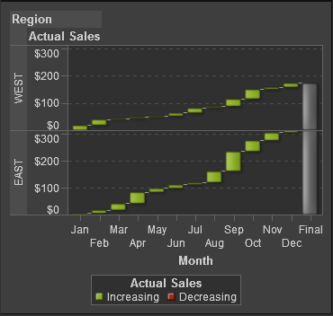
About Waterfall Charts

A waterfall chart shows how the initial value of a measure increases or decreases during a series of operations or transactions. (This chart is also called a progressive bar chart.) The first bar begins at the initial value, and each subsequent bar begins where the previous bar ends. The length and direction of a bar indicates the magnitude and type (positive or negative, for example) of the operation or transaction. The resulting chart is a stepped cascade that shows how the transactions or operations lead to the final value of the measure.
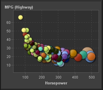
A Waterfall Chart
A Waterfall Chart

About Line Charts

A line chart shows the relationship of one variable to another, often as movements or trends in the data over a period of time. Line graphs summarize source data and typically are used to chart response values against discrete categorical values.
A Line Chart
A Line Chart

About Pie Charts

A pie chart is a circular chart that is divided into slices by radial lines. Each slice represents the relative contribution of each part to the whole.
A Pie Chart
A Pie Chart

About Scatter Plots

A scatter plot is a two-dimensional plot that shows the joint variation of two data items. In a scatter plot, each marker (represented by symbols such as dots, squares, and plus signs) represents an observation. The marker position indicates the value for each observation.
A Scatter Plot
A Scatter Plot

About Time Series Plot

A time series plot shows an ordered sequence of values of a discrete category variable that are observed at equally spaced time intervals.
A Time Series Plot
A Time Series Plot

About Bubble Plots

A bubble plot is a variation of a scatter plot in which the markers are replaced with bubbles. In a bubble plot, each bubble represents an observation. The location of the bubble represents the value for the two measure axes; the size of the bubble represents the value for the third measure. A bubble plot is useful for data sets with dozens to hundreds of values or when the values differ by several orders of magnitude. You can also use a bubble plot when you want specific values to be visually represented by different bubble sizes.
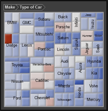
A Bubble Plot
A Bubble Plot

About Treemaps

A treemap is divided into rectangular areas called tiles. The color of each tile represents the value of the first measure in the query. The size of each tile represents the value of the second measure in the query. For example, a treemap might be used to represent sales data where the tile sizes vary according to the number of orders invoiced and the tile colors are derived from a color gradient that represents low to high sales figures.
The layout of the tiles in the treemap is dependent on the size of the display area. This means that the same treemap might appear slightly different in SAS Visual Analytics Designer than it does in SAS Visual Analytics Viewer or on a mobile device.
A Treemap
A Treemap

About Dual Axis Bar Charts

A dual axis bar chart is a variation of the bar chart that has two measures, one on each axis. There can be one measure per axis for a total of two measures.
A Dual Axis Bar Chart

About Dual Axis Line Charts

A dual axis line chart is a variation of the line chart that has two measures, one on each axis. There can be one measure per axis for a total of two measures.
A Dual Axis Line Chart

About Dual Axis Bar-Line Charts

A dual axis bar-line chart is a bar chart that has two measures, one on each axis, and is overlaid by a line chart. There can be one measure per axis for a total of two measures.
A Dual Axis Bar-Line Chart

About Dual Axis Time Series Plots

A dual axis time series plot is a variation of the time series plot that has two measures, one on each axis. There can be one measure per axis for a total of two measures.
A Dual Axis Time Series Plot

Insert a Graph into a Report

To insert a graph into a report:
  • Drag the graph icon from the Objects tab in the left pane and drop it onto the report canvas.
  • Select Insertthen selectGraphs and then select the menu item for the graph object that you want to insert. The graph is automatically placed in the report canvas. If you want the graph to appear in a different place, then drag and drop it in a new location.
The following table lists the available graph objects:
Icon
Graph Type
bar chart icon
Bar Chart
targeted bar chart icon
Targeted Bar Chart
waterfall chart icon
Waterfall Chart
line chart
Line Chart
pie chart icon
Pie Chart
scatter plot icon
Scatter Plot
time series plot
Time Series Plot
bubble plot icon
Bubble Plot
treemap icon
Treemap
dual axis bar chart icon
Dual Axis Bar Chart
dual axis line chart icon
Dual Axis Line Chart
dual axis bar-line chart icon
Dual Axis Bar-Line Chart
dual axis time series chart icon
Dual Axis Time Series Plot

Specify Graph Properties

To specify the properties for graphs:
  1. If not already selected, select the graph in the report canvas that you want to update.
  2. In the right pane, click the Properties tab.
  3. Update the general properties for the graph. Your choices are Name, Title, and Description.
  4. Update the specific properties for the graph. The available properties depend on the selected graph type. For example, for a pie chart, you can specify Data Labels, Group Style, and Legend properties.
    Here is an example of the properties for a pie chart:
    Properties for a Pie Chart
    Properties for a Pie Chart

Specify Graph Styles

To specify styles for graphs:
  1. If not already selected, select the graph in the report canvas that you want to update.
  2. In the right pane, click the Styles tab.
  3. Update the styles for the graph. The available styles depend on the selected graph type. For example, for a pie chart, you can specify Data Styling, Frame Styling, Text Styling, and Data Colors styles.
    Here is an example of the styles for a pie chart:
    Styles for a Pie Chart
    Styles for a Pie Chart