Your First Look at SAS Visual Analytics Designer
SAS Visual Analytics Designer
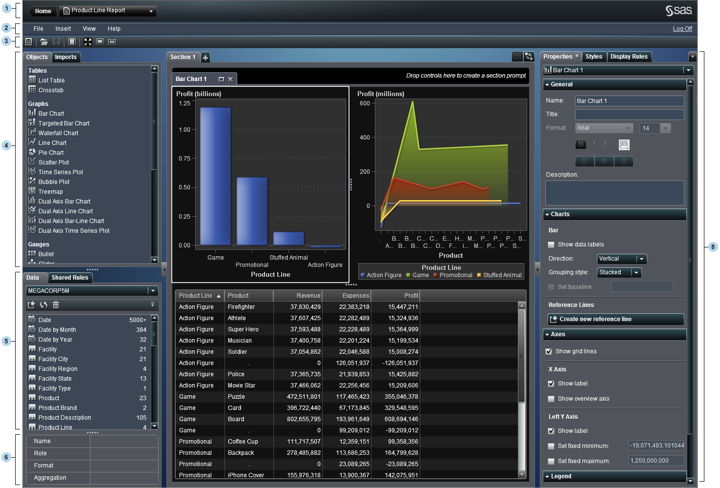
| 1 | The application bar enables you to return to the SAS Visual Analytics home page and access your recently created or viewed reports. You can also access recently used visual explorations, stored processes, or visual data builder queries in your recent history. When you select a visual exploration, the application takes you to SAS Visual Analytics Explorer. When you select a stored process, the application takes you to SAS Visual Analytics Viewer. When you select a visual data builder query, the application takes you to SAS Visual Data Builder. |
| 2 | The menu bar provides menu items that apply to the entire report or to the currently displayed report section. Actions include creating a new report, adding a new section, inserting new report objects, adding interactions, and launching SAS Visual Analytics Viewer without returning to the home page. You can also log off from SAS Visual Analytics. |
| 3 | The
toolbar contains icons that enable you to manage your reports. You
can click  to hide the left and right panes. Or, you can click to hide the left and right panes. Or, you can click  to display the left and right panes. You
can access the report views clicking to display the left and right panes. You
can access the report views clicking  , ,  , or , or  on the menu bar. on the menu bar.
|
| 4 | The Objects and Imports tabs
are in the left pane.
The Objects tab
provides a list of the tables, graphs, and gauges that can be used
in a report or dashboard.
The Imports tab
provides a list of reports and report objects that have been created
in SAS Visual Analytics Designer or exported from SAS Visual Analytics
Explorer. This enables you to create reports from multiple sources
and create full-featured reports. You can choose objects or sections
in these reports to include in either a new or an existing report.
|
| 5 | The Data and Shared
Rules tabs are in the left pane.
The Data tab
enables you to select a data source (or data sources) and the data
items for your report. You can add, refresh, or remove a data source
using the icons above the list of data items.
Using the menu, you can change the data source, define a hierarchy,
define a calculated item, or show or hide data items. You
can also check the details for the measures in the data set. You can
also
For more information, see Using Data Items in a Report.
The Shared
Rules tab enables you to create a new display rule for
a gauge, which is used by other gauges to designate intervals and
colors for ranges. You can also edit or delete an existing shared
display rule. These rules are shared across multiple gauges and can
be created at any time.
|
| 6 | The data item table provides information about a selected data item, including the name, role, format, and aggregation. These data item properties can also be modified, which impacts all of the report objects that use the data item. For more information, see Modify Data Item Properties. |
| 7 | The
canvas is the workspace for building a report. You
can modify the canvas using the report view icons on the toolbar. For
more information, see Creating a New Report. A report can have multiple
sections, which can be accessed by using the tabs at the top of the
canvas. For more information, see Maintaining Multi-Section Reports.
There is also an area
at the top of the canvas where you can drop filter controls and then
categories to create section prompts.
|
| 8 | The
tabs in the right pane enable you to work with details about the report
and report objects. The Properties, Styles,
and Display Rules tabs are displayed by default.
You can choose to display icons instead of tab names. To display the
icons on the tabs, click  after the last tab name and select Show
icons only. You can also choose which tabs are displayed. after the last tab name and select Show
icons only. You can also choose which tabs are displayed.
The Properties tab
lists the properties for the currently selected report or report object.
The report’s title and description are listed. The object’s
name, title, and description are listed. Information that is specific
to the report object type, such as the axes and legend are also included.
If a report object is not selected in the report canvas, then the
properties are for the section and the report.
The Styles tab
enables you to specify the data styling, frame styling, text styling,
and data colors for a selected report object.
The Display
Rules tab enables you to populate or add intervals for
an object that is currently selected in the report canvas. You can
also edit or delete an existing display rule for the selected table,
graph, or gauge. For more information, see Overview of Display Rules.
The Comments tab
enables you to add comments to the report after you save it. For more
information, see Adding Comments to Reports.
The Filters tab
enables you to add a filter (or filters) to the selected report object.
For more information, see About Report Filters.
The Interactions tab
enables you to add or update filter or brush interactions to the report
objects in a section. For more information, see Creating Interactions.
The Roles tab
enables you to add or update data role assignments when you have a
report object with a data source selected.
|
Copyright © SAS Institute Inc. All rights reserved.