| Adding Curves to Plots |
Drawing a Curve from Variables in the DataObject
Now you will create a scatter plot of wind_kts versus min_pressure. On this plot you add the predicted values and the upper and lower confidence limits as computed by the REG procedure. This fitted model is a straight line, which can be visualized by specifying two points as you did for the residual plot. However, visualizing a more general parametric model (for example, a quadratic model in min_pressure) or a nonparametric model requires plotting a polyline, so this example adopts the general approach.
A polyline is a sequence of connected line segments specified by
passing two vectors to the DrawLine method. The first vector
specifies the X coordinates, and the second specifies the Y
coordinates. The polyline is drawn from ![]() to
to ![]() to
to ![]() and so on until
and so on until ![]() .
.
To draw the polyline, you need an IML matrix containing the coordinates to be plotted. You can use the GetVarData method of the DataObject class to get the data from the DataObject. You also need to sort the data according to the X variable, which is min_pressure for this example. (Alternatively, you can use the IML SORT call if you do not want to change the order of observations in the DataObject.)
Add the following statements at the bottom of the program window, and select
Program ![]() Run from the main menu.
Run from the main menu.
 declare ScatterPlot FitPlot;
 FitPlot = ScatterPlot.Create( dobj, "min_pressure", "wind_kts" );
 FitPlot.SetWindowPosition( 50, 50, 50, 50 );

 dobj.Sort( "min_pressure" );
 dobj.GetVarData( "min_pressure", minPress );
 dobj.GetVarData( "Pred", pred );
 FitPlot.DrawUseDataCoordinates();
 FitPlot.DrawSetPenColor( BLUE );
 FitPlot.DrawLine( minPress, pred );

 dobj.GetVarData( "LCL", lower );
 dobj.GetVarData( "UCL", upper );
 FitPlot.DrawSetPenColor( GRAY );
 FitPlot.DrawLine( minPress, lower );
 FitPlot.DrawLine( minPress, upper );
The predicted line is drawn in blue, as specified by the
DrawSetPenColor method
of the Plot class.
The lower and upper limits of prediction are drawn in gray.
All lines are drawn on top of the
observations and are drawn as solid lines with a width of one pixel,
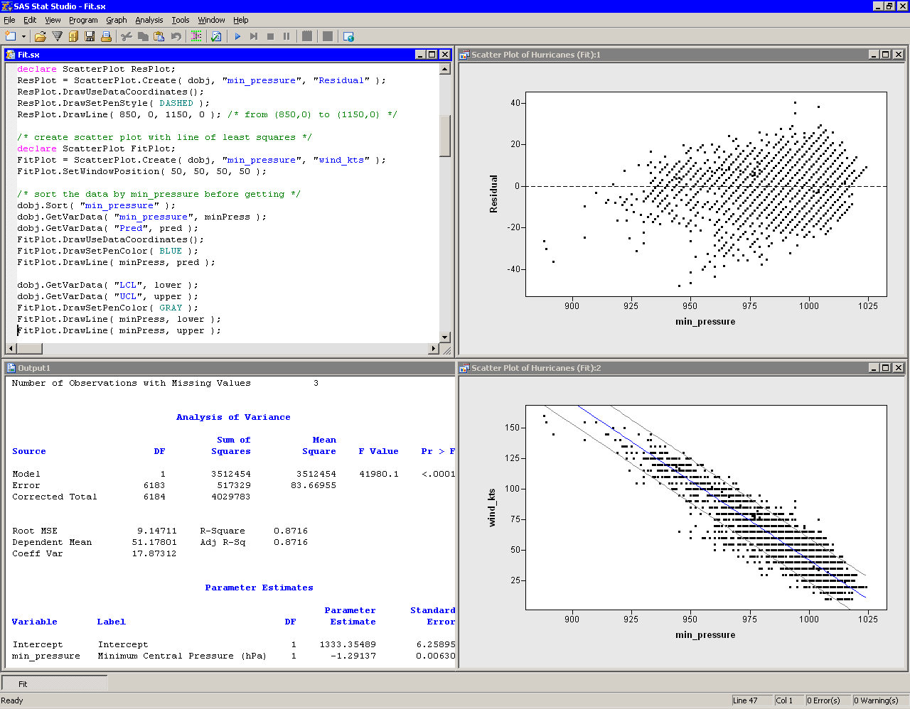
since those default values were not changed. Figure 6.2 shows
the resulting plot.

|
Figure 6.2: A Fitted Model and Confidence Intervals
Notice that the preceding statements read variables from an output data
set into a DataObject. This is possible only if the output data set
has the same number of observations as the DataObject. The advantage
of reading variables into the DataObject is that you can open a data
table to see the values of the added variables, and you can use these
variables in subsequent analyses. Furthermore, you can use the
dynamically linked graphics to identify observations in a plot that
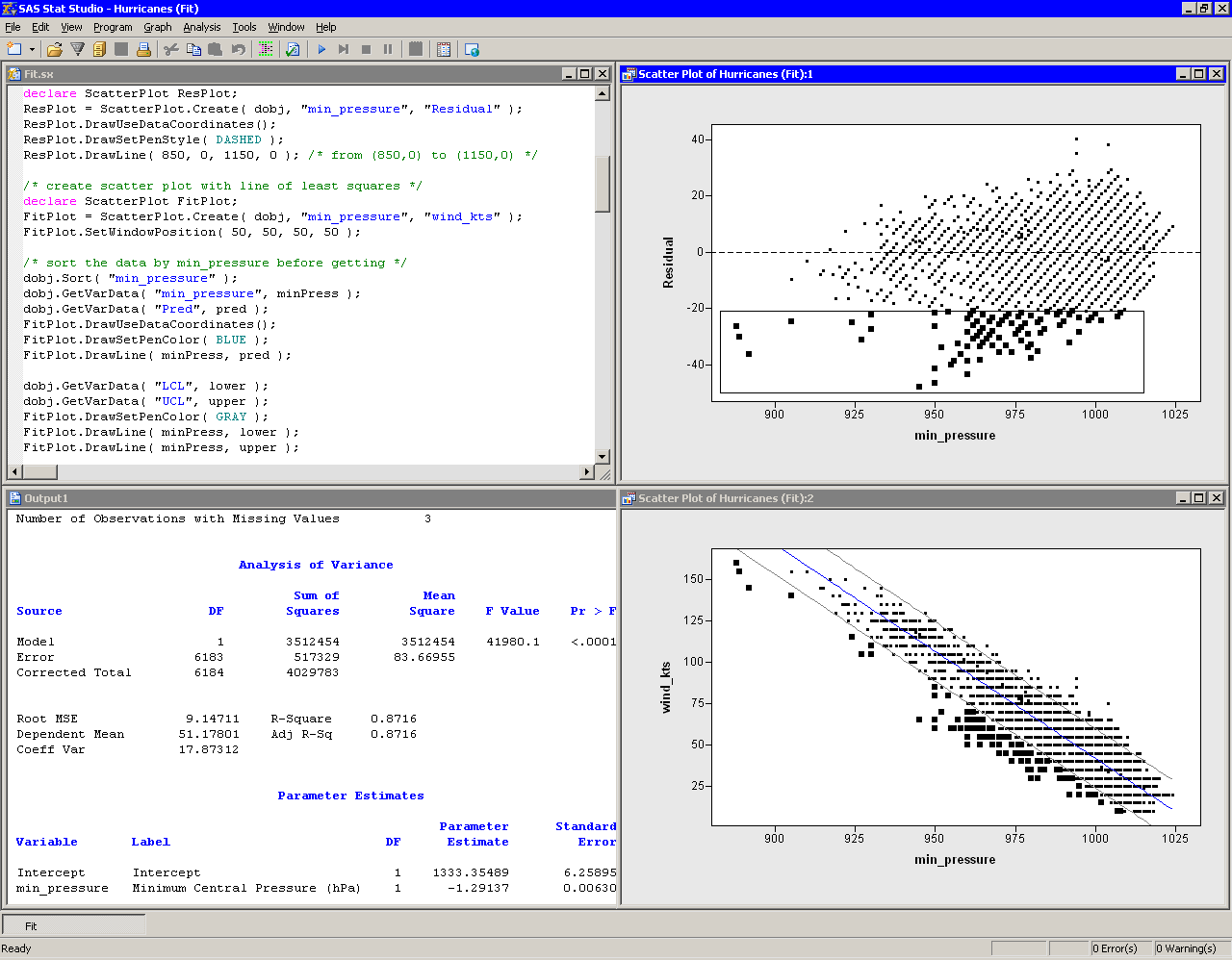
have certain characteristics, For example, Figure 6.3
shows the observations that have large negative residuals for this
model.

|
Figure 6.3: Observations with Large Negative Residuals
Copyright © 2008 by SAS Institute Inc., Cary, NC, USA. All rights reserved.