| The POWER Procedure |
Assigning Analysis Parameters to Axes
Use the PLOT statement to produce plots for all power and sample size analyses in PROC POWER. For the sample size analysis described at the beginning of this example, suppose you want to plot the required sample size on the Y axis against a range of powers between 0.5 and 0.95 on the X axis. The X= and Y= options specify which parameter to plot against the result and which axis to assign to this parameter. You can use either the X= or the Y= option, but not both. Use the X=POWER option in the PLOT statement to request a plot with power on the X axis. The result parameter, here total sample size, is always plotted on the other axis. Use the MIN= and MAX= options to specify the range of the axis indicated with either the X= or the Y= option. Here, specify MIN=0.5 and MAX=0.95 to specify the power range. The following statements produce the plot:
proc power plotonly;
   twosamplemeans test=diff
      groupmeans   = 12 | 15 18
      stddev       = 7 9
      power        = 0.9
      ntotal       = .;
   plot x=power min=0.5 max=0.95;
run;
Note that the value (0.9) of the POWER= option in the TWOSAMPLEMEANS statement is only a placeholder when the PLOTONLY option is used and both the MIN= and MAX= options are used, because the values of the MIN= and MAX= options override the value of 0.9. But the POWER= option itself is still required in the TWOSAMPLEMEANS statement, to provide a complete specification of the sample size analysis.
The resulting plot is shown in Output 68.8.2.
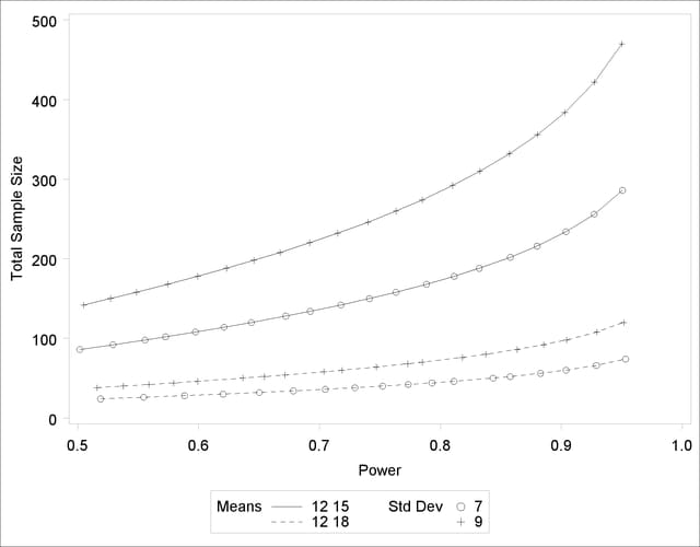
The line style identifies the group means scenario, and the plotting symbol identifies the standard deviation scenario. The locations of plotting symbols indicate computed sample sizes; the curves are linear interpolations of these points. By default, each curve consists of approximately 20 computed points (sometimes slightly more or less, depending on the analysis).
If you would rather plot power on the Y axis versus sample size on the X axis, you have two general strategies to choose from. One strategy is to use the Y= option instead of the X= option in the PLOT statement:
plot y=power min=0.5 max=0.95;
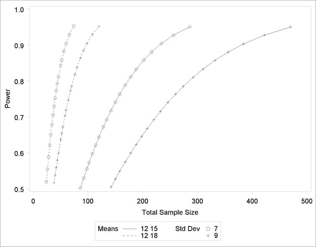
Note that the resulting plot (Output 68.8.3) is essentially a mirror image of Output 68.8.2. The axis ranges are set such that each curve in Output 68.8.3 contains similar values of Y instead of X. Each plotted point represents the computed value of the X axis at the input value of the Y axis.
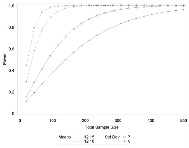
A second strategy for plotting power versus sample size (when originally solving for sample size) is to invert the analysis and base the plot on computed power for a given range of sample sizes. This strategy works well for monotonic power curves (as is the case for the  test and most other continuous analyses). It is advantageous in the sense of preserving the traditional role of the Y axis as the computed parameter. A common way to implement this strategy is as follows:
Determine the range of sample sizes sufficient to cover at the desired power range for all curves (where each "curve" represents a scenario for standard deviation and second group mean).
Use this range for the X axis of a plot.
To determine the required sample sizes for target powers of 0.5 and 0.95, change the values in the POWER= option as follows to reflect this range:
proc power;
   twosamplemeans test=diff
      groupmeans   = 12 | 15 18
      stddev       = 7 9
      power        = 0.5 0.95
      ntotal       = .;
run;
Output 68.8.4 reveals that a sample size range of 24 to 470 is approximately sufficient to cover the desired power range of 0.5 to 0.95 for all curves ("approximately" because the actual power at the rounded sample size of 24 is slightly higher than the nominal power of 0.5).
To plot power on the Y axis for sample sizes between 20 and 500, use the X=N option in the PLOT statement with MIN=20 and MAX=500:
proc power plotonly;
   twosamplemeans test=diff
      groupmeans   = 12 | 15 18
      stddev       = 7 9
      power        = .
      ntotal       = 200;
   plot x=n min=20 max=500;
run;
Each curve in the resulting plot in Output 68.8.5 covers at least a power range of 0.5 to 0.95.
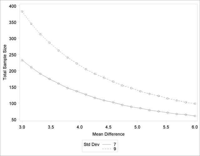
Finally, suppose you want to produce a plot of sample size versus effect size for a power of 0.9. In this case, the "effect size" is defined to be the mean difference. You need to reparameterize the analysis by using the MEANDIFF= option instead of the GROUPMEANS= option to produce a plot, since each plot axis must be represented by a scalar parameter. Use the X=EFFECT option in the PLOT statement to assign the mean difference to the X axis. The following statements produce a plot of required sample size to detect mean differences between 3 and 6:
proc power plotonly;
   twosamplemeans test=diff
      meandiff     = 3 6
      stddev       = 7 9
      power        = 0.9
      ntotal       = .;
   plot x=effect min=3 max=6;
run;
The resulting plot Output 68.8.6 shows how the required sample size decreases with increasing mean difference.
Copyright © SAS Institute, Inc. All Rights Reserved.