| Statistical Graphics Using ODS |
| Contour Plots with PROC KRIGE2D |
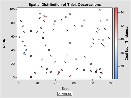
This example is taken from Example 46.2 of Chapter 46, The KRIGE2D Procedure. The following statements create a SAS data set that contains measurements of coal seam thickness:
data thick;
   input East North Thick @@;
   label Thick='Coal Seam Thickness';
   datalines;
 0.7  59.6  34.1   2.1  82.7  42.2   4.7  75.1  39.5

   ... more lines ...

;
The following statements set the output style to DEFAULT and run PROC KRIGE2D:
ods listing style=default;
ods graphics on;
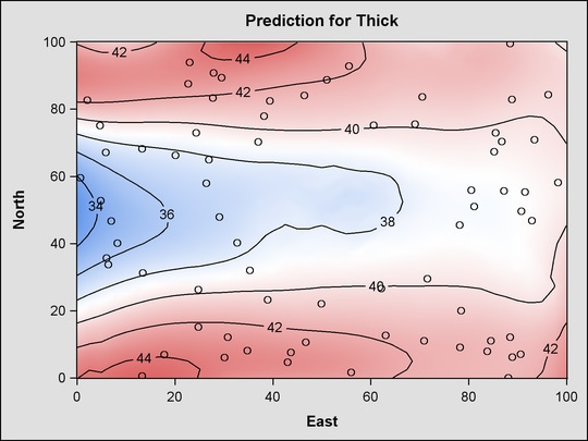
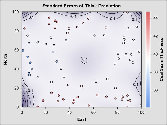
proc krige2d data=thick outest=predictions
plots=(observ(showmissing)
pred(fill=pred line=pred obs=linegrad)
pred(fill=se line=se obs=linegrad));
coordinates xc=East yc=North;
predict var=Thick r=60;
model scale=7.2881 range=30.6239 form=gauss;
grid x=0 to 100 by 2.5 y=0 to 100 by 2.5;
run;
The PLOTS=OBSERV(SHOWMISSING) option produces a scatter plot of the data along with the locations of any missing data. The PLOTS=PRED option produces maps of the kriging predictions and standard errors. Two instances of the PLOTS=PRED option are specified with suboptions that customize the plots. The results are shown in Figure 21.7.
Figure 21.7
PROC KRIGE2D Results Using the DEFAULT Style
Copyright © SAS Institute, Inc. All Rights Reserved.