| Shared Concepts and Topics |
Example 19.2 Unbalanced Two-Way ANOVA
This example uses data from Kutner (1974, p. 98) to illustrate a two-way analysis of variance. The original data source is Afifi and Azen (1972, p. 166). The following statements create the data set a:
data a;
   input drug disease @;
   do i=1 to 6;
      input y @;
      output;
   end;
   datalines;
1 1 42 44 36 13 19 22
1 2 33  . 26  . 33 21
1 3 31 -3  . 25 25 24
2 1 28  . 23 34 42 13
2 2  . 34 33 31  . 36
2 3  3 26 28 32  4 16
3 1  .  .  1 29  . 19
3 2  . 11  9  7  1 -6
3 3 21  1  .  9  3  .
4 1 24  .  9 22 -2 15
4 2 27 12 12 -5 16 15
4 3 22  7 25  5 12  .
;
In the following statements, PROC GENMOD fits two classification variables and their interaction to Y. The first EFFECTPLOT statement displays the default graphic, which plots the predicted values against Disease for each of the four Drug levels. The OBS option also displays the observations on the plot. The second EFFECTPLOT statement modifies the default to plot the predicted values against Drug for each of the four Disease levels. The CLM option is specified to produce 95% confidence bars for the means.
ods graphics on;
proc genmod data=a;
   class drug disease;
   model y=disease drug disease*drug / d=n;
   effectplot / obs;
   effectplot interaction(sliceby=disease) / clm;
run;
ods graphics off;
In Output 19.2.1, the default interaction plot is produced, and the observations are also displayed. From this plot, you can compare the performance of the drugs for a given disease . The predicted values are connected with a line to provide something for your eye to follow—obviously a line has no intrinsic meaning in this graphic. Drugs 3 and 4 are consistently outperformed by the first two drugs.
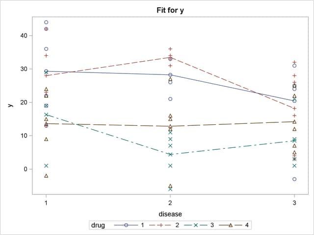
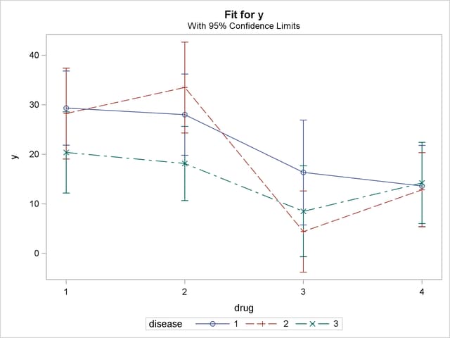
By default, the first classification variable is displayed on the X axis and the second classification variable is used for grouping. Specifying the SLICEBY=DISEASE option in the second EFFECTPLOT statement reverses this, displays the classification variable with the most levels on the X axis, and slices by fewer levels, resulting in a more readable display. Output 19.2.2 shows how well a given drug performs on each disease.
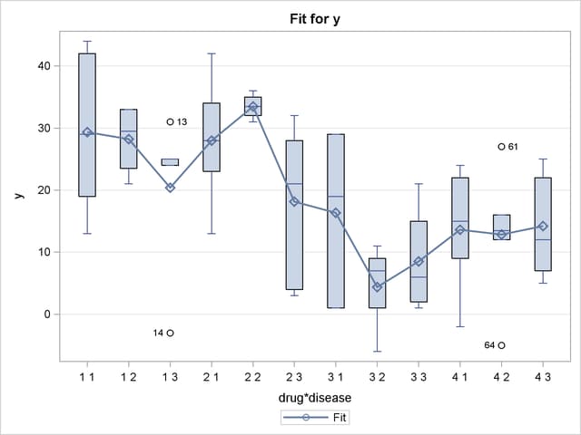
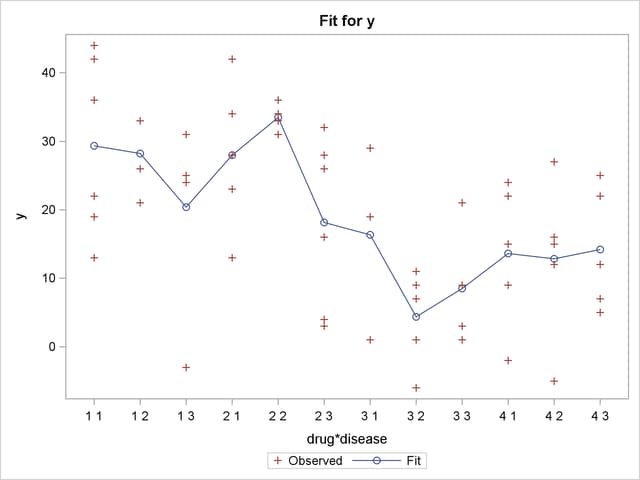
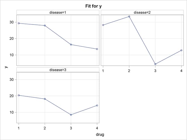
In the following statements, the BOX plot-type is requested to display box plots of the predictions by each drug and disease combination. The second EFFECTPLOT statement displays the same information by using an INTERACTION plot-type and specifies the OBS option to display the individual observations. The third EFFECTPLOT statement creates an interaction plot of predictions versus drug for each of the Disease levels, and displays them in a panel.
ods graphics on;
proc genmod data=a;
   class drug disease;
   model y=drug disease drug*disease / d=n;
   effectplot box;
   effectplot interaction(x=drug*disease) / obs;
   effectplot interaction(plotby=disease);
run;
ods graphics off;
In the box plot in Output 19.2.3, the predicted values are displayed as circles; they coincide with the mean of the data at each level which are displayed as diamonds. The predicted values are again connected by lines. It is difficult to make any conclusions from this graphic.
Output 19.2.4 shows the interaction plot at every combination of Drug and Disease. This plot is identical to the preceding box plot, except the boxes are replaced by the actual observations. Again, it is difficult to see any pattern in the plot.
Output 19.2.5 groups the observations by Disease, and for each disease displays the effectiveness of the three drugs in a panel of plots.
Copyright © SAS Institute, Inc. All Rights Reserved.