| The SEQDESIGN Procedure |
Example 77.4 Generating Graphics Display for Sequential Designs
This example creates the same group sequential design as in Example 77.3 and creates graphics by using ODS Graphics. The following statements request all available graphs in the SEQDESIGN procedure:
   ods graphics on;
   proc seqdesign altref=0.4
                  plots=all
                  ;
      TwoSidedPocock:        design nstages=4 method=poc;
      TwoSidedOBrienFleming: design nstages=4 method=obf;
   run;
   ods graphics off;
With the PLOTS=ALL option, a detailed boundary plot with the rejection region and acceptance region is displayed for the Pocock design, as shown in Output 77.4.1. With the default STOP=REJECT option, the rejection boundaries are also generated at interim stages.
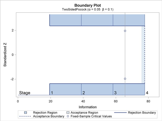
The plot shows identical boundary values in each boundary in the standardized  scale for the Pocock design. The information level and critical value for the corresponding fixed-sample design are also displayed.
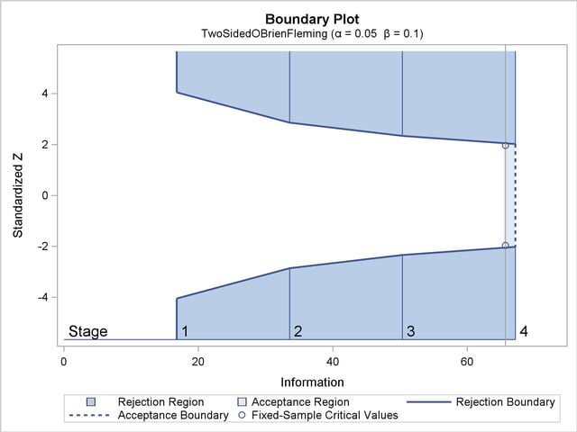
With the PLOTS=ALL option, a detailed boundary plot with the rejection region and acceptance region is also displayed for the O’Brien-Fleming design, as shown in Output 77.4.2. The plot shows that the rejection boundary values are decreasing as the trial advances in the standardized scale.
With the PLOTS=ALL option, the procedure displays a plot of average sample numbers (expected sample sizes for nonsurvival data or expected numbers of events for survival data) under various hypothetical references for all designs simultaneously, as shown in Output 77.4.3. By default, the option CREF=  and expected sample sizes under the hypothetical references
  are displayed, where
  are values specified in the CREF= option. These CREF= values are displayed on the horizontal axis.
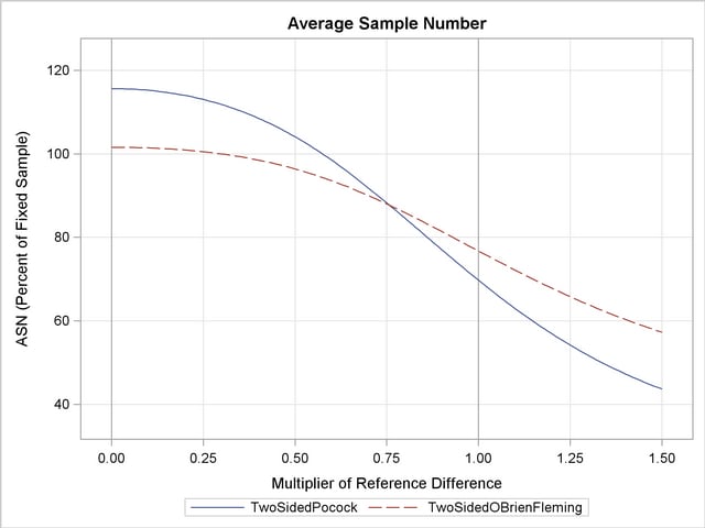
The plot shows that the Pocock design has a larger expected sample size than the O’Brien-Fleming design under the null hypothesis ( ) and has a smaller expected sample size under the alternative hypothesis (
 ).
).
With the PLOTS=ALL option, the procedure displays a plot of the power curves under various hypothetical references for all designs simultaneously, as shown in Output 77.4.4. By default, the option CREF= and powers under hypothetical references are displayed, where are values specified in the CREF= option. These CREF= values are displayed on the horizontal axis.
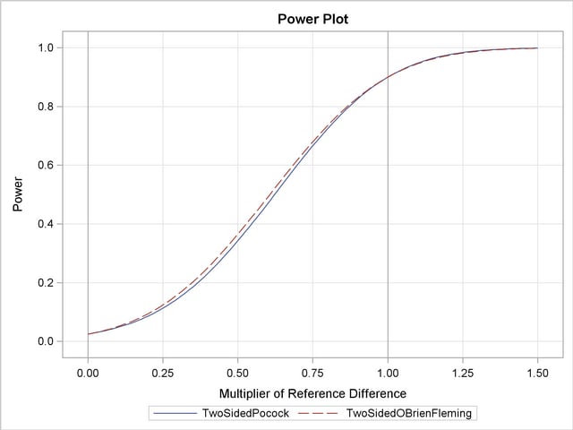
Under the null hypothesis, , the power is  , the upper Type I error probability. Under the alternative hypothesis, , the power is
  , one minus the Type II error probability. The plot shows only minor difference between the two designs.
With the PLOTS=ALL option, the procedure displays a plot of sequential boundaries for all designs simultaneously, as shown in Output 77.4.5. By default, the information levels are used on the horizontal axis.
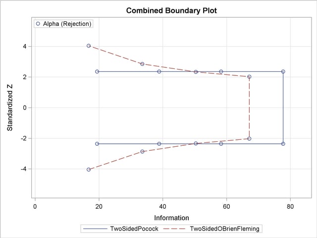
The plot shows that the  boundary values (in absolute value) created from the O’Brien-Fleming method are greater in early stages and smaller in later stages than the boundary values from the Pocock method. The plot also shows that the information level in the Pocock design is larger than the corresponding level in the O’Brien-Fleming design at each stage.
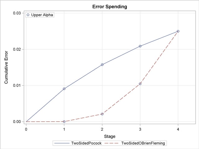
With the PLOTS=ALL option, the procedure displays a plot of cumulative error spends for all boundaries in the designs simultaneously, as shown in Output 77.4.6. With a symmetric two-sided design, cumulative error spending is displayed only for the upper boundary. The plot shows that for the upper boundary, the O’Brien-Fleming method spends fewer errors in early stages and more errors in later stages than the corresponding Pocock method.
Copyright © 2009 by SAS Institute Inc., Cary, NC, USA. All rights reserved.