| Exploring Data in One Dimension |
Box Plots
Box plots are an effective way to compare distributions of interval data. To create side-by-side box plots comparing the distributions of salaries for the American and National Leagues, follow these steps.
| Choose Analyze:Box Plot/Mosaic Plot ( Y ). |
Figure 4.14: Creating a Box Plot
The ( Y ) in the Box Plot/Mosaic Plot ( Y ) menu indicates that a Y variable is required to create a box plot. Since you have no variables selected, a variables dialog prompts you to select at least one Y variable. Selecting a nominal variable for Y creates a mosaic plot; selecting an interval variable for Y creates a box plot.
Y is one of several roles you can assign to variables in analyses. The variables dialog shows that box plots and mosaic plots can also use X, Group, Label, and Freq variables.
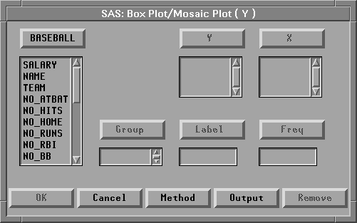
Figure 4.15: Box Plot Variables Dialog
Note |
You can select variables before choosing from the Analyze menu, or you can choose from the Analyze menu before selecting variables. Selecting variables first is faster. If you select variables first, they are assigned to the required variable roles listed in the Analyze menu. Choosing the analysis first gives you more flexibility. If you choose the analysis first, you can assign optional variable roles such as Group and Label. |
| Select SALARY in the list at the left, then click the Y button. |
This assigns the Y role to SALARY. The box plot displays the distribution of the Y variable.
| Select LEAGUE in the list at the left, then click the X button. |
This assigns the X role to LEAGUE. The box plot displays one schematic distribution plot side-by-side for each unique value of the X variable.
| Select NAME in the list at the left, then click the Label button. |
This assigns the Label role to NAME. The label variable is used to identify extreme values in the box plot.
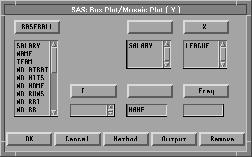
Figure 4.16: Assigning Variable Roles
| Click OK to create the Box Plot. |
The box plot gives a concise picture of the distributions and places them side-by-side for easy comparison. The horizontal line in the middle of a box marks the median or 50th percentile. The top and bottom edges of a box mark the quartiles, or the 25th and 75th percentiles. The narrow boxes extending above and below are called whiskers. Whiskers extend from the quartiles to the farthest observation not farther than 1.5 times the distance between the quartiles. More extreme data values are plotted with individual markers.
The box plot shows long whiskers above with individual observations beyond the whiskers indicating severe skewness. These are the players making extremely high salaries.
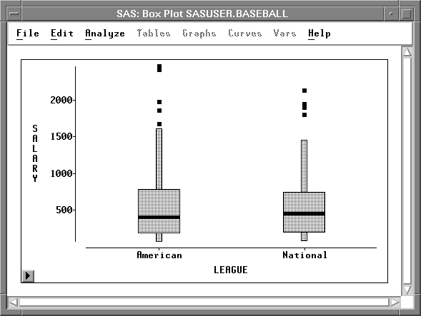
Figure 4.17: Side-By-Side Box Plots
| Point and click at the extreme values to identify them. |
Eddie Murray and Jim Rice were the highest paid players in the American league, while Mike Schmidt was the highest paid player in the National League.
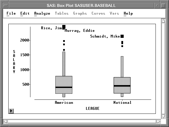
Figure 4.18: Identifying Extreme Values
You can also use a box plot to see the sample mean of a distribution.
| Click on the menu button in the lower left corner of the plot. |
This displays the box plot pop-up menu. Click on Means.
Figure 4.19: Box Plot Pop-up Menu
This toggles the display of mean diamonds on the box plot.
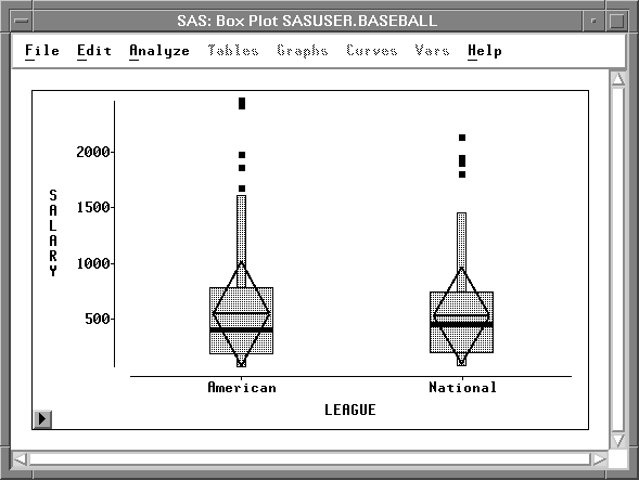
Figure 4.20: Box Plot with Mean Diamonds
The horizontal line in a mean diamond marks the mean salary for each league. The height of a mean diamond is two standard deviations (one on either side of the mean). In this case, the means and standard deviations for each league are almost identical.
You can use other choices on the box plot pop-up menu to adjust axis tick marks and marker sizes and to toggle the display of observations, axes, serifs, and values. When there are two or more categories, you can toggle the display of comparison circles, which enable you to graphically compare the means of multiple categories.
Related Reading |
Box Plots, Chapter 33. |
Copyright © 2007 by SAS Institute Inc., Cary, NC, USA. All rights reserved.
![[menu]](images/one_oneeq3.gif)
![[menu]](images/one_oneeq4.gif)