| Box Plots and Mosaic Plots |
Multiple Comparison Circles
In addition to a table that summarizes the statistics for simultaneous multiple comparison of means, SAS/INSIGHT software provides a graphical technique to help visualize which groups are significantly different from a selected group. Each test is accompanied by a comparison circles plot that graphically illustrates the comparisons (Sall 1992).
There is a circle next to the box plot and centered at each category's sample mean. The radius of the ith circle is ![]() , where q is a quantile used to scale the circles according to the test being used. For details on how each quantile is computed, see refer to Hsu (1996).
, where q is a quantile used to scale the circles according to the test being used. For details on how each quantile is computed, see refer to Hsu (1996).
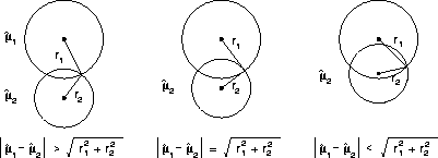
If the jth group is selected (by clicking on its circle), then its circle is highlighted. This circle is red on color monitors. You can determine whether another group is significantly different than the selected group based on how much their corresponding circles overlap. If their circles are nested or nearly overlap so that the external angle of intersection is greater than 90 degrees, then you cannot claim that the means of the two groups are different. If, however, the two circles are disjoint or just barely overlap so that their external angle of intersection is less than 90 degrees, then you can conclude that the means of the two groups are significantly different at the given confidence level.
Circles corresponding to categories that are significantly different from the selected group are drawn in cyan on color monitors. Circles corresponding to categories that are not different are drawn with a dashed line and are red on color monitors.
The geometry behind comparison circles is based on the Pythagorean Theorem: since the radius of the ith circle is ![]() , and since the circle is centered at
, and since the circle is centered at ![]() , then if the two circles meet at right angles, the distance between centers is the hypotenuse of the right triangle formed by the circles' radii. Therefore, when the circles meet at right angles,
, then if the two circles meet at right angles, the distance between centers is the hypotenuse of the right triangle formed by the circles' radii. Therefore, when the circles meet at right angles, ![]() . Statistically, this geometry corresponds to the critical case in which zero happens to fall on the boundary of the confidence interval about
. Statistically, this geometry corresponds to the critical case in which zero happens to fall on the boundary of the confidence interval about ![]() . If
. If ![]() , then the external intersection of the circles is less than 90 degrees, and zero is not contained in the confidence interval about
, then the external intersection of the circles is less than 90 degrees, and zero is not contained in the confidence interval about ![]() . Thus the circles are significantly different.
. Thus the circles are significantly different.
 |
Figure 33.9: The Geometry of Multiple Comparison Circles
The statistics for Hsu's Test for Best and Hsu's Test for Worst are computed differently from the other tests. First, the comparison circles are not selectable. The Test for Best automatically selects the category with the largest sample mean; the Test for Worst selects the category with the smallest sample mean. Second, the quantile used to scale the comparison circles is the maximum of the quantiles computed by running Dunnett's one-sided test k-1 times, with each "non-best" (or "non-worst") group serving in turn as the "control" for Dunnett's test.
Because Hsu's Test for Best does not provide symmetric intervals about ![]() , the comparison circle technique must be modified. While the statistical table reports exactly which groups can be inferred not to be the best, the comparison circles are more conservative because the quantile used to scale the circle radii is the maximum of all quantiles encountered during Hsu's test. The same is true for Hsu's Test for Worst.
, the comparison circle technique must be modified. While the statistical table reports exactly which groups can be inferred not to be the best, the comparison circles are more conservative because the quantile used to scale the circle radii is the maximum of all quantiles encountered during Hsu's test. The same is true for Hsu's Test for Worst.
Related Reading |
Box Plots, Chapter 4. |
Related Reading |
Mosaic Plots, Chapter 5. |
Related Reading |
Distributions, Chapter 12. |
Copyright © 2007 by SAS Institute Inc., Cary, NC, USA. All rights reserved.