| The SHEWHART Procedure |
Step 3: Displaying the Trend Chart
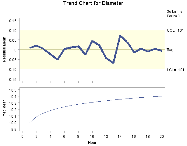
The third step is to create a trend chart with the SHEWHART procedure, as follows:
symbol v = none w=5;
title 'Trend Chart for Diameter';
proc shewhart history=regdata;
   xchart Diameter*hour /
      wtrend   = 1
      trendvar = fitted
      split    = '/'
      stddevs
      nolegend;
   label Diameterx = 'Residual Mean/Fitted Mean';
   label hour     = 'Hour';
run;
The chart is shown in Figure 13.43.51. The values of FITTED are plotted in the lower half of the trend chart. The upper half of the trend chart is an  chart for the residual means (DiameterX
  FITTED). The CNEEDLES= option specifies that the residuals are to be represented by vertical bars as deviations from the central line. The chart in Figure 13.43.51 shows that, after accounting for the trend, the mean level of the process is in control.
If the data are correlated in time, you can use the ARIMA or AUTOREG procedures in place of the REG procedure to remove autocorrelation structure and display a control chart for the residuals; for an example, see Autocorrelation in Process Data. Another application of the TRENDVAR= option is the display of nominal values in control charts for short runs; see Short Run Process Control.
Copyright © SAS Institute, Inc. All Rights Reserved.