| The SHEWHART Procedure |
Example 13.36 Plotting OC Curves for Mean Charts
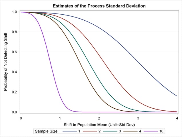
[See SHWOC1 in the SAS/QC Sample Library]This example uses the GPLOT procedure and the DATA step function PROBNORM to plot operating characteristic (OC) curves for  charts with 3
 limits. An OC curve is plotted for each of the subgroup samples sizes 1, 2, 3, 4, and 16. Refer to page 226 in Montgomery (1996). Each curve plots the probability
  of not detecting a shift of magnitude
  in the process mean as a function of
  . The value of is computed using the following formula:
 |
 |
 |
|||
 |
|
 |
The following statements compute (the variable BETA) as a function of (the variable NU). The variable nSample contains the sample size.
data oc;
   keep prob nSample t plot2;
   plot2=.;
   do nSample=1, 2, 3, 4, 16;
      do j=0 to 400;
         t=j/100;
         prob=probnorm( 3-t*sqrt(nSample)) -
              probnorm(-3-t*sqrt(nSample));
         output;
         end;
      end;
   label t   ='Shift in Population Mean (Unit=Std Dev)'
        prob='Probability of Not Detecting Shift';
run;
The following statements use the GPLOT procedure to display the OC curves shown in Output 13.36.1:
proc sgplot data=oc;
   series x=t y=prob /
      group=nSample lineattrs=(pattern=solid thickness=2);
   yaxis grid;
   label nSample='Sample Size';
run;
Copyright © SAS Institute, Inc. All Rights Reserved.