| The UNIVARIATE Procedure |
Example 4.30 Interpreting a Normal Quantile Plot
This example illustrates how to interpret a normal quantile plot when the data are from a non-normal distribution. The following statements create the data set Measures, which contains the measurements of the diameters of 50 steel rods in the variable Diameter:
data Measures;
   input Diameter @@;
   label Diameter = 'Diameter (mm)';
   datalines;
5.501  5.251  5.404  5.366  5.445  5.576  5.607
5.200  5.977  5.177  5.332  5.399  5.661  5.512
5.252  5.404  5.739  5.525  5.160  5.410  5.823
5.376  5.202  5.470  5.410  5.394  5.146  5.244
5.309  5.480  5.388  5.399  5.360  5.368  5.394
5.248  5.409  5.304  6.239  5.781  5.247  5.907
5.208  5.143  5.304  5.603  5.164  5.209  5.475
5.223
;
run;
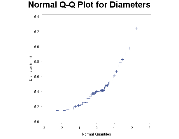
The following statements request the normal Q-Q plot in Output 4.30.1:
symbol v=plus;
title 'Normal Q-Q Plot for Diameters';
proc univariate data=Measures noprint;
   qqplot Diameter / normal
                     square
                     vaxis=axis1;
   axis1 label=(a=90 r=0);
run;
The nonlinearity of the points in Output 4.30.1 indicates a departure from normality. Because the point pattern is curved with slope increasing from left to right, a theoretical distribution that is skewed to the right, such as a lognormal distribution, should provide a better fit than the normal distribution. The mild curvature suggests that you should examine the data with a series of lognormal Q-Q plots for small values of the shape parameter  , as illustrated in Example 4.31. For details on interpreting a Q-Q plot, see the section Interpretation of Quantile-Quantile and Probability Plots.

A sample program for this example, uniex18.sas, is available in the SAS Sample Library for Base SAS software.
Copyright © SAS Institute, Inc. All Rights Reserved.