CHART Procedure

Overview: CHART Procedure
What Does the CHART Procedure Do?
The CHART procedure
produces vertical and horizontal bar charts, block charts, pie charts,
and star charts. These types of charts graphically display values
of a variable or a statistic associated with those values. The charted
variable can be numeric or character.
PROC CHART is a useful
tool that lets you visualize data quickly, but if you need to produce
presentation-quality graphics that include color and various fonts,
then use SAS/GRAPH software.
The GCHART procedure in SAS/GRAPH
software produces the same types of charts as PROC CHART does. In
addition, PROC GCHART can produce donut charts.
What Types of Charts Can PROC CHART Create?
Bar Charts
Horizontal and vertical
bar charts display the magnitude of data with bars, each of which
represents a category of data. The length or height of the bars represents
the value of the chart statistic for each category.
The following output
shows a vertical bar chart that displays the number of responses for
the five categories from the survey data. The following statements
produce the output:
proc chart data=survey;
   vbar response / sumvar=count
   axis=0 to 200 by 50
   midpoints='Always' 'Usually'
             'Sometimes' 'Rarely' 'Never';
run;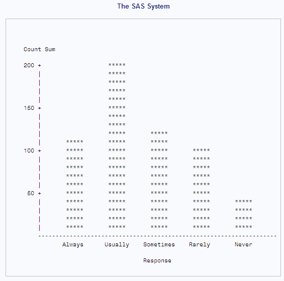
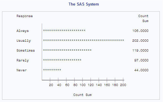
The following output
shows the same data presented in a horizontal bar chart. The two types
of bar charts have essentially the same characteristics, except that
horizontal bar charts by default display a table of statistic values
to the right of the bars. The following statements produce the output:
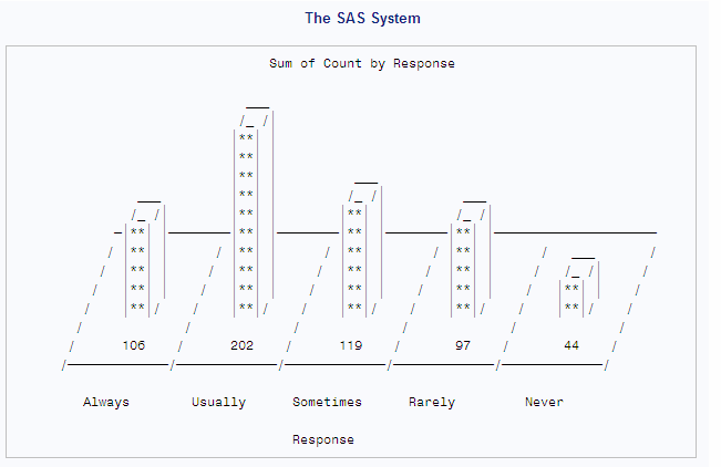
Block Charts
Block charts display
the relative magnitude of data by using blocks of varying height,
each set in a square that represents a category of data. The following
output shows the number of each survey response in the form of a block
chart.
Pie Charts
Pie charts represent
the relative contribution of parts to the whole by displaying data
as wedge-shaped slices of a circle. Each slice represents a category
of the data. The following output shows the survey results divided
by response into five pie slices. The following statements produce
the output:
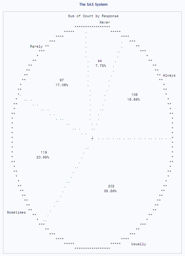
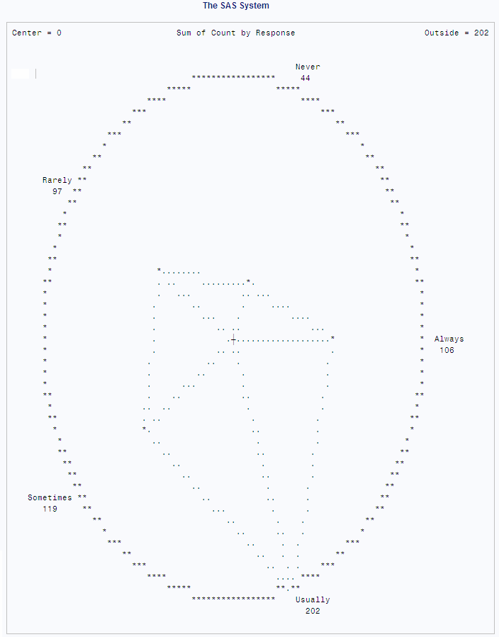
Star Charts
With PROC CHART, you
can produce star charts that show group frequencies, totals, or mean
values. A star chart is similar to a vertical bar chart, but the bars
on a star chart radiate from a center point, like spokes in a wheel.
Star charts are commonly used for cyclical data, such as measures
taken every month or day or hour. They are also used for data in which
the categories have an inherent order (“always” meaning
more frequent than “usually,” which means more frequent
than “sometimes”). The following output shows the survey
data displayed in a star chart. The following statements produce the
output: