Common Overlay Combinations
After you become familiar
with the plot statements GTL offers, you will see them as basic components
that can be stacked in many ways to form more complex plots. For example,
there is no "BARLINE" statement in GTL. You design this kind of graph
by overlaying a SERIESPLOT on a BARCHART or BARCHARTPARM.
proc template;
  define statgraph barline;
    begingraph;
      entrytitle "Overlay of REFERENCELINE, BARCHARTPARM and SERIESPLOT";
      layout overlay;
        referenceline y=25000000 / curvelabel="Target";
        barchartparm x=year y=retail;
        seriesplot x=year y=profit / name="series";
        discretelegend "series";
      endlayout;
    endgraph;
  end;
run;

/* compute sums for each product line */
proc summary data=sashelp.orsales nway;
  class year;
  var total_retail_price profit;
  output out=orsales sum=Retail Profit;
run;

proc sgrender data=orsales template=barline;
  format retail profit comma12.;
run;
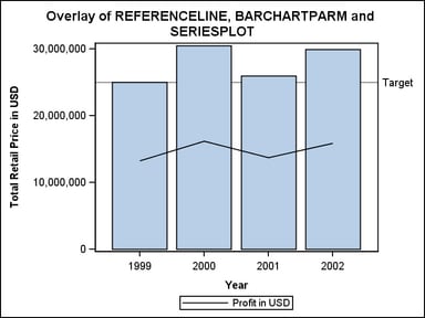
Chart Orientation. When creating a bar chart, it is
sometimes desirable to rotate the chart from vertical to horizontal.
GTL does not provide separate statements for vertical and horizontal
charts—each is considered to be the same plot type with a different
orientation. To create the horizontal version of the bar-line graph,
you need to specify ORIENT=HORIZONTAL on the BARCHARTPARM statement:
proc template;
  define statgraph barline;
    begingraph;
      entrytitle "Overlay of REFERENCELINE, BARCHARTPARM and SERIESPLOT";
      layout overlay;
        referenceline x=25000000 / curvelabel="Target";
        barchartparm x=year y=retail / orient=horizontal ;
        seriesplot x=profit y=year / name="series"
          legendlabel="Profit in USD";
        discretelegend "series";
      endlayout;
    endgraph;
  end;
run;
Here,
the Y axis becomes the category (DISCRETE) axis, and the X axis is
used for the response values. Both the REFERENCELINE and SERIESPLOT
reflect this directly by changing the variables that are mapped to
the X and Y axes. The variable mapping for BARCHARTPARM remains the
way it was, but we add the ORIENT=HORIZONTAL option to swap the axis
mappings. The data set up and SGRENDER step are unchanged.
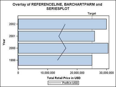
This same
strategy would be used to create a horizontal box plot or histogram.
If you wanted to reverse the ordering of the Y axis, you could add
the REVERSE=TRUE option to the Y-axis options:
layout overlay / yaxisopts=(reverse=true);
Multiple Axes. Sometimes you have equivalent data in different scales (currency,
measurements, and so on), or comparable data in the same scale that
you want to display on independent opposing axes.
The OVERLAY
layout supports up to four independent axes, with a Y2 opposing the
Y axis to the right, and an X2 axis opposing the X axis at the top
of the layout container.
The following
is a complete program to generate this type of graph. We would like
to display Fahrenheit temperatures on a separate Y2 axis from the
Y axis used to display Celsius temperatures. For this particular example,
it is not necessary to have input variables for both temperatures
because an EVAL function can be used to compute a new column of data
within the context of the template.
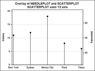
At this point, the most important
concept to understand about template code is that an independent axis
can be created by mapping data to it. Notice that the SCATTERPLOT
statement uses the YAXIS=Y2 option. This causes the Y2 to axis to
be displayed and scaled with the computed variable representing Fahrenheit
values. It is important to note that multiple plots in an overlay
share the same axis (such as the X-Axis). Hence, the options to control
the axis attributes are not found on the plot statements, but rather
in the LAYOUT statement. Most of the Y and Y2 axis options are included
to force the tick marks for the two different axis scales to exactly
correspond. This example and many other axis issues are discussed in detail
in Managing Axes in an OVERLAY Layout.
data temps;
  input City $1-11  Celsius;
datalines;
New York     11
Sydney       12
Mexico City  18
Paris         8
Tokyo         6
run;

proc template;
 define statgraph Y2axis;
  begingraph;
   entrytitle "Overlay of NEEDLEPLOT and SCATTERPLOT";
   entrytitle "SCATTERPLOT uses Y2 axis";
   layout overlay /
       xaxisopts=(display=(tickvalues))
       yaxisopts=(griddisplay=on offsetmin=0
         linearopts=(viewmin=0  viewmax=20
           thresholdmin=0 thresholdmax=0))
       y2axisopts=(label="Fahrenheit" offsetmin=0
         linearopts=(viewmin=32 viewmax=68
           thresholdmin=0 thresholdmax=0)) ;
     needleplot  x=City y=Celsius;
     scatterplot x=City y=eval(32+(9*Celsius/5)) / yaxis=y2
       markerattrs=(symbol=circlefilled);
   endlayout;
  endgraph;
 end;
run;

proc sgrender data=temps template=y2axis;
run;
Often,
the input data's organization will affect your choice of plot statements
in an OVERLAY layout. In Overview of Basic Statements and Options, you saw that
you would choose different plot statements for a fit plot, depending
on the nature of the input data for a fit plot.
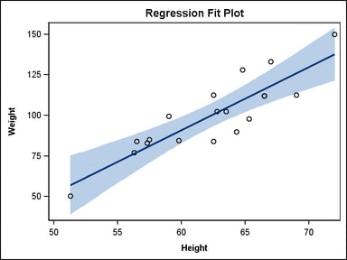
Computed versus Paramterized Plots. If the data set has numeric columns for raw data values of Height
and Weight, the simplest way to create the fit line and confidence
bands is with a REGRESSIONPLOT, LOESSPLOT, or PBSPLINEPLOT statement
and a MODELBAND statement. All of these computed plot statements generate
the values of new columns corresponding to the points of the fit line
and band boundaries.
layout overlay;
  modelband "myclm";
  scatterplot    x=height y=weight / primary=true;
  regressionplot x=height y=weight / alpha=.01 clm="myclm";
endlayout;
If you have data computed by an analytic procedure that
provides points on the fit line and bands, you would choose a SERIESPLOT
and BANDPLOT for the graph. This technique is required when the desired
fit line can't be computed by the REGRESSIONPLOT, LOESSPLOT, or PBSPLINEPLOT
statement options.
layout overlay;
  bandplot x=height limitupper=uclm limitlower=lclm /
    fillattrs=GraphConfidence;
  scatterplot x=height y=weight / primary=true;
  seriesplot  x=height y=p / lineattrs=GraphFit;
endlayout;
Also,
notice that additional options are used to set the appearance of the
fit line and band to match the defaults for REGRESSIONPLOT and MODELBAND.
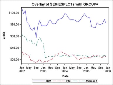
Grouped Data. Another common practice is to overlay series lines for comparisons.
If your data contains a classification variable in addition to X and
Y variables, you could use one SERIESPLOT statement with a GROUP=
option:
proc template;
  define statgraph seriesgroup;
    begingraph;
    entrytitle "Overlay of SERIESPLOTs with GROUP=";
      layout overlay;
        seriesplot x=date y=close / group=stock name="s";
        discretelegend "s";
      endlayout;
    endgraph;
  end;
run;

proc sgrender data=sashelp.stocks template=seriesgroup;
   where date between "1jan2002"d and "31dec2005"d;
run;
By default
when you use a GROUP= option with a plot, the plot automatically cycles
through appearance features (colors, line styles, and marker symbols)
to distinguish group values in the plot. The default features that
are assigned to each group value are determined by the current style.
For the following graph, the default colors and line styles of the
LISTING style are used:
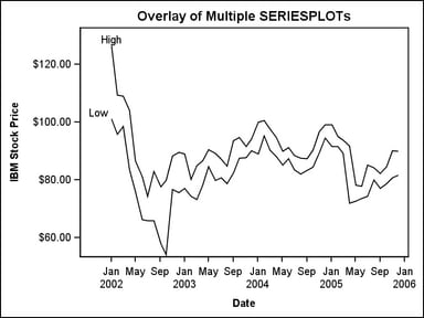
Multiple Response Variables. If your data has multiple
response variables, you could create a SERIESPLOT overlay for each
response. In such situations, you often need to adjust the Y axis
label.
proc template;
 define statgraph series;
  begingraph;
    entrytitle "Overlay of Multiple SERIESPLOTs";
    layout overlay / yaxisopts=(label="IBM Stock Price") ;
      seriesplot x=date y=high / curvelabel="High";
      seriesplot x=date y=low / curvelabel="Low";
    endlayout;
  endgraph;
 end;
run;


proc sgrender data=sashelp.stocks template=series;
   where date between "1jan2002"d and "31dec2005"d
         and stock="IBM";
run;
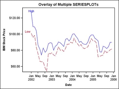
Appearance Options. In cases when multiple plots have the same appearance, you can use
plot options to adjust the appearance of individual plots. For example,
to adjust the series lines from the previous example, you can use
the LINEATTRS= option:
layout overlay / yaxisopts=(label="IBM Stock Price");
  seriesplot x=date y=high / curvelabel="High" lineattrs=GraphData1 ;
  seriesplot x=date y=low  / curvelabel="Low"  lineattrs=GraphData2 ;
endlayout;
You can
also use the CYCLEATTRS= option, which is an option of the LAYOUT
OVERLAY statement that might cause each statement to acquire different
appearance features from the current style.
layout overlay / yaxisopts=(label="IBM Stock Price") cycleattrs=true ;
  seriesplot x=date y=high / curvelabel="High";
  seriesplot x=date y=low / curvelabel="Low";
endlayout;
For additional
information on how set the appearance features of plots, see see Managing Graph Appearance: General Principles and Managing the Graph Appearance with Styles.