Fit and Confidence Plots
About Fit and Confidence Plots
You can use the SGPLOT
and SGPANEL procedures to produce fit plots and ellipses (the ellipses
plot is available with the SGPLOT procedure only). Fit plots represent
the line of best fit (trend line) with confidence limits.
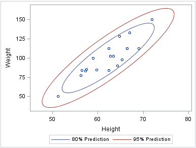
About Ellipse Plots
Ellipse plots create
a confidence elliptical curve computed from input data. In order to
produce useful output, the ELLIPSE statement should be used with another
plot statement that uses numeric axes. Ellipses are available only
for the SGPLOT procedure. The SGPANEL procedure does not support ellipses.
See Also
ELLIPSE Statement (SGPLOT procedure)
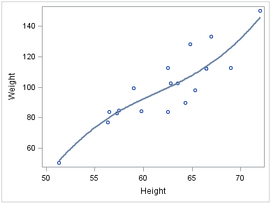
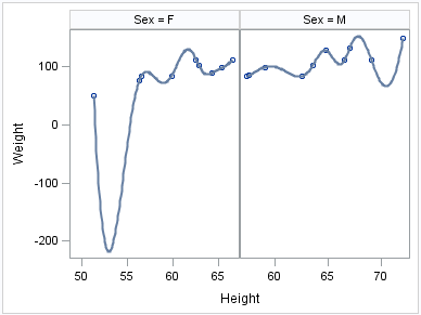
About Loess Plots
A loess plot includes
a scatter plot of two numeric variables along with an overlaid nonlinear
fit line that enables you to perform locally weighted polynomial regression.
You can specify the degree of the local polynomials to use for each
local regression. You can also change the default smoothing technique
that is applied to the fit.
About Penalized B-Spline Plots
A penalized B-spline
curve includes a scatter plot of two numeric variables along with
an overlaid nonlinear fit line. You can specify the degree of the
local polynomials to use for each local regression. You can also change
the default smoothing technique that is applied to the fit.
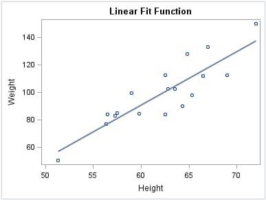
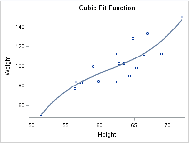
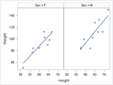
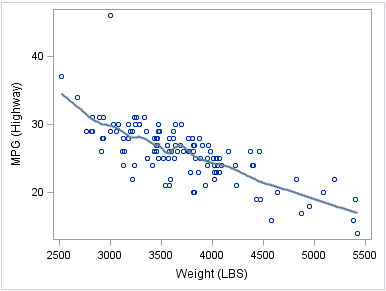
About Regression Plots
A regression plot includes
a scatter plot of two numeric variables along with an overlaid linear
or nonlinear fit line that enables you to perform a regression analysis.
You can specify one of three types of regression equation: linear,
quadratic, or cubic. You can display confidence limits for mean predicted
values or individual predicted values.
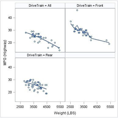
The following examples
show the relationship of height to weight and the line of best fit
for a class of students. Examples are provided for the SGPLOT and
the SGPANEL procedures. The first two examples show the same plot
with a linear and a cubic fit line, respectively. The third example
shows a paneled graph. In all three examples, the automatically generated
legend for the fit line is not needed and has been suppressed.