Basic Plots and Charts
About Basic Plots and Charts
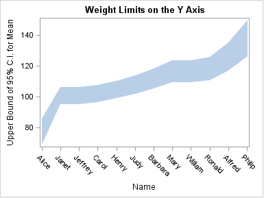
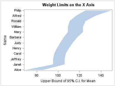
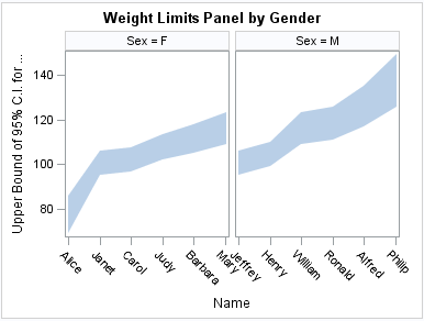
About Band Plots
A band plot creates
a band that highlights part of the plot and shows upper and lower
limits. The input data should be sorted by the X or Y variable.
The following examples
show upper and lower mean weight values for a class of students. The
first two examples use the SGPLOT procedure to show the same band
plotted along the X axis and the Y axis, respectively. The third example
uses the SGPANEL procedure to show a matrix that is paneled by gender.
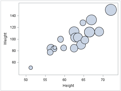
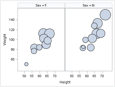
About Bubble Plots
Bubble plots show the
relative magnitude of the values of a variable. The values of two
variables determine the position of the bubble on the plot, and the
value of a third variable determines the size of the bubble.
The following examples
show the height and weight values for a class. The size of each bubble
is determined by the student’s age. Examples are provided for
the SGPLOT and the SGPANEL procedures.
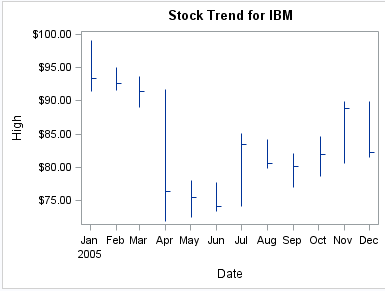
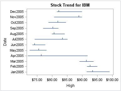
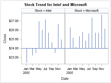
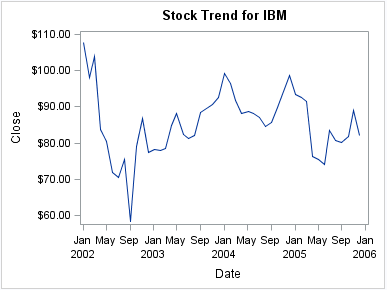
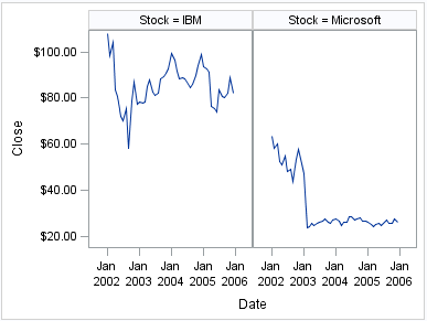
About High-Low Charts
High-low charts show
how several values of one variable relate to one value of another
variable. Typically, each variable value on the horizontal axis has
several corresponding values on the vertical axis.
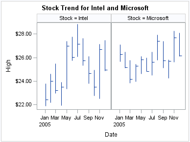
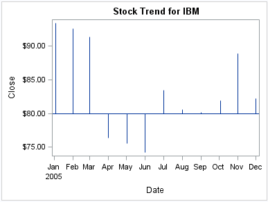
The following examples
show the stock trend for IBM during a particular year. The first two
examples use the SGPLOT procedure to show the same plot along the
X axis and the Y axis, respectively. The third example uses the SGPANEL
procedure to show a paneled graph for Intel and Microsoft stock prices
in the same year. Optional values have been specified for the closing
stock prices, which are represented as tick marks on the high-low
lines.
About Lines
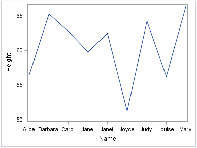
About Reference Lines
You can add horizontal
or vertical reference lines to your graphics. You can draw a reference
line for each value of a specified variable. Or you can specify one
or more explicit values for the reference lines.
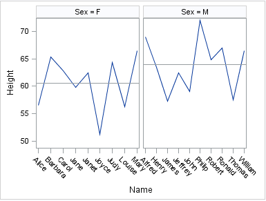
The following examples
show the height values for a class of students. A horizontal reference
line is overlaid on a series plot to show the average height. Examples
are provided for the SGPLOT and the SGPANEL procedures.
In the first example,
a value of 60.8 is specified for the reference line. The second example
uses the MEANS procedure to obtain the averages for males and females
in the class. The SGPANEL procedure then specifies the variable that
contains these averages in order to obtain the reference lines.
About Parameterized Lines
Parameterized lines
are straight lines specified by a point and a slope. The statement
must be used with another plot statement that is derived from data
values that provide boundaries for the axis area. For example, the
LINEPARM statement can be used with a scatter plot or a histogram.
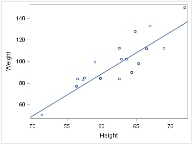
The following example
shows weight with respect to height for a class of students. A single
line is generated by specifying values for the point and for the slope.
The line in the example approximates a line of best fit.
You can generate multiple
lines by specifying a numeric variable for any or all required arguments.
Examples are provided for the SGPLOT and the SGPANEL procedures. The
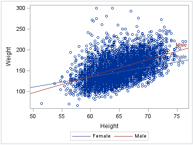
following two examples create lines of best fit for male and female
participants in a heart disease study. The lines show weight with
respect to height.
The examples first sort
the data set by male and female participants. The sorted data is output
to a data set named HEART.
The examples then use
the REG procedure and output the regression statistics to a data set
named STATS. The STATS data set includes the slope and the Y-intercept
for the regression.
The first example uses
the SGPLOT procedure to show lines of best fit for females and males
in the study. The regression lines are labeled and have their own
legend.
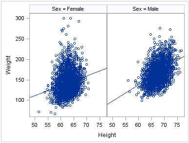
The following example
uses the SGPANEL procedure to create the same information, which is
paneled by gender.
See Also
REFLINE Statement (SGPANEL procedure)
REFLINE Statement (SGPLOT procedure)
LINEPARM Statement (SGPANEL procedure)
LINEPARM Statement (SGPLOT procedure)
About Needle Plots
The following examples
show the stock trend during a particular year. Examples are provided
for the SGPLOT and the SGPANEL procedures. Each example specifies
an optional baseline value on the Y axis.
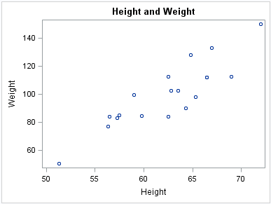
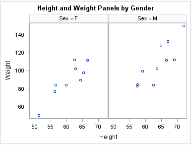
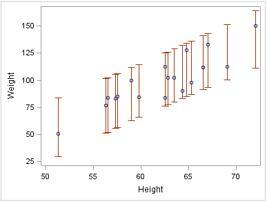
About Scatter Plots
Scatter plots show the
relationship of one variable to another, often revealing concentrations
or trends in the data. Typically, each variable value on the horizontal
axis can have any number of corresponding values on the vertical axis.
The following examples
show the relationship of height to weight for a class of students.
Examples are provided for the SGPLOT and the SGPANEL procedures. The
third example includes error bars.
About Series Plots
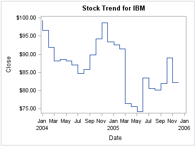
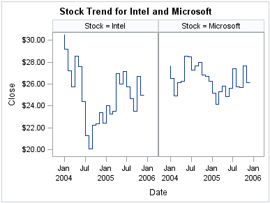
About Step Plots
Step plots display a
series of horizontal and vertical line segments that connect observations
of input data. The plots use a step function to connect the data points.
The vertical line can change at each step.
The following examples
show step plots of stock trends. Examples are provided for the SGPLOT
and the SGPANEL procedures.
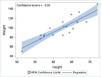
About Text Insets
A text inset provides
an easy way to add text to a graphic. You can insert a text string
as well as a series of label-value pairs.
The following example
shows a linear regression curve with a text inset in the upper left
corner. Text insets are available only for the SGPLOT procedure. The
SGPANEL procedure does not support text insets.
See Also
INSET Statement (SGPLOT procedure)
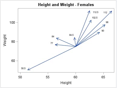
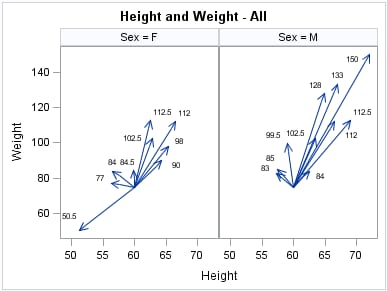
About Vector Plots
Vectors are directed
line segments. A vector plot is a two-dimensional graphic that uses
vectors to represent both direction and magnitude at each point.
The following examples
show the relationship of height to weight for a class of students.
Examples are provided for the SGPLOT and the SGPANEL procedures. Both
examples specify optional X and Y origins and data labels.