Example Program and Statement Details
Example Program
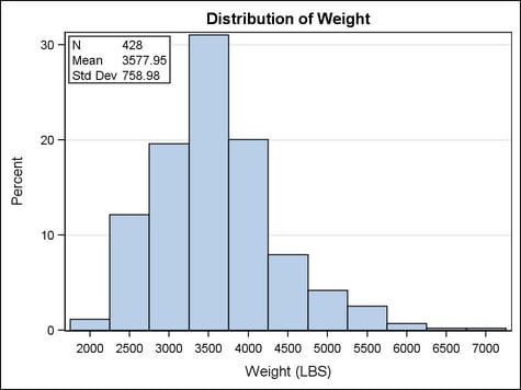
The GRIDDED layout offers
the best way to nest a table of information inside another layout.
In the GRIDDED layout, you can control the content, text justification,
and fonts of columns. Because this example nests the GRIDDED layout
within an OVERLAY layout, you can control where it appears within
the plot area. The AUTOALIGN= option enables you to specify a prioritized
list of possible positions where the layout should be drawn. The position
actually used is the first one that avoids collision with the histogram.
Also, the GRIDDED layout is set to be opaque so that the grid lines
do not show through.
This example also illustrates
a reusable template in the sense that it works for any numeric variable
specified by the dynamic variable VAR. Also, SGE functions for computing
the N, MEAN, STDDEV of the variable are used in the table to compute
the statistics as the template is executed.
proc template;
 define statgraph inset;
  dynamic VAR;
  begingraph;
   entrytitle "Distribution of " VAR;
   layout overlay / yaxisopts=(griddisplay=on);
    histogram VAR / scale=percent;
    layout gridded / columns=2
        autoalign=(topleft topright) border=true
        opaque=true backgroundcolor=GraphWalls:color;
     entry halign=left "N";
     entry halign=left eval(strip(put(n(VAR),12.0)));
     entry halign=left "Mean";
     entry halign=left eval(strip(put(mean(VAR),12.2)));
     entry halign=left "Std Dev";
     entry halign=left eval(strip(put(stddev(VAR),12.2)));
    endlayout;
   endlayout;
  endgraph;
 end;
run;

proc sgrender data=sashelp.cars template=inset;
   dynamic VAR="Weight";
run;
Statement Summary
A GRIDDED layout is
commonly used to create small tables of text that are nested within
other layouts. The layout might also be used to span and center a
single entry (a legend, for example) across a set of grids. Or it
might be used to display a grid of graphs when there is no need to
scale axis data ranges or align graphs across grid cells.
The layout’s
grid size is determined by the COLUMNS= and ROWS= options. The resulting columns and rows can
be separated by areas called “gutters,” which are controlled
by the COLUMNGUTTER= and ROWGUTTER= options.
By default, the results
of the GTL-statements are placed
into the grid sequentially from left to right, wrapping to a new row
each time the current row is filled. You can use the ORDER= option to fill cells from top to bottom down
a column. In that case, the layout cells wrap to a new column each
time the current column is filled.
Options
specifies whether this
layout is automatically aligned within its parent when nested within
an overlay-type or region layout. For more information about how child
positions are determined in an overlay-type or region layout, see
the LAYOUT OVERLAY’s Statement Summary.
Available only if the
parent layout contains a scatter plot; ignored otherwise. Within the
parent layout, attempt to center this layout in the area that is farthest
from any surrounding data point markers.
Within the parent layout,
restrict this layout’s possible locations to those locations
in the specified location-list, and use the location-list position that least collides with the parent layout’s other
graphics features. The location-list is blank-separated and can contain any of these locations: TOPLEFT,
TOP, TOPRIGHT, LEFT, CENTER, RIGHT, BOTTOMLEFT, BOTTOM, and BOTTOMRIGHT.
specifies the attributes
of the border line around the layout. See General Syntax for Attribute Options for the syntax
on using a style-element and Line Options for available line-options.
specifies the number
of columns in the layout.
Default: If ORDER=ROWMAJOR, the default is 1. If ORDER=COLUMNMAJOR,
as many columns are created as needed to satisfy the ROWS= request.
Restriction: Assuming ORDER=ROWMAJOR, if COLUMNS=n and there are m cells defined,
and n > m, then only m columns are created (there are n - m cells with zero size).
This option is used
to create a grid with a fixed number of columns, without concern for
how many rows. For example, the following settings ensure that columns
1 and 2 in the first row are filled with content, as shown in the
figure:

specifies this layout’s
horizontal alignment within its parent when nested within an overlay-type
or region layout. For more information about how child positions are
determined in an overlay-type or region layout, see the LAYOUT OVERLAY’s Statement Summary.
Range: A number specification can
range from 0 to 1. The number represents a fraction of the parent container’s width, where
0 is all the way to the left and 1 is all the way to the right.
Restriction: This option is available only when this statement is nested within
an overlay-type or region layout. It is ignored if this statement
is the outermost layout or if the parent layout is not an overlay-type
or region layout.
specifies whether the
legend appears inside or outside the plot area when nested within
an overlay-type layout.
Restriction: This option has effect only when the GRIDDED layout block appears
within an overlay-type layout. For more information about how child
positions are determined in an overlay-type layout, see the LAYOUT
OVERLAY’s Example Program and Statement Details.
Interaction: If this option is set to OUTSIDE, the HALIGN= and VALIGN= options
must specify a keyword (LEFT, RIGHT, or CENTER). The number setting for the alignment is invalid when
the layout is positioned outside of the plot area.
Interaction: The actual position is determined by this option’s setting
plus the settings for the AUTOALIGN= or HALIGN= and VALIGN= options.
specifies whether cells
are populated using column priority or by row priority.
Requirement: When this option is set to COLUMNMAJOR, the ROWS= option must be
specified to indicate how many rows to fill before wrapping to the
next column. The default number of rows is 1.
specifies the amount
of extra space that is added inside the layout border.
Default: The default padding for all sides is 0. Values without units are
in pixels (px). A unit must be provided if other than pixels.
Enables separate settings
for the left, right, top, and bottom padding dimensions. Use the pad-options to create non-uniform padding. These
options must be enclosed in parentheses. Each option is specified
as a name = value pair. Sides
not assigned padding are padded with the default amount.
| LEFT=dimension | specifies the amount of extra space added to the left side. |
| RIGHT=dimension | specifies the amount of extra space added to the right side. |
| TOP=dimension | specifies the amount of extra space added to the top. |
| BOTTOM=dimension | specifies the amount of extra space added to the bottom. |
specifies the number
of rows in the layout.
Default: If ORDER=COLUMNMAJOR, the default is 1. If ORDER=ROWMAJOR,
this option is ignored and as many rows are created as needed to satisfy
the COLUMNS= request.
Restriction: Assuming ORDER=COLUMNMAJOR, if ROWS=n and there are m cells defined,
and n > m, then only m rows are created (there are n - m cells with zero size).
This option is used
to create a grid with a fixed number of rows, without concern for
how many columns. For example, the following settings ensure that
rows 1 and 2 in the first column are filled with content, as shown
in the figure:

specifies this layout’s
vertical alignment within its parent when nested within an overlay-type
or region layout. For more information about how child positions are
determined in an overlay-type or region layout, see the LAYOUT OVERLAY’s Statement Summary.
Range: A number specification can
range from 0 to 1. The number represents a fraction of the parent container’s height, where
0 is on the bottom and 1 is on the top.
Restriction: This option is available only when this statement is nested within
an overlay-type or region layout. It is ignored if this statement
is the outermost layout or if the parent layout is not an overlay-type
or region layout.