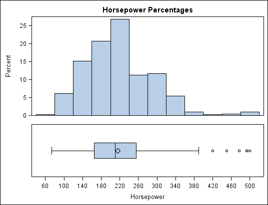
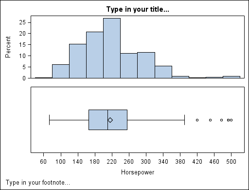
The graph
that you create in this topic contains two cells: one with a histogram
and another with a box plot.
There
is more than one way to create this graph in the designer. The following
procedure describes one method:
-
If the
Graph Gallery is not displayed, select
View Graph Gallery
 to display it.
-
In the
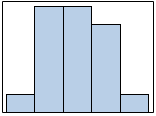
Basic tab of the Graph Gallery, click the Histogram
icon, and then click
OK. The Histogram icon
looks like this:
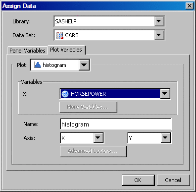
The Assign
Data dialog box opens.
-
In the
Assign Data dialog box, select the following:
Select SASHELP from the list box.
Select CARS from the list box.
Select HORSEPOWER from the list box.
-
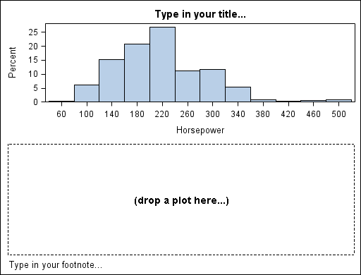
Right-click
the graph and select
Add a Row. A new row
is added beneath the histogram. The new row contains the text "drop
a plot here."
-
From the
Plot Layers panel of the
Elements pane, click and drag the Box(H) icon to the blank row
in your graph. (If the
Elements pane is not
visible, select
ViewElements to display it.) The Box(H) icon
looks like this:
The Assign
Data dialog box opens.
-
In the
Assign Data dialog box, select
HORSEPOWER from the
Y variable list box. Then click
OK.
Note: You do not
need to select anything for the X variable.
-
Right-click
the X axis label (Horsepower) and select
Common Column
Axis. Both plots now share the same axis, as seen in
the following display.
-
Double-click
the title text box (where it says "Type in your title") and type
Horsepower Percentages.
-
Right-click
the footnote text box and select
Remove Footnote. The footnote text box disappears.
-
Reduce
the size of the box plot.
-
Click
the box plot. A dashed line appears around the perimeter of the plot.
-
Position
the cursor over the upper edge of the dashed line. The cursor changes
to a two-headed arrow

.
-
Click
and drag the dashed line downward. The box plot becomes shorter, and
the histogram becomes taller.
-
(Optional)
Save the graph.
For instructions, see Save a Graph.
Tip
You can create
a similar graph by selecting the Data Profile 2 graph icon from the
Analytical tab of the Graph Gallery.