Example 3: Rotating Plot Symbols through the Color List
| Features: |
SYMBOL statement options: VALUE=
|
| Sample library member: | GSYRPSC1 |
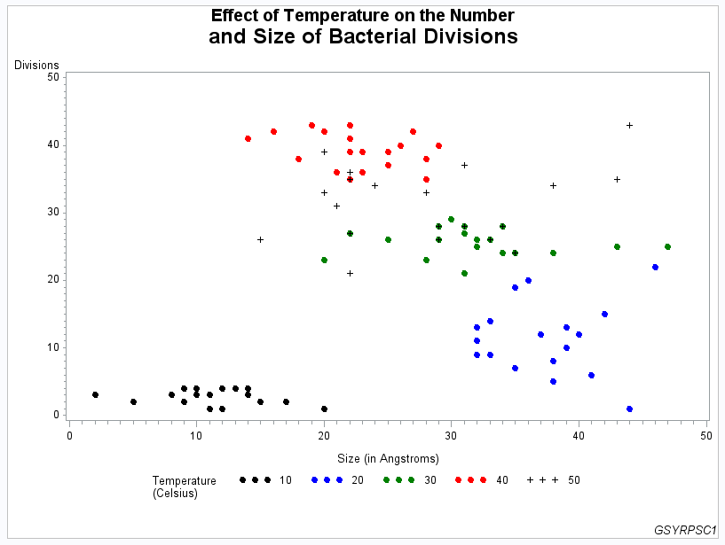
This example specifies
a plot symbol on a SYMBOL statement and rotates the symbol through
the specified color list. Temperature values in the data are represented
by the same plot symbol in a different color. The example also shows
how default symbol sequencing provides a default plot symbol if a
plot needs more plot symbols than are defined. It also uses a LEGEND
statement to specify a two-line legend label and to align the label
with the legend values.
Program
goptions reset=all  border
         colors=(black blue green red)
          ;
data bacteria;
   input temp div mass life @@;
   datalines;
10 3 10 1  20 22 46 0  30 23 20 9   40 42 16 16  50 33 20 6
10 1 11 2  20 01 44 2  30 21 31 10  40 41 14 12  50 31 21 7
10 4 14 3  20 13 32 4  30 24 34 9   40 43 22 14  50 34 24 2
10 2 09 2  20 12 40 6  30 26 29 8   40 42 20 16  50 26 29 4
10 3 08 3  20 09 33 8  30 24 38 11  40 39 23 18  50 34 38 2
10 2 09 1  20 08 38 1  30 25 47 14  40 38 18 12  50 43 44 1
10 4 10 3  20 15 42 3  30 29 30 14  40 35 22 14  50 39 20 8
10 3 11 2  20 20 36 5  30 28 31 9   40 40 26 15  50 28 31 0
10 2 15 3  20 19 35 7  30 26 25 11  40 39 25 17  50 26 15 4
10 4 12 3  20 14 33 2  30 27 22 8   40 36 23 12  50 27 22 3
10 4 13 3  20 12 37 4  30 26 33 9   40 42 27 14  50 26 33 5
10 2 17 1  20 10 39 6  30 25 43 13  40 40 29 16  50 35 43 7
10 3 14 1  20 08 38 4  30 28 34 8   40 38 28 14  50 28 34 4
10 1 12 1  20 06 41 2  30 26 32 14  40 36 21 12  50 21 22 2
10 1 11 4  20 09 32 2  30 27 31 8   40 39 22 12  50 37 31 2
10 1 20 2  20 11 32 5  30 25 32 16  40 41 22 15  50 35 22 5
10 4 09 2  20 13 39 1  30 28 29 12  40 43 19 15  50 28 29 1
10 3 02 2  20 09 32 5  30 26 32 9   40 39 22 15  50 36 22 5
10 2 05 3  20 07 35 4  30 24 35 15  40 37 25 14  50 24 35 4
10 3 08 1  20 05 38 6  30 23 28 9   40 35 28 16  50 33 28 6
;
proc sort data=bacteria;
   by temp;
run;
title1 "Effect of Temperature on the Number"
       j=c  h=2 "and Size of Bacterial Divisions";
footnote1  j=r "GSYRPSC1";
symbol1 value=dot;
axis1 label=("Size (in Angstroms)") ;
axis2 label=("Divisions");
legend1 label=(position=(top left)
               "Temperature" j=l "(Celsius)")
        ;
proc gplot data= bacteria;
     plot div*mass=temp / haxis=axis1
                          vaxis=axis2
                          legend=legend1;
run;
quit;
Program Description
Set the graphics environment. The
COLORS= option specifies the color list. This list is used by the
SYMBOL statement.
Create the data set. BACTERIA
contains information about the number and size of bacterial divisions
at various temperatures.
data bacteria;
   input temp div mass life @@;
   datalines;
10 3 10 1  20 22 46 0  30 23 20 9   40 42 16 16  50 33 20 6
10 1 11 2  20 01 44 2  30 21 31 10  40 41 14 12  50 31 21 7
10 4 14 3  20 13 32 4  30 24 34 9   40 43 22 14  50 34 24 2
10 2 09 2  20 12 40 6  30 26 29 8   40 42 20 16  50 26 29 4
10 3 08 3  20 09 33 8  30 24 38 11  40 39 23 18  50 34 38 2
10 2 09 1  20 08 38 1  30 25 47 14  40 38 18 12  50 43 44 1
10 4 10 3  20 15 42 3  30 29 30 14  40 35 22 14  50 39 20 8
10 3 11 2  20 20 36 5  30 28 31 9   40 40 26 15  50 28 31 0
10 2 15 3  20 19 35 7  30 26 25 11  40 39 25 17  50 26 15 4
10 4 12 3  20 14 33 2  30 27 22 8   40 36 23 12  50 27 22 3
10 4 13 3  20 12 37 4  30 26 33 9   40 42 27 14  50 26 33 5
10 2 17 1  20 10 39 6  30 25 43 13  40 40 29 16  50 35 43 7
10 3 14 1  20 08 38 4  30 28 34 8   40 38 28 14  50 28 34 4
10 1 12 1  20 06 41 2  30 26 32 14  40 36 21 12  50 21 22 2
10 1 11 4  20 09 32 2  30 27 31 8   40 39 22 12  50 37 31 2
10 1 20 2  20 11 32 5  30 25 32 16  40 41 22 15  50 35 22 5
10 4 09 2  20 13 39 1  30 28 29 12  40 43 19 15  50 28 29 1
10 3 02 2  20 09 32 5  30 26 32 9   40 39 22 15  50 36 22 5
10 2 05 3  20 07 35 4  30 24 35 15  40 37 25 14  50 24 35 4
10 3 08 1  20 05 38 6  30 23 28 9   40 35 28 16  50 33 28 6
;
proc sort data=bacteria;
   by temp;
run;
title1 "Effect of Temperature on the Number"
       j=c  h=2 "and Size of Bacterial Divisions";
footnote1  j=r "GSYRPSC1";
Define symbol shape. The
VALUE= option specifies a dot for the plot symbol. Because no color
is specified, the symbol is rotated through the color list. Because
the plot needs a fifth symbol, the default plus sign is rotated into
the color list to provide that symbol.