The UCM Procedure
- Overview
-
Getting Started

-
SyntaxFunctional SummaryPROC UCM StatementAUTOREG StatementBLOCKSEASON StatementBY StatementCYCLE StatementDEPLAG StatementESTIMATE StatementFORECAST StatementID StatementIRREGULAR StatementLEVEL StatementMODEL StatementNLOPTIONS StatementOUTLIER StatementRANDOMREG StatementSEASON StatementSLOPE StatementSPLINEREG StatementSPLINESEASON Statement
-
Details
-
Examples
- References
Statistical Graphics
Statistical procedures use ODS Graphics to create graphs as part of their output. ODS Graphics is described in detail in Chapter 21: Statistical Graphics Using ODS in SAS/STAT 12.1 User's Guide.
Before you create graphs, ODS Graphics must be enabled (for example, with the ODS GRAPHICS ON statement). For more information about enabling and disabling ODS Graphics, see the section “Enabling and Disabling ODS Graphics” in that chapter.
The overall appearance of graphs is controlled by ODS styles. Styles and other aspects of using ODS Graphics are discussed in the section “A Primer on ODS Statistical Graphics” in that chapter.
This section provides information about the basic ODS statistical graphics produced by the UCM procedure.
You can obtain most plots relevant to the specified model by using the global PLOTS= option in the PROC UCM statement. The plot of series forecasts in the forecast horizon is produced by default. You can further control the production of individual plots by using the PLOT= options in the different statements.
The main types of plots available are as follows:
-
Time series plots of the component estimates, either filtered or smoothed, can be requested by using the PLOT= option in the respective component statements. For example, the use of PLOT=SMOOTH option in a CYCLE statement produces a plot of smoothed estimate of that cycle.
-
Residual plots for model diagnostics can be obtained by using the PLOT= option in the ESTIMATE statement.
-
Plots of series forecasts and model decompositions can be obtained by using the PLOT= option in the FORECAST statement.
The following example is a simple illustration of the available plot options.
Analysis of Sunspot Data: Illustration of ODS Graphics
In this example a well-known series, Wolfer’s sunspot data (Anderson 1971), is considered. The data consist of yearly sunspot numbers recorded from 1749 to 1924. These sunspot numbers are known to have a cyclical pattern with a period of about eleven years. The following DATA step creates the input data set:
data sunspot;
   input year wolfer @@;
   year = mdy(1,1, year);
   format year year4.;
datalines;
1749  809 1750  834 1751  477 1752  478 1753  307 1754  122 1755   96
1756  102 1757  324 1758  476 1759  540 1760  629 1761  859 1762  612
1763  451 1764  364 1765  209 1766  114 1767  378 1768  698 1769 1061

   ... more lines ...
The following statements specify a UCM that includes a cycle component and a random walk trend component:
proc ucm data=sunspot;
   id year interval=year;
   model wolfer;
   irregular;
         level ;
   cycle plot=(filter smooth);
   estimate back=24 plot=(loess panel cusum wn);
   forecast back=24 lead=24 plot=(forecasts decomp);
run;
The following subsections explain the graphics produced by the above statements.
Component Plots
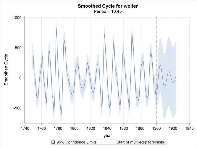
The plots in Figure 35.8 and Figure 35.9, produced by specifying PLOT=(FILTER SMOOTH) in the CYCLE statement, show the filtered and smoothed estimates, respectively,
of the cycle component in the model. Note that the smoothed estimate appears smoother than the filtered estimate. This is
always true because the filtered estimate of a component at time ![]() is based on the observations prior to time
is based on the observations prior to time ![]() —that is, it uses measurements from the first observation up to the
—that is, it uses measurements from the first observation up to the ![]() th observation. On the other hand, the corresponding smoothed estimate uses all the available observations—that is, all the
measurements from the first observation to the last. This makes the smoothed estimate of the component more precise than the
filtered estimate for the time points within historical period. In the forecast horizon, both filtered and smoothed estimates
are identical, being based on the same set of observations.
th observation. On the other hand, the corresponding smoothed estimate uses all the available observations—that is, all the
measurements from the first observation to the last. This makes the smoothed estimate of the component more precise than the
filtered estimate for the time points within historical period. In the forecast horizon, both filtered and smoothed estimates
are identical, being based on the same set of observations.
Figure 35.8: Sunspots Series: Filtered Cycle
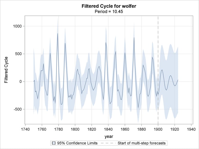
Figure 35.9: Sunspots Series: Smoothed Cycle
Residual Diagnostics
If the fitted model is appropriate for the given data, then the corresponding one-step-ahead residuals should be approximately white—that is, uncorrelated—and approximately normal. Moreover, the residuals should not display any discernible pattern. You can detect departures from these conditions graphically. Different residual diagnostic plots can be requested by using the PLOT= option in the ESTIMATE statement.
The normality can be checked by examining the histogram and the normal quantile plot of residuals. The whiteness can be checked by examining the ACF and PACF plots that show the sample autocorrelation and sample partial-autocorrelation at different lags. The diagnostic panel shown in Figure 35.10, produced by specifying PLOT=PANEL, contains these four plots.
Figure 35.10: Sunspots Series: Residual Diagnostics
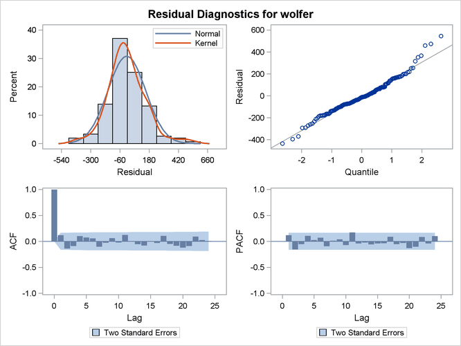
The residual histogram and Q-Q plot show no serious violation of normality. The histogram appears reasonably symmetric and
follows the overlaid normal density curve reasonably closely. Similarly in the Q-Q plot the residuals follow the reference
line fairly closely. The ACF and PACF plots also do not exhibit any violation of the whiteness assumption; the correlations
at all nonzero lags seem to be insignificant.
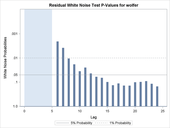
The residual whiteness can also be formally tested by using the Ljung-Box portmanteau test. The plot in Figure 35.11, produced by specifying PLOT=WN, shows the p-values of the Ljung-Box test statistics at different lags. In these plots the p-values for the first few lags, equal to the number of estimated parameters in the model, are not shown because they are always
missing. This portion of the plot is shaded blue to indicate this fact. In the case of this model, five parameters are estimated
so the p-values for the first five lags are not shown. The p-values are displayed on a log scale in such a way that higher bars imply more extreme test statistics. In this plot some
early p-values appear extreme. However, these p-values are based on large sample theory, which suggests that these statistics should be examined for lags larger than the
square root of sample size. In this example it means that the p-values for the first ![]() lags can be ignored. With this consideration, the plot shows no violation of whiteness since the p-values after the
lags can be ignored. With this consideration, the plot shows no violation of whiteness since the p-values after the ![]() th lag do not appear extreme.
th lag do not appear extreme.
Figure 35.11: Sunspots Series: Ljung-Box Portmanteau Test
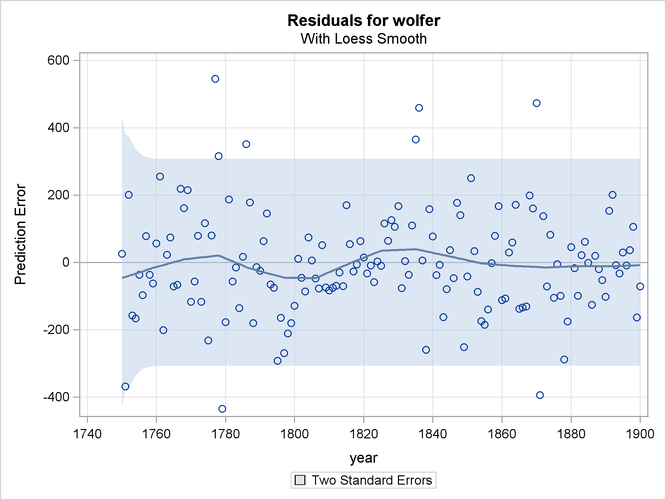
The plot in Figure 35.12, produced by specifying PLOT=LOESS, shows the residuals plotted against time with an overlaid LOESS curve. This plot is useful for checking whether any discernible pattern remains in the residuals. Here again, no significant pattern appears to be present.
Figure 35.12: Sunspots Series: Residual Loess Plot
The plot in Figure 35.13, produced by specifying PLOT=CUSUM, shows the cumulative residuals plotted against time. This plot is useful for checking structural breaks. Here, there appears to be no evidence of structural break since the cumulative residuals remain within the confidence band throughout the sample period. Similarly you can request a plot of the squared cumulative residuals by specifying PLOT=CUSUMSQ.
Figure 35.13: Sunspots Series: CUSUM Plot
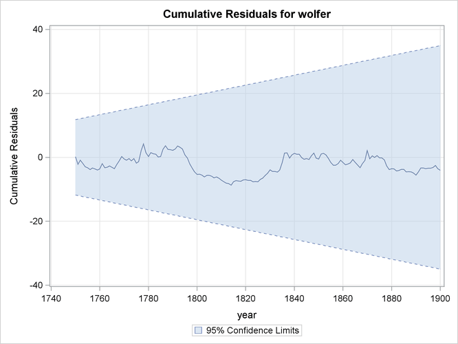
Brockwell and Davis (1991) can be consulted for additional information on diagnosing residuals. For more information on CUSUM and CUSUMSQ plots, you can consult Harvey (1989).
Forecast and Series Decomposition Plots
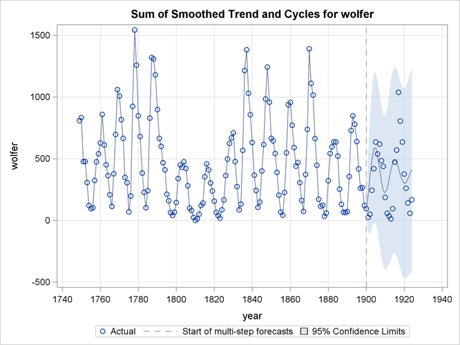
You can use the PLOT= option in the FORECAST statement to obtain the series forecast plot and the series decomposition plots. The series decomposition plots show the result of successively adding different components in the model starting with the trend component. The IRREGULAR component is left out of this process. The following two plots, produced by specifying PLOT=DECOMP, show the results of successive component addition for this example. The first plot, shown in Figure 35.14, shows the smoothed trend component and the second plot, shown in Figure 35.15, shows the sum of smoothed trend and cycle.
Figure 35.14: Sunspots Series: Smoothed Trend
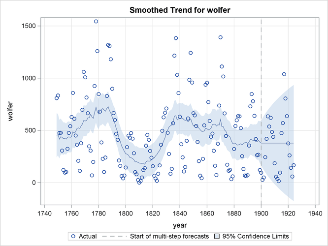
Figure 35.15: Sunspots Series: Smoothed Trend plus Cycle
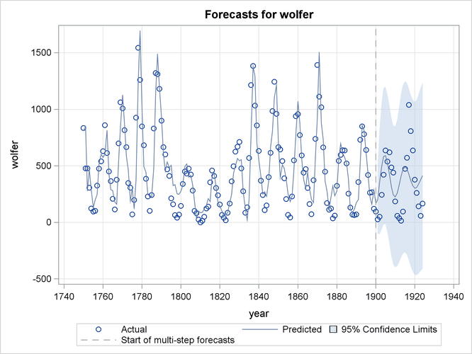
Finally, Figure 35.16 shows the forecast plot.
Figure 35.16: Sunspots Series: Series Forecasts