Using Graphs to Display Query Results

Overview of the Graph Types

About Bar Charts

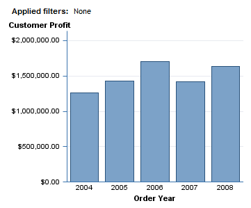
A bar chart consists of a grid and some vertical or horizontal bars. Each bar represents quantitative data.
A Bar Chart That Is Based on Data Items From a Relational Data Source

About Bar-Line Charts

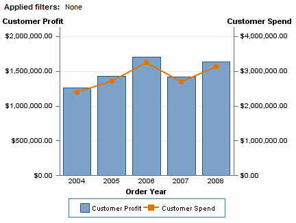
A bar-line chart is a bar chart with an overlaid line graph.
A Bar-Line Chart That Is Based on Data Items From a Relational Data Source

About Line Graphs

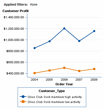
A line graph shows the relationship of one variable to another, often as movements or trends in the data over a period of time. Line graphs summarize source data and typically are used to chart response values against discrete categorical values.
A Line Graph That Is Based on Data Items From a Multidimensional Data Source

About Pie Charts

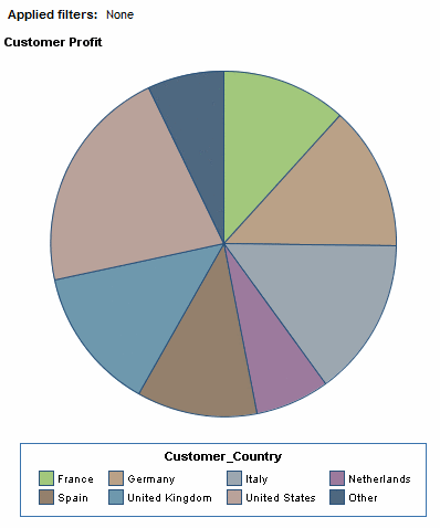
A pie chart is a circular chart that is divided into slices by radial lines. Each slice represents the relative contribution of each part to the whole.
A Pie Chart That Is Based on Data Items From a Multidimensional Data Source

About Progressive Bar Charts

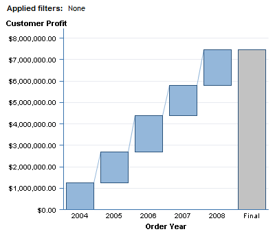
A progressive bar chart shows how the initial value of a measure increases or decreases during a series of operations or transactions. The first bar begins at the initial value, and each subsequent bar begins where the previous bar ends. The length and direction of a bar indicates the magnitude and type (positive or negative, for example) of the operation or transaction. The resulting chart is a stepped cascade that shows how the transactions or operations lead to the final value of the measure.
A Progressive Bar Chart That Is Based on Data Items From a Relational Data Source

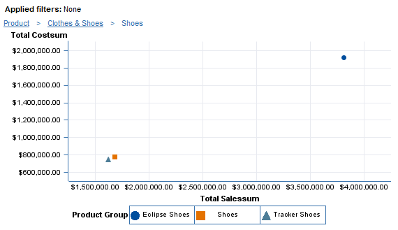
About Scatter Plots

A scatter plot is a two-dimensional plot that shows the joint variation of two data items. In a scatter plot, each marker (represented by symbols such as dots, squares, and plus signs) represents an observation. The marker position indicates the value for each observation.
A Scatter Plot That Is Based on Data Items From a Multidimensional Data Source

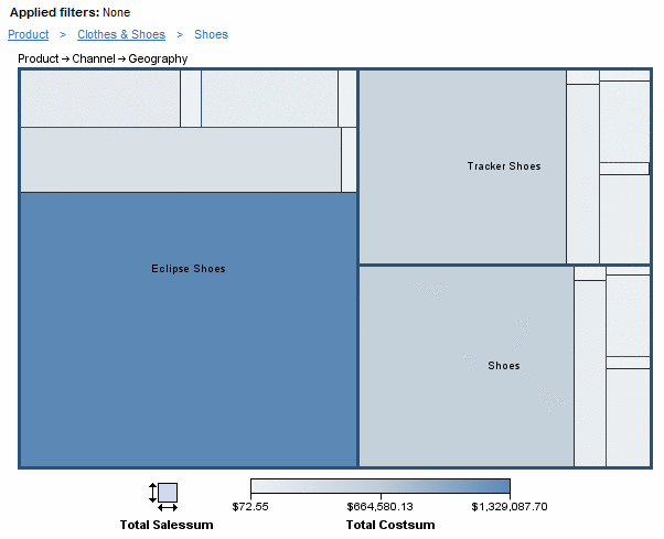
About Tile Charts

A tile chart is divided into rectangular areas. The color of each area represents the value of the first measure in the query. The size of each area represents the value of the second measure in the query. For example, a tile chart might be used to represent sales data where the tile sizes vary according to the size of product inventories and the tile colors are derived from a color gradient that represents low to high sales figures.
A Tile Chart That Is Based on Data Items From a Multidimensional Data Source

Insert a Graph into a Report Layout

To insert a graph into a report layout, perform one of these tasks:
  • Click the graph tool on the layout grid toolbar to insert the graph in the next available cell.
  • Drag the graph tool from the toolbar into a specific cell.
The following table lists the available graph tools.
Note: If you selected either of the detail data options in the Summarization Options dialog box, then the only graph type available to insert is a scatter plot. For more information, see Use Detail Data Instead of Grouped and Aggregated Data.
Tool
Graph Type
bar chart icon
bar chart
line graph icon
line graph
bar-line chart icon
bar-line chart
progressive bar chart icon
progressive bar chart
scatter plot icon
scatter plot
pie chart icon
pie chart
tile chart icon
tile chart
Data items in the section query are given the default assignments (see Default Data Assignments in New Graphs) in a new graph.
Default Data Assignments in New Graphs
Graph Type
Measures
Categories/Hierarchies
First Measure
Second Measure
All Other Measures
First Category/Hierarchy
Second Category/Hierarchy
Third Category/Hierarchy
All Other Categories/Hierarchies
bar charts and progressive bar charts
bar height
hidden
hidden
bars
hidden
hidden
hidden
bar-line charts
bar height
line height
hidden
bars
hidden
hidden
hidden
line graphs
line height
hidden
hidden
line
hidden
hidden
hidden
pie charts
segment size
hidden
hidden
segments
hidden
hidden
hidden
scatter plots
horizontal axis
vertical axis
hidden
marker groups
hidden
hidden
hidden
tile charts
size
color
auxiliary data tips
categories
categories
categories
hidden
You can change the default data assignments. For example, a bar chart uses a Sales measure to determine the bar height. You want to also assign Unit Cost, which has been hidden by default, to bar height. For more information, see Specifying How Data Items Are Used in Graphs.
Graphs also have default properties that you can change. For example, by default, graphs do not have titles. To create a title, open the Properties dialog box and enter text in the Title field on the General tab. For more information, see Create or Modify a Graph Title.
Tip
In general, the defaults for properties that are related to style (for example, font and color) depend on the currently applied report style. For more information, see Specifying Your Preferences.

Specifying How Data Items Are Used in Graphs

Assign Data Items to Functions in Bar Charts

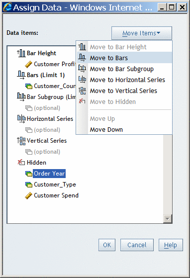
To assign data items to functions in a bar chart, complete these steps:
  1. Select Datathen selectAssign Data or right-click in the bar chart, and then select Assign Data to open the Assign Data dialog box.
  2. Perform one of these tasks to assign data items:
    • Use drag and drop features to assign data items.
    • Use the Move Items drop-down list to assign data items.
    You can assign each data item to one of these functions:
    Bar Height
    Specify at least one measure that will be used to determine the height of each bar. You can add additional measures to Bar Height; however, if you assign more than one measure to Bar Height, then you cannot add a category or hierarchy to Bar Subgroup. Bar Height is required.
    Bars (Limit 1)
    Select a category or hierarchy, each value of which will be represented by one or more bars. Bars is required.
    Bar Subgroup (Limit 1)
    You can subdivide each bar across the values of the category or hierarchy that you assign to this function. However, you cannot use this function if you have assigned more than one measure to Bar Height.
    Horizontal Series
    You can create separate bar charts for each value of a selected category or hierarchy. The charts appear side by side. For example, if you select a Gender category for the horizontal series, a chart for each value of Gender is displayed side by side.
    Vertical Series
    You can create separate bar charts for each value of a selected category or hierarchy. The charts appear stacked one on top of the other. For example, if you select a Gender category for the vertical series, a chart for each value of Gender is stacked vertically.
    Hidden
    Data items that are assigned to Hidden do not appear in the bar chart but can be used in filtering.
    For more information, see Hiding Data Items.
    Assign Data Dialog Box for Bar Charts
    Assign Data Dialog Box for Bar Charts
  3. Click OK.

Assign Data Items to Functions in Bar-Line Charts

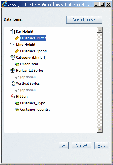
To assign data items to functions in a bar-line chart, complete these steps:
  1. Select Datathen selectAssign Data or right-click in the bar-line chart, and then select Assign Data to open the Assign Data dialog box.
  2. Perform one of these tasks to assign data items:
    • Use drag and drop features to assign data items.
    • Use the Move Items drop-down list to assign data items.
    You can assign each data item to one of these functions:
    Bar Height
    Specify one or more measures that will be used to determine the height of each bar. Bar Height is required.
    Line Height
    Select one or more measures that will be used to determine the height of the line at each bar. Line Height is required.
    Category (Limit 1)
    Select a category or hierarchy, each value of which will be represented by one or more bars and one or more lines. Category is required.
    Horizontal Series
    You can create separate bar-line charts for each value of a selected category or hierarchy. The charts appear side by side. For example, if you select a Gender category for the horizontal series, a chart for each value of Gender is displayed side by side.
    Vertical Series
    You can create separate bar-line charts for each value of a selected category or hierarchy. The charts appear stacked one on top of the other. For example, if you select a Gender category for the vertical series, a chart for each value of Gender is stacked vertically.
    Hidden
    Data items that are assigned to Hidden do not appear in the bar-line chart but can be used in filtering.
    For more information, see Hiding Data Items.
    Assign Data Dialog Box for Bar-Line Charts
    Assign Data Dialog Box for Bar-Line Charts
  3. Click OK.

Assign Data Items to Functions in Line Graphs

To assign data items to functions in a line graph, complete these steps:
  1. Select Datathen selectAssign Data or right-click in the line graph, and then select Assign Data to open the Assign Data dialog box.
  2. Use the Move Items drop-down list to assign each data item to one of these functions.
    Perform one of these tasks to assign data items:
    • Use drag and drop features to assign data items.
    • Use the Move Items drop-down list to assign data items.
    You can assign each data item to one of these functions:
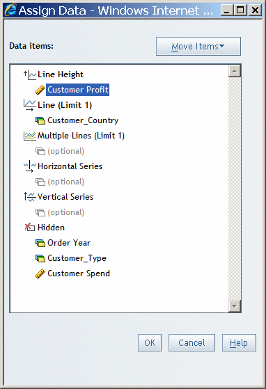
    Line Height
    Select at least one measure that will determine the height of each plot point along the line. Although there is no limit to the number of measures that you can assign to Line Height, consider graph appearance and report performance when assigning multiple measures to this function. In addition, if you assign more than one measure to Line Height, then you cannot assign a category or hierarchy to Multiple Lines. Line Height is required.
    Line (Limit 1)
    Select a category or hierarchy, each value of which will be represented by a plot point on the lines shown in this graph. Line is required.
    Multiple Lines (Limit 1)
    You can subdivide the line into several lines, one for each value of the category or hierarchy that you assign to this function. However, you cannot use this function if you have assigned more than one measure to Line Height.
    Horizontal Series
    You can create separate line graphs for each value of a selected category or hierarchy. The charts appear side by side. For example, if you select a Gender category for the horizontal series, a chart for each value of Gender is displayed side by side.
    Vertical Series
    You can create separate line graphs for each value of a selected category or hierarchy. The charts appear stacked one on top of the other. For example, if you select a Gender category for the vertical series, a chart for each value of Gender is stacked vertically.
    Hidden
    Data items that are assigned to Hidden do not appear in the line graph but can be used in filtering.
    For more information, see Hiding Data Items.
    Assign Data Dialog Box for Line Graphs
    Assign Data Dialog Box for Line Graphs
  3. Click OK.

Assign Data Items to Functions in Pie Charts

To assign data items to functions in a pie chart, complete these steps:
  1. Select Datathen selectAssign Data or right-click in the pie chart, and then select Assign Data to open the Assign Data dialog box.
  2. Use the Move Items drop-down list to assign each data item to one of these functions.
    Perform one of these tasks to assign data items:
    • Use drag and drop features to assign data items.
    • Use the Move Items drop-down list to assign data items.
    You can assign each data item to one of these functions:
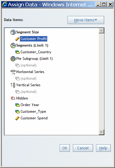
    Segment Size
    Select at least one measure that will determine the size of each segment. Although there is no limit to the number of measures that you can assign to Segment Size, consider graph appearance and report performance when assigning multiple measures to this function. In addition, if you assign more than one measure to Segment Size, then you cannot add a category or hierarchy to Pie Stacks. Segment Size is required.
    Segments (Limit 1)
    Select a category or hierarchy, each value of which will be represented by a segment. Segments is required.
    Pie Stacks (Limit 1)
    You can subdivide the pie chart into a stack of pie charts, one for each value of the category or hierarchy that you assign to this function. However, you cannot use this function if you have assigned more than one measure to Segment Size.
    Horizontal Series
    You can create separate pie charts for each value of a selected category or hierarchy. The charts appear side by side. For example, if you select a Gender category for the horizontal series, a chart for each value of Gender is displayed side by side.
    Vertical Series
    You can create separate pie charts for each value of a selected category or hierarchy. The charts appear stacked one on top of the other. For example, if you select a Gender category for the vertical series, a chart for each value of Gender is stacked vertically.
    Hidden
    Data items that are assigned to Hidden do not appear in the pie chart but can be used in filtering.
    For more information, see Hiding Data Items.
    Assign Data Dialog Box for Pie Charts
    Assign Data Dialog Box for Pie Charts
  3. Click OK.

Assign Data Items to Functions in Progressive Bar Charts

To assign data items to functions in a progressive bar chart, complete these steps:
  1. Select Datathen selectAssign Data or right-click in the progressive bar chart, and then select Assign Data to open the Assign Data dialog box.
  2. Perform one of these tasks to assign data items:
    • Use drag and drop features to assign data items.
    • Use the Move Items drop-down list to assign data items.
    You can assign each data item to one of these functions:
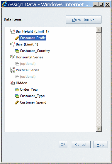
    Bar Height (Limit 1)
    Specify the measure that will be used to determine the height of each bar. Bar Height is required.
    Bars (Limit 1)
    Select a category or hierarchy, each value of which will be represented by a bar. Bars is required.
    Horizontal Series
    You can create separate progressive bar charts for each value of a selected category or hierarchy. The charts appear side by side. For example, if you select a Gender category for the horizontal series, a chart for each value of Gender is displayed side by side.
    Vertical Series
    You can create separate progressive bar charts for each value of a selected category or hierarchy. The charts appear stacked one on top of the other. For example, if you select a Gender category for the vertical series, a chart for each value of Gender is stacked vertically.
    Hidden
    Data items that are assigned to Hidden do not appear in the progressive bar chart but can be used in filtering.
    For more information, see Hiding Data Items.
    Assign Data Dialog Box for Progressive Bar Charts
    Assign Data Dialog Box for Progressive Bar Charts
  3. Click OK.

Assign Data Items to Functions in Scatter Plots

To assign data items to functions in a scatter plot, complete these steps:
  1. Select Datathen selectAssign Data or right-click in the scatter plot, and then select Assign Data to open the Assign Data dialog box.
  2. Perform one of these tasks to assign data items:
    • Use drag and drop features to assign data items.
    • Use the Move Items drop-down list to assign data items.
    You can assign each data item to one of these functions:
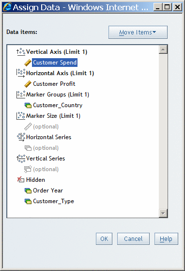
    Vertical Axis (Limit 1)
    Specify the measure that will be used to determine the vertical position of each marker. Vertical Axis is required.
    Horizontal Axis (Limit 1)
    Select the measure that will be used to determine the horizontal position of each marker. Horizontal Axis is required.
    Marker Groups (Limit 1)
    Select a category or hierarchy, each value of which will be a set of markers. Marker Groups is required for multidimensional data sources. If detail data is used, then this function groups and colors the data points. If aggregated data is used, there is one point for each data value in the category or hierarchy.
    Marker Size (Limit 1)
    Select the measure that will be used to determine the size of each marker.
    Note: You can also use the Markers tab in the Properties dialog box to specify a marker size that will be constant for all markers in the graph.
    Horizontal Series
    You can create separate scatter plots for each value of a selected category or hierarchy. The charts appear side by side. For example, if you select a Gender category for the horizontal series, a chart for each value of gender is displayed side by side.
    Vertical Series
    You can create separate scatter plots for each value of a selected category or hierarchy. The charts appear stacked one on top of the other. For example, if you select a Gender category for the vertical series, a chart for each value of gender is stacked vertically.
    Hidden
    Data items that are assigned to Hidden do not appear in the scatter plot but can be used in filtering.
    For more information, see Hiding Data Items.
    Assign Data Dialog Box for Scatter Plots
    Assign Data Dialog Box for Scatter Plots
  3. Click OK.

Assign Data Items to Functions in Tile Charts

To assign data items to functions in a tile chart, complete these steps:
  1. Select Datathen selectAssign Data or right-click in the tile chart, and then select Assign Data to open the Assign Data dialog box.
  2. Use the Move Items drop-down list to assign each data item to one of these functions.
    Perform one of these tasks to assign data items:
    • Use drag and drop features to assign data items.
    • Use the Move Items drop-down list to assign data items.
    You can assign each data item to one of these functions:
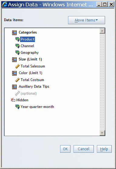
    Categories
    Select one or more categories or hierarchies whose values determine the number of tiles and the arrangement of the tiles. Each tile is associated with a value for each of the categories that it represents. For example, you might have a widget for a country with three categories that it is associated with. Although there is no limit to the number of categories or hierarchies that you can assign to Categories, consider graph appearance and report performance when assigning multiple categories or hierarchies to this function. Categories is required.
    Size (Limit 1)
    Select the measure whose values are used to determine the size of each tile. Size is required.
    Color (Limit 1)
    Select the measure whose values are used to create the gradient colors in the chart. To specify colors for low, medium, and high values, use the Properties dialog box. The default colors are based on the report's currently applied style. If you do not assign a measure to this function, the measure that is assigned to Size is also used to determine the colors.
    Auxiliary Data Tips
    Select one or more measures whose values you want to display as data tips. Although there is no limit to the number of measures that you can assign to Auxiliary Data Tips, consider report performance when assigning many measures to this function. Data tip values for the categories, color and size measures, and auxiliary data tip measures appear when you move the mouse over a tile.
    Hidden
    Data items that are assigned to Hidden do not appear in the tile chart but can be used in filtering.
    For more information, see Hiding Data Items.
    Assign Data Dialog Box for Tile Charts
    Assign Data Dialog Box for Tile Charts
  3. Click OK.

Create or Modify a Graph Title

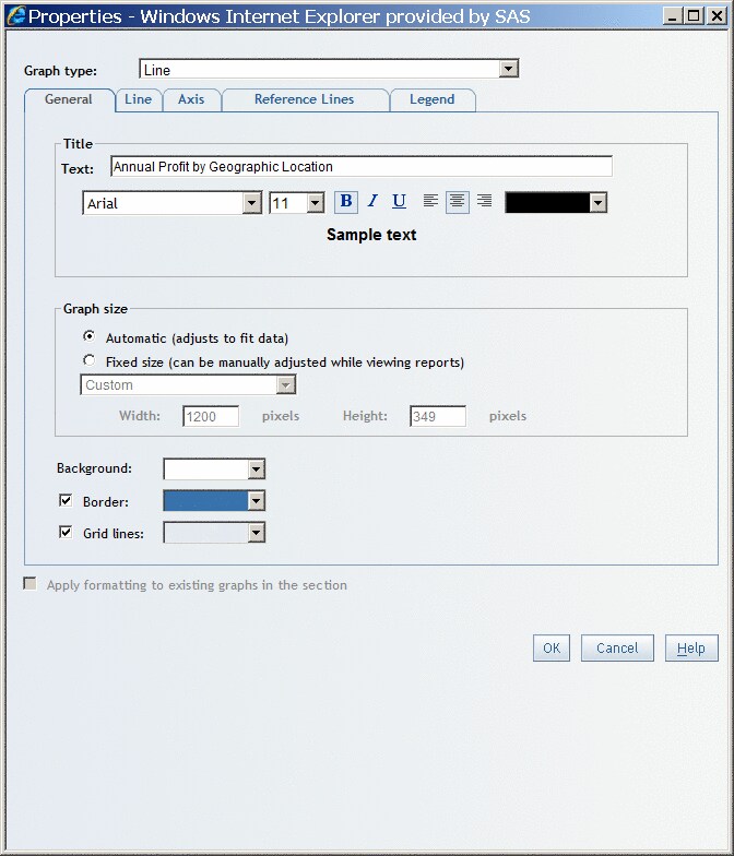
By default, new graphs do not have titles. To create a new title or to modify an existing title, complete these steps:
  1. Right-click in the chart, and then select Properties to open the Properties dialog box.
    The General tab is displayed by default.
  2. Under Title, complete these steps:
    1. Type or modify the content in the Text field.
      You cannot use these characters: < > & #
    2. Specify the font, font size, font style, font color, and alignment.
    Properties Dialog Box for Graphs
    Properties Dialog Box for Graphs
  3. Click OK.
    In View mode, the formatted title appears above the graph. In Edit mode, the title appears in the graph object.

Specify the Size of a Graph

To change the size of a graph, complete these steps:
  1. Right-click in the graph, and then select Properties to open the Properties dialog box.
    The General tab is displayed by default.
  2. Under Graph size, select one of these options (depending on the graph type):
    Automatic (adjust to fit data) (all graph types except tile charts)
    Select this option to produce a graph that best fits the size of the current window. This option is the default.
    Fixed size (can be manually adjusted while viewing reports) (for all graph types except tile charts)
    Select this option if you want to specify a fixed size for the graph. From the drop-down list, select Small, Medium, Large, or Custom. If you select Custom, type the width and height in pixels. The maximum width is 1200 pixels. The maximum height is 900 pixels.
    To specify a fixed graph size, from the Size drop-down list, select Small, Medium, Large, or Custom. If you select Custom, type the width and height in pixels. The maximum width is 1200 pixels. The maximum height is 900 pixels. The default is Medium.
  3. Click OK.
Tip
If you select the Fixed size option, you can use your mouse to resize the graph in View mode. Point to the bottom right corner or to the bottom or right border. When the pointer becomes a horizontal, vertical, or diagonal bar, you can drag the graph to the new size and then release the mouse button.

Specify the Border for a Graph

By default, graph borders are turned off. To specify that a graph has a border, complete these steps:
  1. Right-click in the graph, and then select Properties to open the Properties dialog box.
    The General tab is displayed by default.
  2. Select the Border check box. Clear the check box if you no longer want the graph to have a border.
  3. Click OK.

Specify the Border Color of a Graph

To specify the color that is used for the border of a graph, complete these steps:
  1. Right-click in the graph, and then select Properties to open the Properties dialog box.
    The General tab is displayed by default.
  2. From the Border drop-down list, select a border color for the graph.
  3. Click OK.

Specify the Background Color of a Graph

You can specify a background color for all graph types except tile charts. To specify a background color, complete these steps:
  1. Right-click in the graph, and then select Properties to open the Properties dialog box.
    The General tab is displayed by default.
  2. From the Background drop-down list, select a background color for the graph.
  3. Click OK.

Turn Grid Lines On or Off

Grid lines are available for all graph types except pie charts and tile charts. To turn grid lines on or off and to specify a color for the lines, complete these steps:
  1. Right-click in the graph, and then select Properties to open the Properties dialog box.
    The General tab is displayed by default.
  2. Select or clear the Grid lines check box, depending on whether you want to hide or show grid lines on the graph. Grid lines are turned on by default.
  3. If you are showing grid lines, then select a line color from the drop-down list.
  4. Click OK.

Specify the Scale Type and Style of the Axis

You can specify axis properties for all graph types except for pie charts and tile charts. To specify properties, complete these steps:
  1. Right-click in the graph, and then select Properties to open the Properties dialog box.
    The General tab is displayed by default.
  2. Select the Axis tab.
  3. (Optional) You can select Display an additional axis for the second measure if one of the following conditions is true for the currently selected graph:
    • It is a bar chart and exactly two measures are assigned to the bar height.
    • It is a line graph and exactly two measures are assigned to the measure axis.
    • It is a bar-line chart.
  4. Under Scale, select Automatic or Fixed. The default is Automatic.
  5. If you selected Fixed, then enter any combination of a minimum value, maximum value, baseline value, and tick mark increment for the indicated axis or axes.
    • For bar charts, line graphs, bar-line charts, and progressive bar charts, enter values for the first (or only) measure axis.
    • For bar charts and line graphs, if you selected Display an additional axis for the second measure, then you can also enter values for the second measure axis.
    • For scatter plots, enter values for the vertical axis, the horizontal axis, or both.
    Tip
    Before entering fixed values, find out what the default scale values are by displaying the graph in View mode.
  6. Under Labels, select a font, font size, font style, font color, and orientation for the axis labels. The default orientation is Horizontal.
    Note: The orientation option is not available for bar charts that use horizontal bars.
  7. Under Values, select a font, font size, font style, and font color for the axis values.
  8. Click OK.
Note: Tick marks are displayed next to each value of the data item.

Add, Modify, or Remove Reference Lines

You can add, modify, or remove reference lines for all graph types, except pie charts or tile charts.
To add reference lines, complete these steps:
  1. Right-click in the graph, and then select Properties to open the Properties dialog box.
    The General tab is displayed by default.
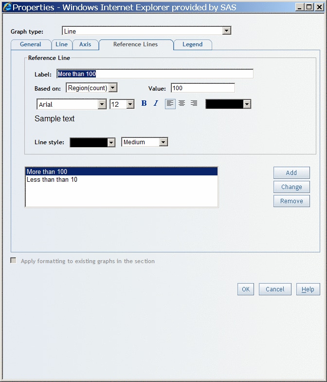
  2. Select the Reference Lines tab.
  3. Under Reference Lines, complete these steps:
    1. Type content in the Label field.
      You cannot use these characters: < > & #
    2. Select an item from the Based on drop-down list.
    3. Enter a Value.
    4. Specify the font, font size, font style, alignment, and color.
    5. Specify a color and width for Line style.
      Reference Lines Tab for a Graph in the Properties Dialog Box
      Reference Lines Tab for a Graph in the Properties Dialog Box
    6. Click Add.
  4. (Optional) Add another reference line or lines to the graph.
  5. (Optional) Modify the properties of a reference line. For example, you might change the Label. Click Change.
  6. (Optional) Remove a reference line by selecting it in the list of existing reference lines. Click Remove.
  7. Click OK.

Specify the Position, Label Style, and Background Color of the Legend

Legend properties are available for all graph types except progressive bar charts. However, bar charts, line graphs, and scatter plots must meet certain requirements for the legend properties to be available, as follows:
Graph Type
Requirement
Bar charts
A category must be assigned to the bar subgroup function or the bar chart must use more than one measure.
Line graphs
A category must be assigned to the multiple lines function or the line graph must use more than one measure.
Scatter plots
For scatter plots that use relational data, a category must be assigned to the marker groups function. (Legend properties are always available for scatter plots that use multidimensional data.)
To specify legend properties, complete these steps:
  1. Right-click in the graph, and then select Properties to open the Properties dialog box.
    The General tab is displayed by default.
  2. Select the Legend tab.
  3. Under Position, select Above, Below, Left, or Right. The default is Below.
    Tip
    To leave more horizontal room for the graph, position the legend above or below the graph.
  4. Under Labels, select a font, font size, font style, and font color for the labels in the legend.
    Note: You cannot format labels for bar-line charts that use multidimensional data.
  5. For bar charts, pie charts, bar-line charts, line graphs, and scatter plots, select a color from the Background drop-down list.
    Note: You cannot select a background color for tile charts or for bar charts, pie charts, and line graphs that use multidimensional data.
  6. (Optional) Select a color from the Border drop-down list.
  7. Click OK.

Copy the Formatting of a Selected Graph

To copy the formatting of a selected graph to other graphs in the report section, complete these steps:
  1. Right-click in the graph, and then select Properties to open the Properties dialog box.
    The General tab is displayed by default.
    The option to copy formatting appears on all of the tabs in the Properties dialog box.
  2. Select the check box to specify that you want the formatting applied to other graphs in the section. Depending on the graph type, one of these options will display:
    Apply formatting to existing graphs in the section (all graph types except tile charts)
    Formatting properties that are copied include title style, background color, border color, marker size, bar shape, the option to display a second measure axis, measure axis label orientation, the option to display data labels, and legend style.
    Only relevant properties are copied. For example, the bar shape property is not copied to pie charts, and legend style properties are not copied to progressive bar charts, which do not support legends.
    Apply formatting to existing tile charts in this section (tile charts only)
    Formatting properties are copied only to other tile charts in the section.
  3. Click OK.

Change the Currently Selected Graph Type

Except for tile charts, you can change a selected graph from one type to another. Complete these steps:
  1. Right-click in the graph, and then select Properties to open the Properties dialog box.
    The General tab is displayed by default.
    The Graph type drop-down list is available to use no matter which tab is displayed.
  2. From the Graph type drop-down list, select the new graph type.
  3. Click OK.
The data item assignments and properties are changed to match the new graph type.

Specifying Properties That Are Specific to a Graph Type

Specify Properties That Are Specific to a Bar Chart

To specify properties that are specific to a bar chart, complete these steps:
  1. Right-click in the bar chart, and then select Properties to open the Properties dialog box.
    The General tab is displayed by default.
  2. Select the Bar tab.
  3. Under Orientation, specify whether you want to use Vertical bars or Horizontal bars. The default is Vertical bars.
  4. Under Subgroup, specify whether you want to display Stacked bars or Clustered bars. Clustered bars, the default, are grouped next to each other along the horizontal axis.
    Note: This property is available only if a data item is assigned to the bar subgroup function in the Assign Data dialog box.
  5. From the Shape drop-down list, select Two-dimensional bar, Three-dimensional bar, or Three-dimensional cylinder. The default is Two-dimensional bar.
  6. (Optional) Select the Show data values option to display a value above each vertical bar or to the right of each horizontal bar.
  7. Click OK.

Specify Properties That Are Specific to a Bar-Line Chart

To specify properties that are specific to a bar-line chart, complete these steps:
  1. Right-click in the bar-line chart, and then select Properties to open the Properties dialog box.
    The General tab is displayed by default.
  2. Select the Bar-line tab.
  3. Under Shape and Size, specify these options:
    1. From the Bar shape drop-down list, select a shape for the bars. Your choices are Two-dimensional bar, Three-dimensional bar, or Three-dimensional cylinder. The default is Two-dimensional bar
    2. From the Line thickness drop-down list, select a point size. Sizes range from 1 to 5 points. The default is 2 pt.
    3. From the Marker size drop-down list, select a marker size. On each line in the graph, there is a marker for each tick mark on the horizontal axis. Your choices are No marker, Small, Medium, and Large. The default is Small.
  4. (Optional) Select the Show data values option to display a value above each marker.
  5. Click OK.

Specify Properties That Are Specific to a Line Graph

To specify properties that are specific to a line graph, complete these steps:
  1. Right-click in the line graph, and then select Properties to open the Properties dialog box.
    The General tab is displayed by default.
  2. Select the Line tab.
  3. Under Size, specify these options:
    1. From the Line thickness drop-down list, select a point size. Sizes range from 1 to 5 points. The default is 2 pt.
    2. From the Marker size drop-down list, select a marker size. On each line in the graph, there is a marker for each tick mark on the horizontal axis. Your choices are No marker, Small, Medium, and Large. The default is Small.
  4. (Optional) Select the Show data values option to display above each point of the line.
  5. Click OK.

Specify Properties That Are Specific to a Pie Chart

To specify properties that are specific to a pie chart, complete these steps:
  1. Right-click in the pie chart, and then select Properties to open the Properties dialog box.
    The General tab is displayed by default.
  2. Select the Pie tab.
  3. Under Shape, select a shape for the pie. Your choices are Two-dimensional or Three-dimensional. The default is Two-dimensional.
  4. Under Multiple measures, specify whether you want to display Stacked pies or Multiple pies.
    Note: This option is not available for pie charts that use only one measure or if a category or hierarchy is assigned to the pie stacks function in the Assign Data dialog box.
  5. Under Labels, specify a font, font size, font style, and font color.
  6. (Optional) Under Values, specify one or more of these options, and then specify the font, font size, font style, and font color:
    Combine minimal values into a slice labeled "Other"
    This option is selected by default.
    Show data values
    Select this option to display a value along with each segment.
    Show data values as a percent of the total
    Select this option to display a percentage value along with each segment.
  7. Click OK.

Specify Properties That Are Specific to a Progressive Bar Chart

To specify properties that are specific to a progressive bar chart, complete these steps:
  1. Right-click in the progressive bar chart, and then select Properties to open the Properties dialog box.
    The General tab is displayed by default.
  2. Select the Progressive Bar tab.
  3. (Optional) Under Initial Bar, select the Set an initial value option to specify an initial value for the first bar in the chart. If you use this option, then you can type an optional label in the Initial bar label field. By default, this option is not selected.
  4. (Optional) Under Final bar, select the Show the final (cumulative) value option to display the value for the final bar. This option is selected by default. If you use this option, then you can type an optional label in the Final bar label field. The default label is Final.
  5. Under Colors, select a color for each type of bar that appears in the chart. The Positive bars and Negative bars drop-down lists are always available. The Initial bar and Final bar drop-down lists are available only if you have selected the corresponding options.
    Note: For progressive bar charts, the Plateau report style uses the color green for positive values and the color blue for negative values. For the Seaside, Festival, and Meadow report styles, the positive values are green and the negative values are red.
  6. (Optional) Select the Show trend line option to overlay a trend line on the progressive bar chart.
  7. (Optional) Select the Show data values option to display a value above each bar.
  8. Click OK.

Specify Properties That Are Specific to a Scatter Plot

To specify properties that are specific to a scatter plot, complete these steps:
  1. Right-click in the scatter plot, and then select Properties to open the Properties dialog box.
    The General tab is displayed by default.
  2. Select the Markers tab.
  3. From the Marker size drop-down list, select a marker size. There is a marker for each tick mark on the horizontal axis. Your choices are No marker, Small, Medium, and Large. The default is Small.
    Note: If you assigned a measure to the marker size function in the Assign Data dialog box, then the Size selection in this dialog box is ignored.
  4. (Optional) Select the Show data values option to display a value above each marker.
  5. Click OK.

Specify Properties That Are Specific to a Tile Chart

To specify properties that are specific to a tile chart, complete these steps:
  1. Right-click in the tile chart, and then select Properties to open the Properties dialog box.
    The General tab is displayed by default.
  2. Select the Tile tab.
  3. From the Layout type drop-down list, select one of these options:
    Standard
    Specifies a standard layout tile chart that ignores sort order and keeps the tiles as close to squares as possible.
    Toggle
    Specifies a simple layout that divides a variable’s associated tiles in a single dimension, and switches the orientation as each level is placed. This layout works best with small amounts of data. For large amounts of data, try Flow.
    Flow
    Specifies a layout in which the available space is divided into a number of rows of similar but not equal heights. The number of rows is computed based on the number of tiles that will be displayed in conjunction with the aspect ratio of the available space. Then, the ordered tiles are placed in the rows from the top, down, and left to right. At each level, you can read the tiles like a page in a book.
  4. From the Show data levels drop-down list, specify the number of levels of detail (that is, the number of times that the chart is divided). You can show 1, 2, or 3. The default is 2, unless there is only one category. In that case, the default is 1.
  5. Under Color, select colors for the low, medium, and high values.
  6. Under Labels, select a font, font size, font style, and font color to control how the labels display.
  7. Click OK.