Overview
The SAS
BI Dashboard uses data models to define data that is used in indicators.
The core object is the indicator, and a dashboard is just a collection
of indicators. An indicator never has more than one data model (and
is rarely used without a query). The data model is an abstraction
layer for the query. Access to four types of data sources is supplied
with the SAS BI Dashboard:
Before
you create a dashboard, you must understand how to create a data model.
Understanding the data flow in the SAS BI Dashboard is the key to
building enterprise dashboards that operate efficiently within your
organization’s Business Intelligence system.
Unlike
the flow of data in a report (which is usually relatively simple),
the flow of data in a dashboard can be very different. Consider the
dashboard in your car. Although you see a single representation of
the state of the car, the state is actually a collection of different
types of data received by the dashboard. The fuel gauge receives data
from the fuel tank, the speedometer receives data from the wheels,
the battery gauge receives data from the battery, and so on. Like
your car’s dashboard, a SAS BI Dashboard can have disparate
data sources.
Whereas
a report created with SAS Web Report Studio might fill several screens
with data from a single information map, a dashboard might render
data in a small display that is the result of SQL/JDBC queries, information
maps, and SAS Strategic Performance Management scorecards. A dashboard
can also render the output of stored processes. Here is an example
of a portal page that contains three dashboards that use different
data sources:
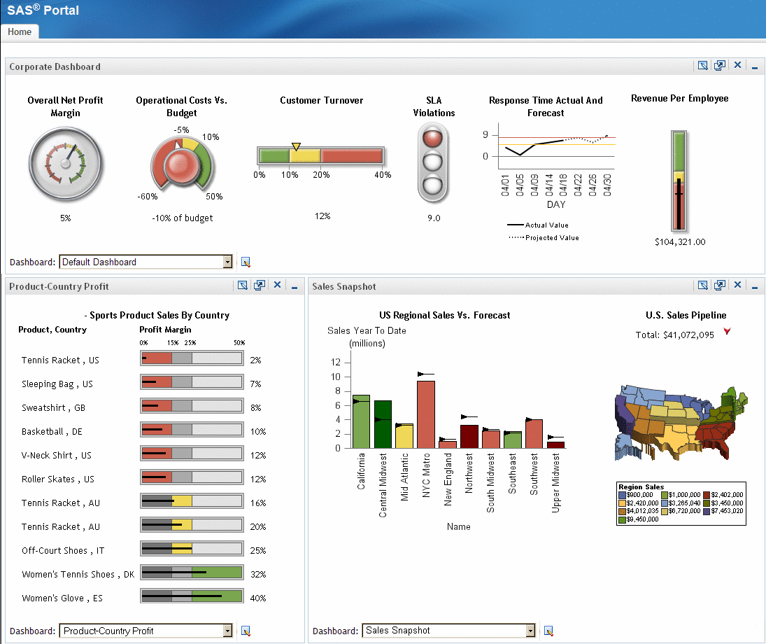
In the
dashboard across the top, there are six indicators, each with its
own data model underneath. These indicators are driven by six different
SQL queries, but the data models could be all information maps, all
scorecards, or some combination of these types.
Notice
that the data models for the first four indicators and the last one
return only one row of data. The best way to represent a single row
of data is a gauge. Each of these indicators shows a different type
of gauge.
The data
model for the fifth indicator returns several rows of data. The best
way to represent multiple rows of data is a graph, in this case a
line graph. The dashboard in the lower left corner contains a single
indicator that is driven by a query that returns eleven rows of data.
The values in the Profit Margin data field drive the bar and trend
display.
The dashboard
in the lower right corner contains two indicators. The indicator on
the left renders ten rows of data (one for each region) as a bar graph.
Two columns are rendered: Sales YTD targeted as the bar height and
Sales Quota YTD as the target line. A third computed column, Relative
To Forecast, controls the bar color. This indicator is driven by an
information map.
The last
indicator, the US Sales Pipeline Map, contains output generated from
a stored process. For more information, see Graph Display.
By using
information maps and SQL queries to retrieve data, you are unconstrained
with how the data is laid out at the data set level. For example,
you can use computed columns and grouping in the data model. After
you have the data configured, the lack of constraints helps you to
get initial dashboards up and running quickly. But this same simplicity
means that data structure is not enforced.