Data Model Rules
Here are
several rules that will help you to create quicker and more efficient
data models:
-
Plan the data model by considering the kinds of indicator display types that will be used with the data model and the required appearance of the desired end result.For example, KPIs appear best with a data model that produces summarized data with a limited number of data rows. A data model with significant amounts of data, when used to drive a KPI indicator display, causes the SAS BI Dashboard to try to produce one KPI graphic representation for each row of data in the data model. Other indicator display types, such as the bar chart, automatically summarize the data. In this case, it might be appropriate to use a data model that produces a larger number of data rows.
-
A query shouldn’t return a lot of data.For example, if an indicator is defined to display a gauge, each row in the result set becomes a gauge. If the result set returns a large number of rows, the indicator will have a large, unwieldy number of gauges. Instead, a query should return a single row or a small number of rows, such as 10. Even an indicator that displays a graph shouldn’t use more than 100 or 200 rows.
-
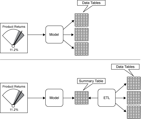
If the source data has too many rows, aggregate the data.Summarize data at the query or data-model level. Do not rely on the indicator display to perform the summary.For a SAS Information Map, you can usually use an aggregation selected in the data model editor to summarize numeric data, which reduces the number of rows to a reasonable number.For an SQL query, you can summarize data using aggregation functions such as AVG() and the distinct keyword.Another summarization strategy is to summarize the data into a summary table. The summary table is then used as the basis for the SQL query or as the base table for the information map. The first illustration that follows shows the SAS BI Dashboard data model using a query that combines data from multiple tables. The second illustration shows the same two tables being summarized by an ETL program. The SAS BI Dashboard data model then uses this summarized table.
-
To display multiple gauges or a graph in an indicator, each numeric value should be associated with a name.After you define a query, you select the data fields to include in the indicator display. For every numeric data field displayed in the indicator, select a data field from the Category label drop-down list to associate with the numeric value. This associated data field is displayed with the gauge or the category value in a graph.