Click on the About tab within each sample for product and release requirements.
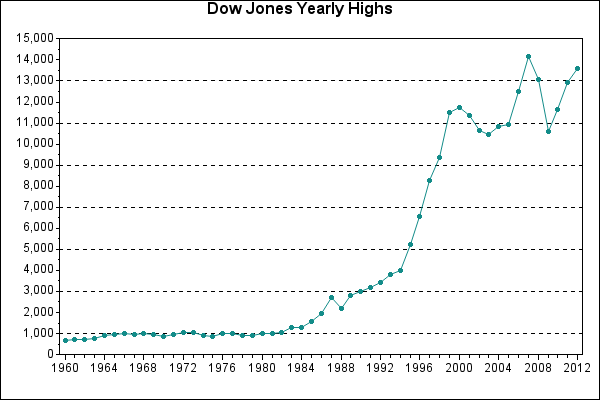
Sample 52648 - Display multiple axis scales and label plot points with PROC GPLOT[ View Code ]
Sample 50993 - Use hardware font symbols as plotting symbols with PROC GPLOT[ View Code ]
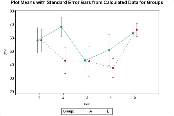
Sample 50217 - Plot means with standard error bars from calculated data for groups with PROC GPLOT[ View Code ]
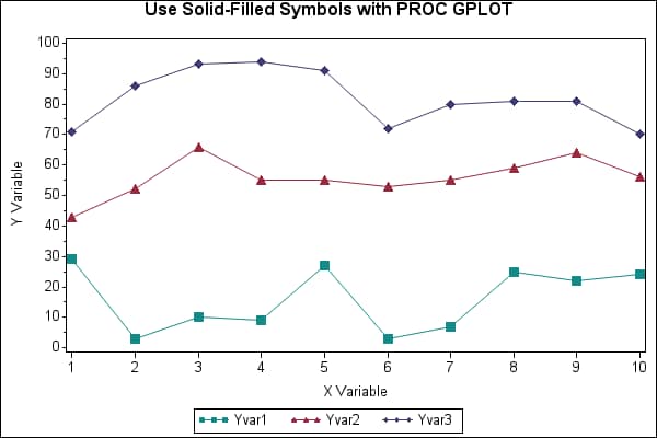
Sample 50209 - Use solid-filled symbols with PROC GPLOT[ View Code ]
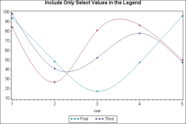
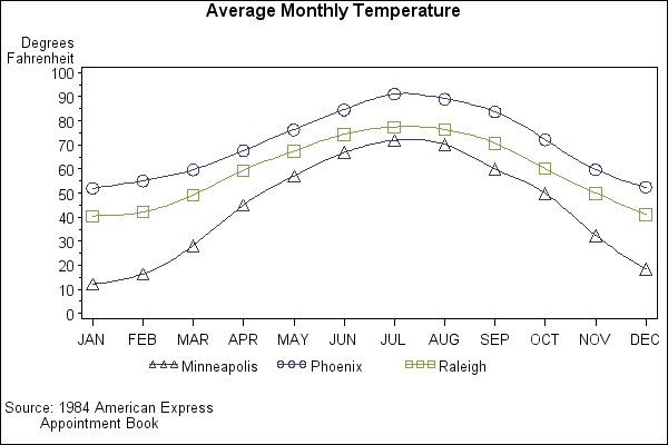
Sample 46723 - Include only select values in the legend with PROC GPLOT[ View Code ]
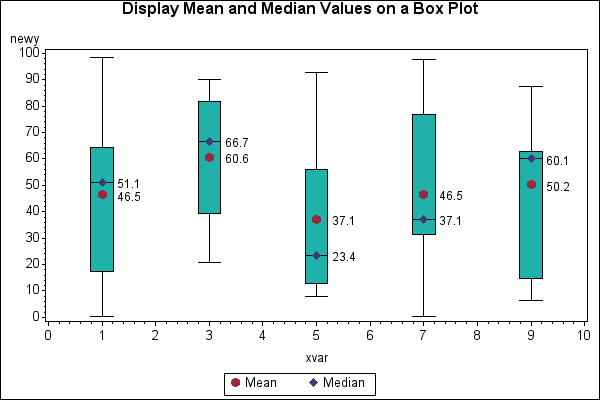
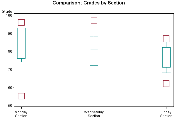
Sample 46719 - Display mean and median values on a box plot generated with PROC GPLOT[ View Code ]
Sample 42893 - Shade the graph background for a data range[ View Code ]
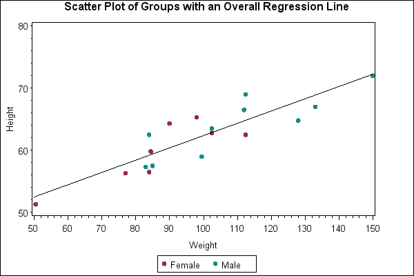
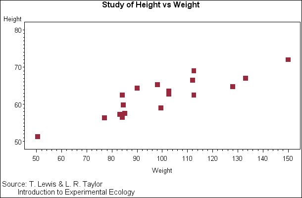
Sample 42864 - Scatter plot of groups with an overall regression line[ View Code ]

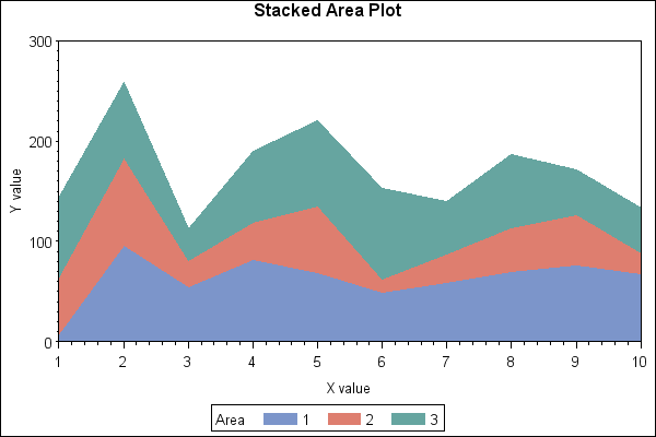
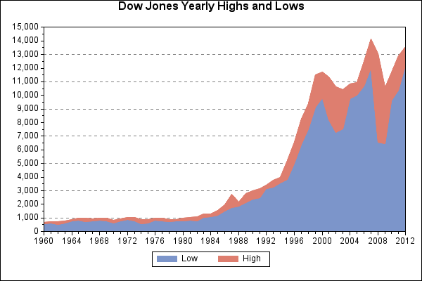
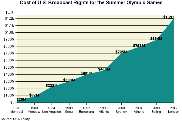
Sample 42556 - Generate a stacked area plot with PROC GPLOT[ View Code ]
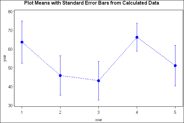
Sample 42515 - Plot means with standard error bars from calculated data with PROC GPLOT[ View Code ]
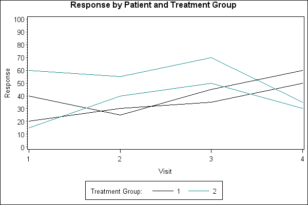
Sample 38076 - Create a spaghetti plot with the GPLOT procedure[ View Code ]
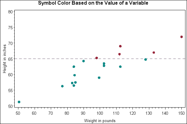
Sample 38062 - Symbol color based on the value of a variable with PROC GPLOT[ View Code ]
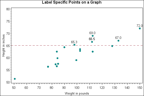
Sample 38060 - Label specific points on a graph with PROC GPLOT[ View Code ]
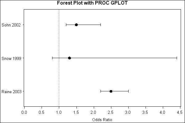
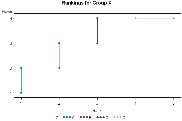
Sample 35773 - Produce a Forest Plot with PROC GPLOT[ View Code ]
Sample 25597 - Rotate plot symbols through the colors list using a SYMBOL statement with PROC GPLOT[ View Code ]
Sample 25596 - Fill the area between plot lines using a SYMBOL statement with PROC GPLOT [ View Code ]
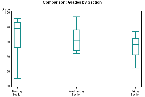
Sample 25595 - Creating and modifying box plots using the SYMBOL statement with PROC GPLOT[ View Code ]
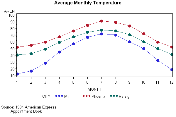
Sample 25584 - Plot three variables using PROC GPLOT[ View Code ]
Sample 25583 - Plotting two variables using the PLOT statement with PROC GPLOT[ View Code ]

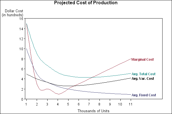
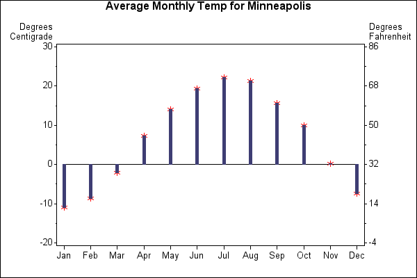
Sample 25582 - Plotting with different scales of values using PROC GPLOT[ View Code ]
Sample 25581 - Generate an overlay plot using PROC GPLOT[ View Code ]
Sample 25580 - Fill areas in an overlay plot using PROC GPLOT[ View Code ]
Sample 25579 - Connect plot data points using PROC GPLOT[ View Code ]
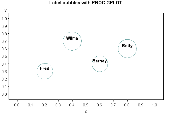
Sample 25577 - Label and size plot bubbles using PROC GPLOT[ View Code ]
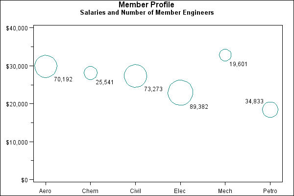
Sample 25576 - Generate a simple bubble plot using PROC GPLOT[ View Code ]

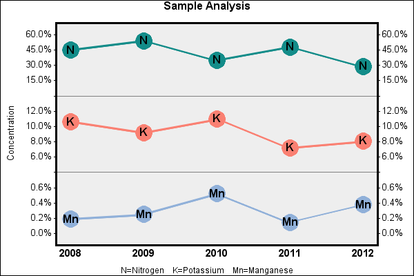
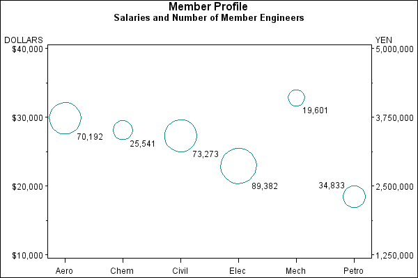
Sample 25575 - Add a right vertical axis to a plot using PROC GPLOT[ View Code ]
Sample 25506 - Order axis tick marks with SAS® date values[ View Code ]
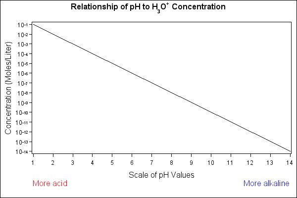
Sample 25505 - Specify logarithmic axes using PROC GPLOT[ View Code ]
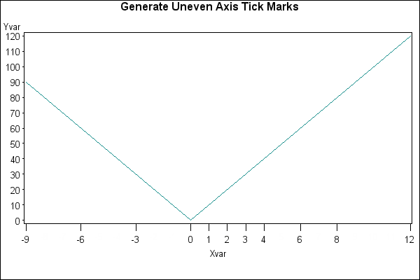
Sample 24938 - Display unevenly spaced horizontal axis tick marks[ View Code ]
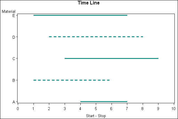
Sample 24937 - Create a time line plot with PROC GPLOT and Annotate[ View Code ]
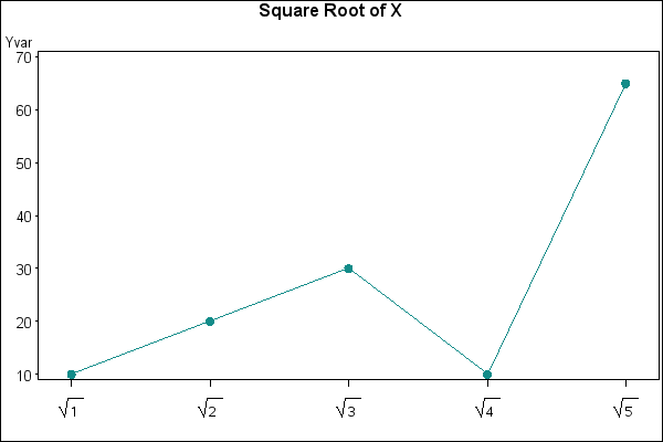
Sample 24936 - Represent tick mark values on an axis with a special symbol[ View Code ]
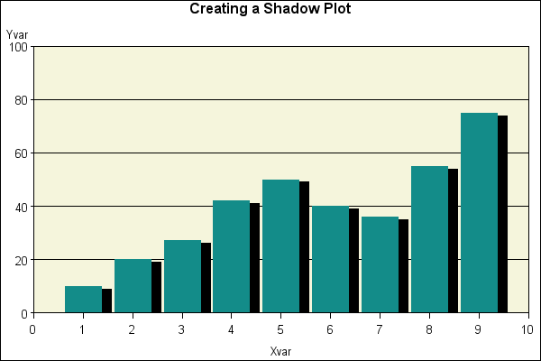
Sample 24935 - Create a shadow behind a needle plot with PROC GPLOT[ View Code ]
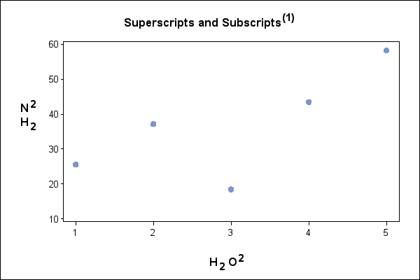
Sample 24934 - Use superscripts and subscripts with SAS/GRAPH® output[ View Code ]
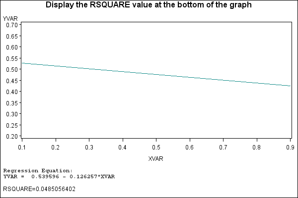
Sample 24933 - Display the RSQUARE value at the bottom of PROC GPLOT output[ View Code ]
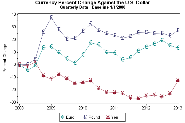
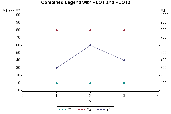
Sample 24932 - Display the left and right axes with a single combined legend with PROC GPLOT[ View Code ]
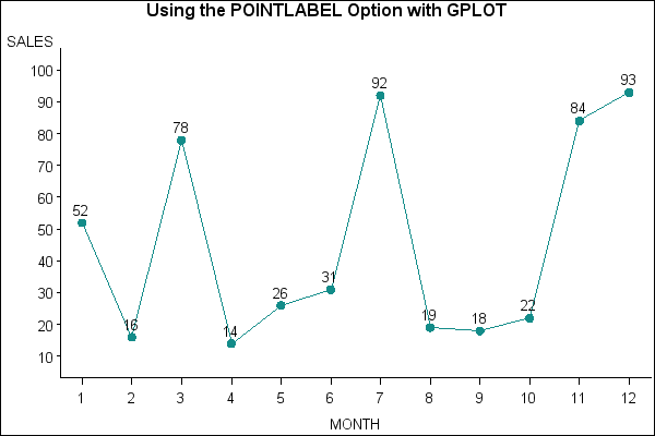
Sample 24930 - Label data points with PROC GPLOT and the POINTLABEL option[ View Code ]
Sample 24929 - Generate page numbers on BY-group processed plots[ View Code ]

Sample 24928 - Display the BY group as name and description with graphics output[ View Code ]
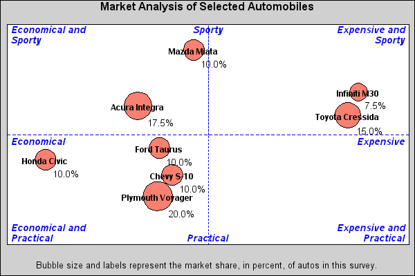
Sample 24927 - Create axis area quadrants for a bubble plot[ View Code ]
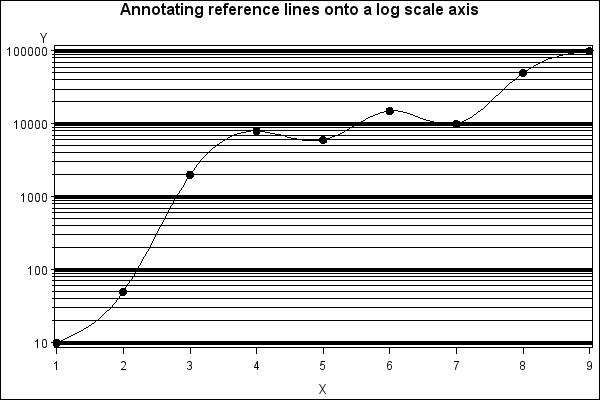
Sample 24926 - Overlay reference lines on a log scale axis[ View Code ]
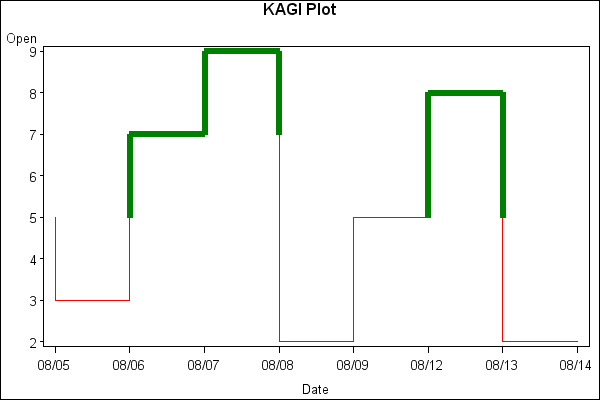
Sample 24924 - Create a KAGI plot with PROC GPLOT and Annotate[ View Code ]
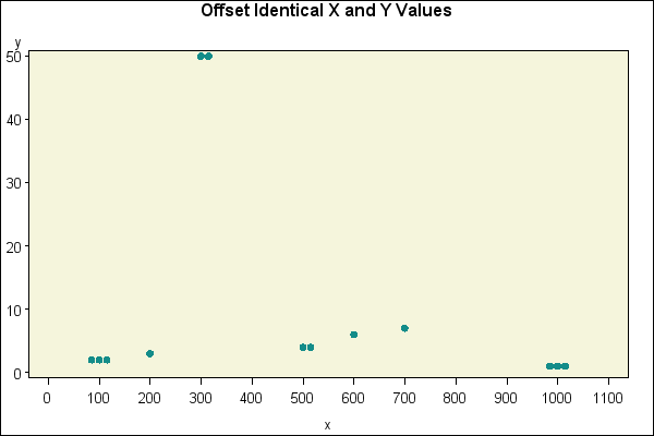
Sample 24923 - Use jittering to offset identical X and Y values with PROC GPLOT[ View Code ]
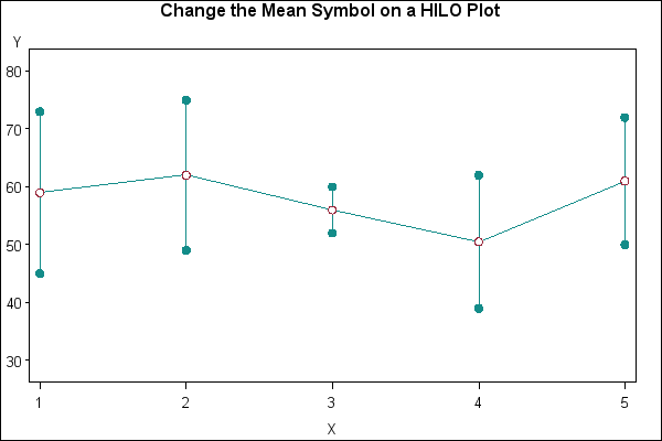
Sample 24922 - Change the mean symbol on a HILO plot with PROC GPLOT[ View Code ]
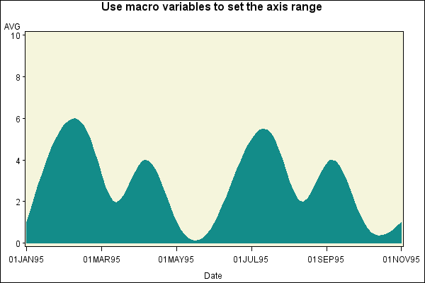
Sample 24921 - Use PROC GPLOT to control the axis range with macro variables[ View Code ]
Sample 24920 - Label data points in a two-dimensional plot using PROC GPLOT and Annotate[ View Code ]
Sample 24919 - Use GPLOT to set the symbol size based on the frequency of the data[ View Code ]

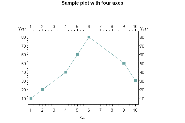
Sample 24918 - Use GPLOT with Annotate to create a plot with four axes (left, right, top and bottom)[ View Code ]
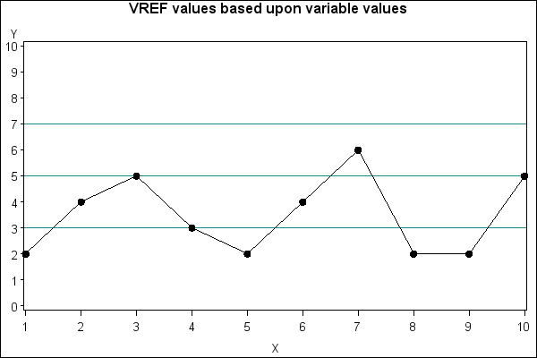
Sample 24917 - Generate reference lines based upon the value of a data set variable[ View Code ]
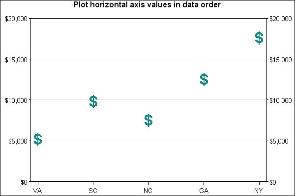
Sample 24916 - Plot horizontal axis values in data order with PROC GPLOT[ View Code ]
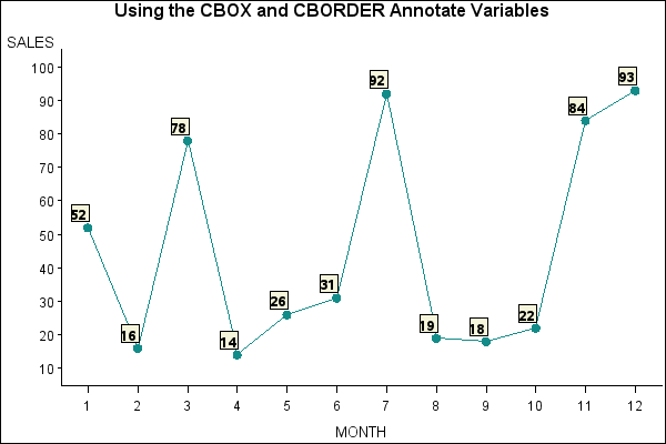
Sample 24915 - Label data points with the Annotate CBOX and CBORDER variables[ View Code ]
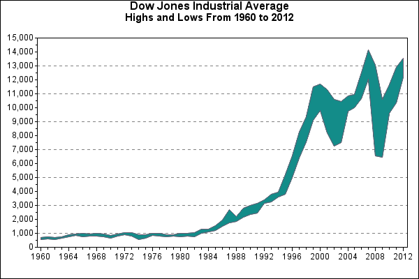
Sample 24914 - Create candlestick plots[ View Code ]

Sample 24913 - Maintain symbols across BY values with PROC GPLOT[ View Code ]
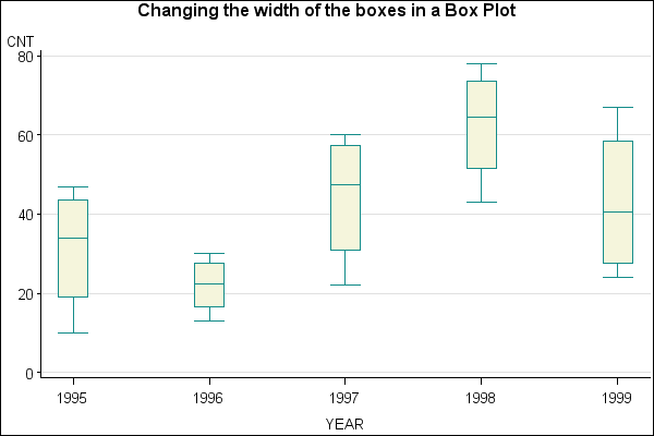
Sample 24912 - Change the width of the boxes when creating a box plot with PROC GPLOT[ View Code ]
Sample 24911 - Generate bubble labels with PROC GPLOT[ View Code ]
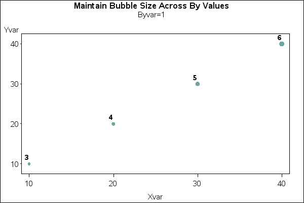
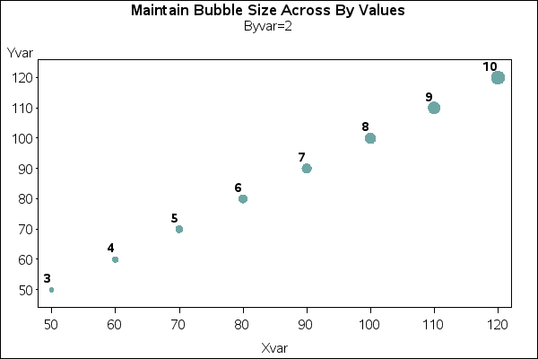
Sample 24910 - Use PROC GPLOT with Annotate to maintain bubble sizes across BY values[ View Code ]
Sample 24909 - Create a break on the vertical axis of a plot[ View Code ]

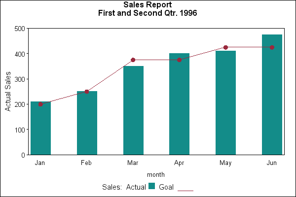
Sample 24908 - Overlay a plot line on a vertical bar chart with PROC GPLOT[ View Code ]
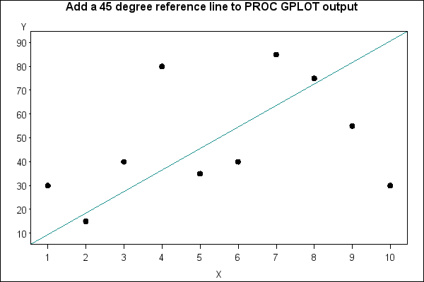
Sample 24907 - Add a 45-degree reference line to PROC GPLOT output [ View Code ]
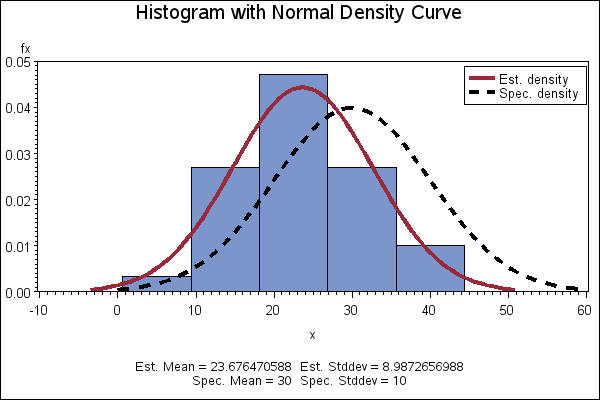
Sample 24878 - Create a histogram with a normal density curve[ View Code ]
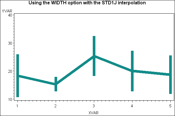
Sample 24857 - Control the thickness of interpolation lines for BOX, STD, HILO and AREA plots with PROC GPLOT[ View Code ]
Sample 24837 - Label plot lines in an overlay plot using PROC GPLOT with Annotate[ View Code ]