Sample 25584: Plot three variables using PROC GPLOT
 |  |  |  |  |
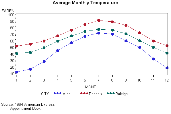
This example shows that when your data contains a classification variable that groups data, you can use a plot request with PROC GPLOT to generate a separate interpolation line for each unique value of the classification variable.
These sample files and code examples are provided by SAS Institute Inc. "as is" without warranty of any kind, either express or implied, including but not limited to the implied warranties of merchantability and fitness for a particular purpose. Recipients acknowledge and agree that SAS Institute shall not be liable for any damages whatsoever arising out of their use of this material. In addition, SAS Institute will provide no support for the materials contained herein.
This sample code shows that when your data contains a classification variable that groups data, you can use a plot request with PROC GPLOT to generate a separate interpolation line for each unique value of the classification variable.
The graphics output in the Results tab was produced using SAS® 9.2. Submitting the sample code with releases of SAS prior to SAS 9.2 might produce different results.
/* Set the graphics environment */
goptions reset=all border cback=white
htitle=12pt htext=10pt;
/* Create the data set CITYTEMP */
data citytemp;
input MONTH FAREN CITY $;
datalines;
1 40.5 Raleigh
1 12.2 Minn
1 52.1 Phoenix
2 42.2 Raleigh
2 16.5 Minn
2 55.1 Phoenix
3 49.2 Raleigh
3 28.3 Minn
3 59.7 Phoenix
4 59.5 Raleigh
4 45.1 Minn
4 67.7 Phoenix
5 67.4 Raleigh
5 57.1 Minn
5 76.3 Phoenix
6 74.4 Raleigh
6 66.9 Minn
6 84.6 Phoenix
7 77.5 Raleigh
7 71.9 Minn
7 91.2 Phoenix
8 76.5 Raleigh
8 70.2 Minn
8 89.1 Phoenix
9 70.6 Raleigh
9 60.0 Minn
9 83.8 Phoenix
10 60.2 Raleigh
10 50.0 Minn
10 72.2 Phoenix
11 50.0 Raleigh
11 32.4 Minn
11 59.8 Phoenix
12 41.2 Raleigh
12 18.6 Minn
12 52.5 Phoenix
;
run;
/* Define titles and footnotes */
title1 'Average Monthly Temperature';
footnote1 j=l ' Source: 1984 American Express';
footnote2 j=l ' Appointment Book';
footnote3 ' ';
/* Define symbol characteristics */
symbol1 interpol=join value=dot height=1.7;
/* Generate a plot of three variables */
/* that produces a legend. */
proc gplot data= citytemp;
plot faren*month=city / hminor=0;
run;
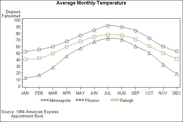
/* Generate second graph with modified axes */
footnote2 j=l ' Appointment Book';
footnote3 ' ';
/* Define symbol characteristics */
symbol1 color=dabg interpol=spline value=triangle
height=2;
symbol2 color=mob interpol=spline value=circle
height=2;
symbol3 color=day interpol=spline value=square
height=2;
/* Define axis characteristics */
axis1 label=none
value=('JAN' 'FEB' 'MAR' 'APR' 'MAY' 'JUN'
'JUL' 'AUG' 'SEP' 'OCT' 'NOV' 'DEC')
order = 1 to 12 by 1
offset=(2)
width=1;
axis2 label=('Degrees' justify=right 'Fahrenheit')
order=(0 to 100 by 10)
width=1;
/* Enhance the legend */
legend1 label=none value=(tick=1 'Minneapolis');
plot faren*month=city /
haxis=axis1 hminor=0
vaxis=axis2 vminor=1
legend=legend1;
run;
quit;
These sample files and code examples are provided by SAS Institute Inc. "as is" without warranty of any kind, either express or implied, including but not limited to the implied warranties of merchantability and fitness for a particular purpose. Recipients acknowledge and agree that SAS Institute shall not be liable for any damages whatsoever arising out of their use of this material. In addition, SAS Institute will provide no support for the materials contained herein.
This example shows that when your data contains a classification variable that groups data, you can use a plot request with PROC GPLOT to generate a separate interpolation line for each unique value of the classification variable.
| Type: | Sample |
| Topic: | SAS Reference ==> Procedures ==> GPLOT Query and Reporting ==> Creating Reports ==> Graphical ==> Graph Elements ==> Symbols/Interpolation |
| Date Modified: | 2005-09-01 03:03:11 |
| Date Created: | 2005-05-23 14:17:08 |
Operating System and Release Information
| Product Family | Product | Host | SAS Release | |
| Starting | Ending | |||
| SAS System | SAS/GRAPH | z/OS | 9.1 TS1M0 | |
| Microsoft® Windows® for 64-Bit Itanium-based Systems | 9.1 TS1M0 | |||
| Microsoft Windows Server 2003 Datacenter 64-bit Edition | 9.1 TS1M0 | |||
| Microsoft Windows Server 2003 Enterprise 64-bit Edition | 9.1 TS1M0 | |||
| Microsoft Windows 2000 Advanced Server | 9.1 TS1M0 | |||
| Microsoft Windows 2000 Datacenter Server | 9.1 TS1M0 | |||
| Microsoft Windows 2000 Server | 9.1 TS1M0 | |||
| Microsoft Windows 2000 Professional | 9.1 TS1M0 | |||
| Microsoft Windows NT Workstation | 9.1 TS1M0 | |||
| Microsoft Windows Server 2003 Datacenter Edition | 9.1 TS1M0 | |||
| Microsoft Windows Server 2003 Enterprise Edition | 9.1 TS1M0 | |||
| Microsoft Windows Server 2003 Standard Edition | 9.1 TS1M0 | |||
| Microsoft Windows XP Professional | 9.1 TS1M0 | |||
| 64-bit Enabled AIX | 9.1 TS1M0 | |||
| 64-bit Enabled HP-UX | 9.1 TS1M0 | |||
| 64-bit Enabled Solaris | 9.1 TS1M0 | |||
| HP-UX IPF | 9.1 TS1M0 | |||
| Linux | 9.1 TS1M0 | |||
| OpenVMS Alpha | 9.1 TS1M0 | |||
| Tru64 UNIX | 9.1 TS1M0 | |||