Sample 24867: Produce and label a population tree
 |  |  |  |  |
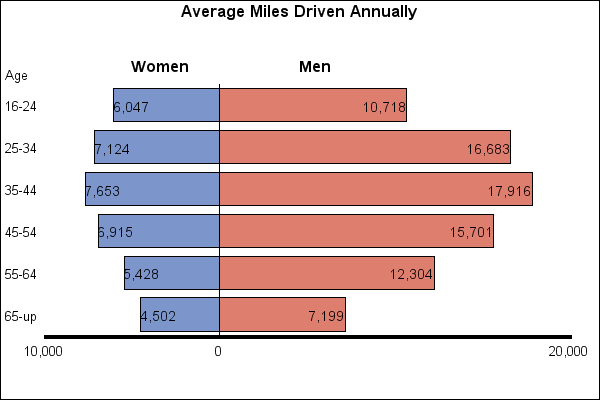
This example produces a population tree that compares average miles driven by men and women. The data values for one group of drivers are made negative to force GCHART to add a zero reference line. The negative values appear positive because a format is used to display the values.
These sample files and code examples are provided by SAS Institute Inc. "as is" without warranty of any kind, either express or implied, including but not limited to the implied warranties of merchantability and fitness for a particular purpose. Recipients acknowledge and agree that SAS Institute shall not be liable for any damages whatsoever arising out of their use of this material. In addition, SAS Institute will provide no support for the materials contained herein.
This example produces a population tree that compares average miles driven by men and women. The data values for one group of drivers are made negative to force GCHART to add a zero reference line. The negative values appear positive because a format is used to display the values.
The graphics output in the Results tab was produced using SAS® 9.2. Submitting the sample code with releases of SAS prior to SAS 9.2 might produce different results.
 /* Set the graphics environment */
goptions reset=all cback=white border htitle=13pt
         htext=10pt;

 /* Create the data set, MILEAGE.  Mileage contains the number of */
 /* miles driven by males and females in certain age categories.  */
data mileage;
   input age $ sex $ amount;
   datalines;
65-up M 7199
65-up F 4502
55-64 M 12304
55-64 F 5428
45-54 M 15701
45-54 F 6915
35-44 M 17916
35-44 F 7653
25-34 M 16683
25-34 F 7124
16-24 M 10718
16-24 F 6047
;
run;

 /* Convert the data values for one group to negative values to     */
 /* create the input data set, CONVERT.  CONVERT contains the same  */
 /* variables as MILEAGE; however, the values of AMOUNT for the     */
 /* female drivers are made negative to force a zero reference line */
 /* in the bar chart.                                               */
data convert;
   set mileage;
   if sex='F' then amount=-amount;
run;

 /* Create a format for the values of AMOUNT.  The POSVAL. format */
 /* adds a comma and suppresses the sign on the values so that    */
 /* negative values appear as positive values.                    */
proc format;
   picture posval low-high='000,009';
run;

 /* Create the Annotate data set, ANLABELS.  ANLABELS adds the */
 /* labels to the bars.  Because data values are used to place */
 /* the labels, XSYS and YSYS use the absolute data coordinate */
 /* system, 2.  A value of A for WHEN causes the labels to     */
 /* overlay the chart.                                         */
data anlabels(drop=age sex amount);
   length text $ 8;
   retain function 'label' when 'a' xsys ysys '2' hsys '3' size 3.5;
   set convert;
   midpoint=age; subgroup=sex;
   text=left(put(amount, posval.));

   /* POSITION changes depending on the group that is being labeled. */
   if sex ='F' then position='>';
   else position='<';
   output;
run;

 /* Add a title to the graph */
title1 'Average Miles Driven Annually';

 /* Modify the appearance of the axes. In the AXIS2 statement,   */
 /* the VALUE= option suppresses the third tick mark so that the */
 /* range for each group is zero to the maximum value.           */
axis1 label=(justify=left 'Age') style=0;
axis2 label=none value=(tick=3 '') minor=none major=none
      width=3 order=(-10000 to 20000 by 10000);

 /* Create the bar chart */
proc gchart data=convert;

   /* The FORMAT statement applies the POSVAL format */
   /* to the values of AMOUNT. */
   format amount posval.;

   /* The NOTE statement places the labels   */
   /* "Women" and "Men" above the population */
   /* tree.                                  */
   note font="Albany AMT/bold" move=(22pct,82pct) h=12pt 'Women'
                               move=(50pct,82pct) 'Men';

   /* In the HBAR statement, SUBGROUP=  names the variable */
   /* that determines the groups, and ANNOTATE= includes   */
   /* the annotation defined in the ANLABELS data set.     */
   hbar age / sumvar=amount discrete nostat subgroup=sex
              maxis=axis1 raxis=axis2 nolegend annotate=anlabels;

run;
quit;
These sample files and code examples are provided by SAS Institute Inc. "as is" without warranty of any kind, either express or implied, including but not limited to the implied warranties of merchantability and fitness for a particular purpose. Recipients acknowledge and agree that SAS Institute shall not be liable for any damages whatsoever arising out of their use of this material. In addition, SAS Institute will provide no support for the materials contained herein.
This example produces a population tree that compares average miles driven by men and women. The data values for one group of drivers are made negative to force GCHART to add a zero reference line. The negative values appear positive because a format is used to display the values.
| Type: | Sample |
| Topic: | SAS Reference ==> Procedures ==> GCHART Query and Reporting ==> Creating Reports ==> Graphical ==> Graph Elements ==> Annotation Query and Reporting ==> Creating Reports ==> Graphical ==> Graph Types ==> Charts ==> Bar |
| Date Modified: | 2005-08-24 16:06:25 |
| Date Created: | 2004-11-11 11:07:52 |
Operating System and Release Information
| Product Family | Product | Host | SAS Release | |
| Starting | Ending | |||
| SAS System | SAS/GRAPH | All | n/a | n/a |