Bar-Line Chart Task
Example: City and Highway Mileage by Origin
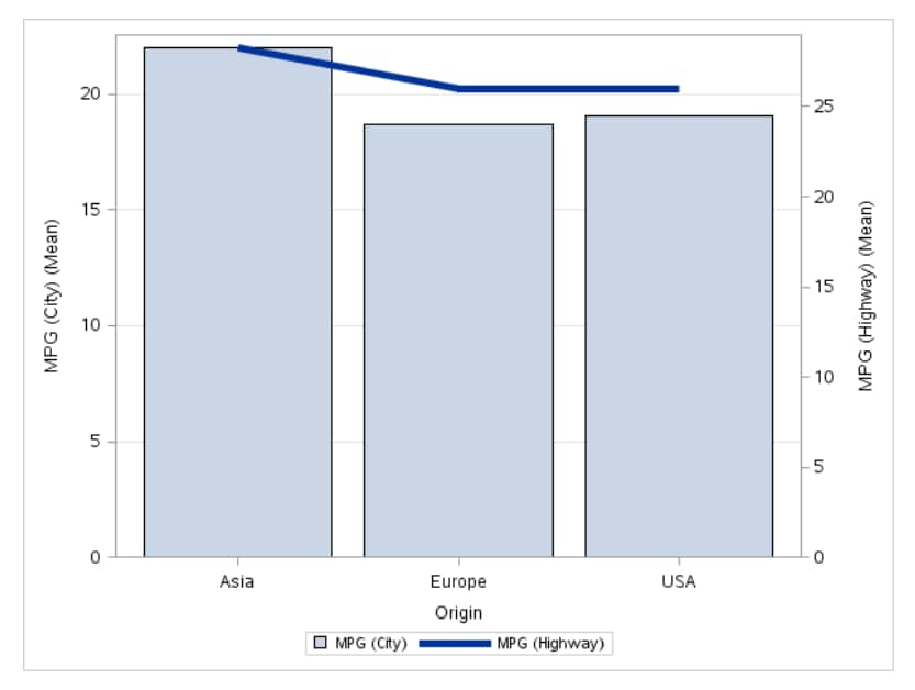
For example, you can
create a bar-line chart that compares the number of miles per gallon
(in the city and on the highway) that cars use depending on their
country of origin. The task calculates the mean of the number of miles
per gallon in the city and in the highway for each country. This bar-line
chart shows that cars from Asia tend to get the highest number of
miles per gallon in city and highway driving.
To create this example:

Assigning Data to Roles
You can subset the data in the
input data set by applying an SQL WHERE clause. In the Where
string box, enter your valid SQL syntax. You must enclose
character strings in single quotation marks. To view this WHERE clause
with the resulting graph, select the Include as footnote check
box.
To run the Bar-Line
Chart task, you must assign a column to the Category variable, Bar
response variable, and Line response variable roles.
|
Option Name
|
Description
|
|---|---|
|
Roles
|
|
|
Category
variable
|
specifies the variable
that classifies the observations into distinct subsets.
|
|
Bar response
variable
|
specifies a numeric
response variable for the bar chart.
|
|
Line response
variable
|
specifies a numeric
response variable for the line plot.
|
|
Group variable
|
specifies a variable
that is used to group the data.
|
|
URL variable
|
specifies a character
variable that contains URLs for web pages to be displayed when parts
of the plot are selected within an HTML page.
|
|
Statistics
|
|
|
Mean
|
calculates the mean
of the response variables.
|
|
Sum
|
calculates the sum of
the response variables.
|
Setting Options
|
Option Name
|
Description
|
|---|---|
|
Title and Footnote
|
|
|
You can specify a custom
title and footnote for the output. You can also specify the font size
for this text.
|
|
|
Bar Details
|
|
|
Apply bar
color
|
specifies the color
for the bars.
|
|
Transparency
|
specifies the degree
of transparency for the plot. The range is 0 (completely opaque) to
1 (completely transparent).
|
|
Apply bar
gradient
|
applies a gradient to
each bar.
Note: This option is available
only if you are running the second maintenance release for SAS 9.4
or later.
|
|
Data skin
|
specifies a special
effect to be used on all filled bars.
|
|
Line Details
|
|
|
Apply line
color
|
specifies the color
for the line.
|
|
Line thickness
|
specifies the thickness
(in pixels) of the line.
|
|
Transparency
|
specifies the degree
of transparency for the plot. The range is 0 (completely opaque) to
1 (completely transparent).
|
|
Use solid
line pattern
|
specifies a solid pattern
for the line.
|
|
Category Axis
|
|
|
Reverse
|
specifies that the values
of the tick marks are displayed in reverse (descending) order.
|
|
Show values
in data order
|
places the discrete
values for the tick marks in the order in which they appear in the
data.
|
|
Show label
|
enables you to display
a label for the axis. Enter this label in the Custom label box.
|
|
Response Axes
|
|
|
Use zero
baseline
|
specifies whether to
offset all lines from the discrete category values and all bars from
category midpoints. By default, there is no offset.
|
|
Use uniform
scale
|
uses the same scale
for both response axes.
|
|
Show grid
on left (bar) axis
|
creates grid lines at
each tick on the axis for the bar chart.
|
|
Drop statistics
suffix
|
removes the name of
the calculated statistic in the axis label. For example, if you are
calculating the mean, the axis label could be Weight (Mean).
|
|
Add plot
prefix to axis labels
|
adds (Bar) and (Line)
to the labels for the response axes.
|
|
Custom label
for left (bar) axis
|
enables you to specify
a custom label for the response axis in the bar chart. The default
label is the name of the bar response variable.
|
|
Custom label
for right (line) axis
|
enables you to specify
a custom label for the response axis in the line chart. The default
label is the name of the line response variable.
|
|
Legend Details
|
|
|
Legend location
|
specifies whether the
legend is placed outside or inside of the axis area.
|
|
Graph Size
|
|
|
You can specify the
width and height of the graph in inches, centimeters, or pixels.
|
|
Copyright © SAS Institute Inc. All rights reserved.