Bar Chart Task
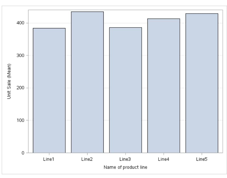
Example: Bar Chart of Mean Sales for Each Product Line
For example, you can
create a bar chart that compares the total amount of sales for each
product line in the Sashelp.Pricedata data set. By default, the task
calculates the mean of the response variable for each product line.
This bar chart shows that Line 2 has the highest mean product sales.
To create this example:

Assigning Data to Roles
You can subset the data in the
input data set by applying an SQL WHERE clause. In the Where
string box, enter your valid SQL syntax. You must enclose
character strings in single quotation marks. To view this WHERE clause
with the resulting graph, select the Include as footnote check
box.
To run the Bar Chart
task, you must assign a column to the Category variable role.
|
Option Name
|
Description
|
|---|---|
|
Roles
|
|
|
Category
variable
|
specifies the variable
that classifies the observations into distinct subsets.
|
|
Response
variable
|
specifies a numeric
response variable for the plot.
|
|
Group variable
|
specifies a variable
that is used to group the data.
|
|
URL variable
|
specifies a character
variable that contains URLs for web pages to be displayed when parts
of the plot are selected within an HTML page.
|
|
BY variable
|
creates a separate graph
for each BY group.
|
|
Direction
|
|
|
You can create either
a vertical or horizontal bar chart.
|
|
|
Group Layout
|
|
|
Cluster
|
displays group values
as separate adjacent bars that replace the single category bar. Each
set of group values is centered at the midpoint tick mark for the
category.
|
|
Stack
|
overlays group values
without any clustering. Each group is represented by unique visual
attributes derived from the GraphData1... GraphDatan style
elements in the current style.
|
|
Statistics
|
|
|
Mean
|
calculates the mean
of the response variable.
|
|
Sum
|
calculates the sum of
the response variable.
|
|
Limits
|
|
|
Limits
|
specifies which limit
lines to display. Limits are displayed as heavier line segments with
a serif at the end that extends from each bar. Limit lines are displayed
only if you select the Mean statistic.
|
|
Limit statistic
|
specifies the statistic
for the limit lines.
|
|
Limit multiplier
|
specifies the number
of standard units for the limit lines. By default, this value is 1.
|
Setting Options
|
Option Name
|
Description
|
|---|---|
|
Title and Footnote
|
|
|
You can specify a custom
title and footnote for the output. You can also specify the font size
for this text.
|
|
|
Bar Details
|
|
|
Apply bar
color
|
specifies the color
for the bars when a column is not assigned to the Group
variable role.
|
|
Transparency
|
specifies the degree
of transparency for the plot. The range is 0 (completely opaque) to
1 (completely transparent).
|
|
Apply bar
gradient
|
applies a gradient to
each bar.
Note: This option is available
only if you are running the second maintenance release of SAS 9.4
or later.
|
|
Data skin
|
specifies a special
effect to be used on all filled bars.
|
|
Bar Labels
|
|
|
Show bar
labels or statistics
|
displays the values
of the calculated response as data labels.
|
|
Category Axis
|
|
|
Reverse
|
specifies that the
values for the tick marks are displayed in reverse (descending) order.
|
|
Show values
in data order
|
places the discrete
values for the tick marks in the order in which they appear in the
data.
|
|
Show label
|
enables you to display
a label for the axis. Enter this label in the Custom label box.
|
|
Response Axis
|
|
|
Show grid
|
creates grid lines at
each tick on the axis.
|
|
Drop statistics
suffix
|
removes the name of
the calculated statistic in the axis label. For example, if you are
calculating the mean, the axis label could be Weight (Mean).
|
|
Show label
|
specifies whether to
display the label for the response axis. By default, the axis label
is the name of the variable. However, you can create a custom label.
|
|
Legend Details
|
|
|
Legend location
|
specifies whether the
legend is placed outside or inside the axis area.
|
|
Graph Size
|
|
|
You can specify the
width and height of the graph in inches, centimeters, or pixels.
|
|
Copyright © SAS Institute Inc. All rights reserved.