Scatter Plot Task
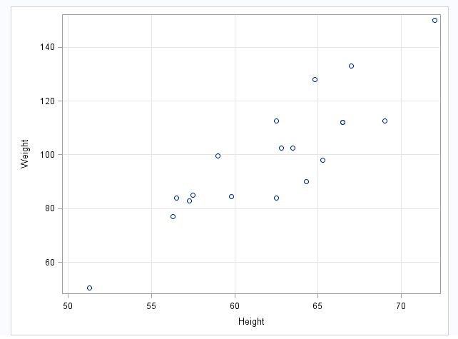
Example: Scatter Plot of Height versus Weight

Assigning Data to Roles
You can subset the data in the
input data set by applying an SQL WHERE clause. In the Where
string box, enter your valid SQL syntax. You must enclose
character strings in single quotation marks. To view this WHERE clause
with the resulting graph, select the Include as footnote check
box.
To run the Scatter
Plot task, you must assign columns to the X variable and Y
variable role.
|
Option Name
|
Description
|
|---|---|
|
Roles
|
|
|
X variable
|
specifies the variable
for the x axis.
|
|
Y variable
|
specifies the variable
for the y axis.
|
|
Group variable
|
specifies a variable
that is used to group the data. The plot elements for each group value
are automatically distinguished by different visual attributes.
|
|
Marker label
variable
|
displays a label for
each data point. If you specify a variable, the values of that variable
are used for the data labels. If you do not specify a variable, then
the values of the Y variable are used for the data labels.
|
|
URL variable
|
specifies a character
variable that contains URLs for web pages to be displayed when parts
of the plot are selected within an HTML page.
|
|
Fit Plots
Note: This is available only if
you assign numeric variables.
|
|
|
Regression
|
creates a plot with
the fitted regression line. You can specify whether to include the
confidence limits for means and the prediction limits for the individual
predicted values. The Alpha option specifies
the confidence level for the confidence limits. The Degree option
specifies the degree of the polynomial fit.
|
|
Loess
|
creates a fitted loess
curve. You can specify whether to include the confidence limits.
The Alpha option specifies the confidence
level for the confidence limits.
|
|
PBSpline
|
creates a fitted penalized
B-spline curve. You can specify whether to include the confidence
limits for means and the prediction limits for the individual predicted
values. The Alpha option specifies the confidence
level for the confidence limits.
|
Setting Options
|
Option Name
|
Description
|
|---|---|
|
Title and Footnote
|
|
|
You can specify a custom
title and footnote for the output. You can also specify the font size
for this text.
|
|
|
Marker Details
|
|
|
You can specify the
symbol type, color, and size of the markers. You can also specify
the degree of transparency for the plot. The range is 0 (completely
opaque) to 1 (completely transparent).
|
|
|
Marker Labels
|
|
|
Font size
|
specifies the appearance
of the labels in the plot when you assign a variable to the Marker
label variable role.
|
|
X Axis, Y Axis
|
|
|
Show grid
lines
|
creates grid lines at
each tick on the axis.
|
|
Show label
|
displays the label for
the axis. By default, the label is the variable name.
To customize, enter
this label in the Custom label box.
|
|
Legend Details
|
|
|
Legend location
|
specifies whether the
legend is placed outside or inside the axis area.
|
|
Graph Size
|
|
|
You can specify the
width and height of the graph in inches, centimeters, or pixels.
|
|
Copyright © SAS Institute Inc. All rights reserved.