The Box Plot task creates
a single box plot, which represents numeric values measured as intervals.
If you choose to categorize the values of the analysis variable, then
multiple box plots are created.
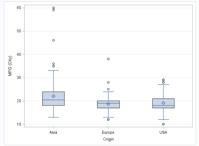
Example: Box Plots Comparing MPG (City) for Cars
This example creates
three box plots that compares how many miles per gallon (city) cars
consume depending on their area of origin (Asia, Europe, and United
States).
To create this example:
In the Tasks section,
expand the Graph folder and double-click Box
Plot. The user interface for the Box Plot task opens.
On the Data tab,
select the SASHELP.CARS data set.
Assign columns to these
roles:
Role
Column Name
Analysis
variable
MPG_City
Category
variable
Origin
To run the task, click .
Here is the resulting
box plot:
Assigning Data to Roles
To run the Box Plot
task, you must assign a column to the Analysis variable role.
You can create either a vertical box plot or a horizontal box plot.
Role
Description
Analysis
variable
specifies the analysis
variable for the plot.
Category
variable
creates a box plot for
each distinct value of the category variable.
Group variable
specifies a variable
that is used to group the data.
URL variable
specifies a character
variable that contains URLs for web pages to be displayed when parts
of the plot are selected within an HTML page.
BY variable
creates a separate graph
for each BY group.
Setting Options
Option Name
Description
Title and Footnote
You can specify a custom
title and footnote for the output. You can also specify the font size
for this text.
Box Detail
Box width
specifies the width
of each box. Specify a value between 0.0 (0% of the available width)
and 1.0 (100% of the available width).
Fill
specifies whether the
boxes are filled with color. The default color is white.
Data skin
specifies a special
effect to be used on the plot. The data skin affects all filled boxes.
The effect that a data skin has on a filled area depends on the skin
type, the graph style, and the color of the skinned element. Most
of the skins work best with lighter colors over a medium to large
filled area.
Transparency
specifies the degree
of transparency for the plot. The default value is 0. However, valid
values range from 0 (completely opaque) to 1 (completely transparent).
Set cap
shape
specifies whether to
display the cap lines for the whiskers. If you select this option,
you can select the shape of the whisker cap lines. Here are the valid
values:
Bracket displays
a straight line with brackets.
Line displays
a straight line.
Serif displays
a short straight line.
Notches
specifies that the boxes
be notched. The endpoints of the notches are at the following computed
locations:
Group Layout
Group Order
specifies the orderi
of boxes within a group. The groups can be displayed in ascending
order, in descending order, or in the order in which they appear in
the data.
Category Axis
Reverse
specifies that the values
for the tick marks are displayed in reverse (descending) order.
Show values
in data order
places the discrete
values for the tick marks in the order in which they appear in the
data.
Show label
enables you to display
a label for the axis. Enter this label in the Custom label box.
Analysis Axis
Show grid
creates grid lines at
each tick on the axis.
Show label
specifies whether to
display the label for the analysis axis. By default, the axis label
is the name of the variable. However, you can create a custom label.
Legend Details
Show legend
specifies whether to
display a legend in the output.
Legend location
specifies whether the
legend is placed outside or inside the axis area.
Graph Size
You can specify the
width and height of the graph in inches, centimeters, or pixels.