About the Analysis of Means Task
Analysis of means is a method for simultaneously comparing
treatment means with their overall mean.
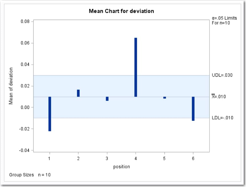
Mean Chart
The mean chart shows
the deviation of the mean for the groups identified by the Group
variable.
Here is an example
of a mean chart. For
more information, see Example: Determine the Deviation of Label Positions.
Proportion Chart
Proportion charts (also
called p charts) are for group (treatment level)
proportions.
A health care system
administrator wants to compare cesarean section rates for a set of
medical groups (Rodriguez 1996).
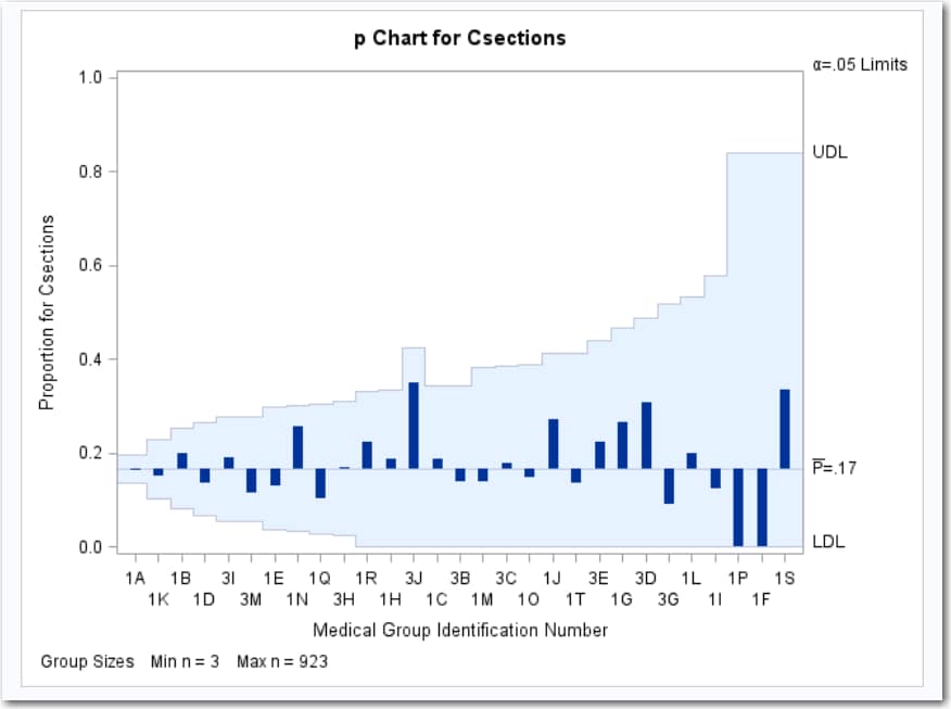
Each point on the p chart
represents the proportion of C-sections for a particular group. For
example, the value plotted for group 1A is 150/923=0.163. Because
all the points fall within the decision limits, it can be concluded
that the variation in proportions of C-sections across medical groups
is strictly due to chance. By default, the decision limits shown correspond
to a significance level of  . If you assume that all groups have the same proportion
of C-sections, there is a 0.05 probability that one or more of the
decision limits are exceeded purely by chance. The decision limits
vary with the number of deliveries in each group, and the widest limits
correspond to the group with the smallest number of deliveries.
. If you assume that all groups have the same proportion
of C-sections, there is a 0.05 probability that one or more of the
decision limits are exceeded purely by chance. The decision limits
vary with the number of deliveries in each group, and the widest limits
correspond to the group with the smallest number of deliveries.
Rate Chart
A rate chart (also called
a u chart) is for group (treatment level) rates.
The rate plotted on a u chart is the number
or count of events that occur in a group divided by a measure of the
opportunity for an event to occur.
A health care administrator
wants to compare the admission rates for a set of clinics (Rodriguez
1996).
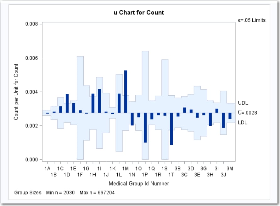
Each point on the u chart
represents the rate of occurrence, computed as the count divided by
the number of opportunity units. The points are displayed in the sort
order for the group variable, ID. The chart shows that Clinics 1D,
1H, and 1M have significantly higher admissions rates, and Clinics
1N, 1T, and 3H have significantly lower admissions rates.
By default, the decision
limits correspond to a significance level of . If you assume that all clinics have the same rate
of admissions, there is a 0.05 probability that one or more of the
decision limits are exceeded purely by chance. The decision limits
vary with the number of 1,000 member years for each clinic.
. If you assume that all clinics have the same rate
of admissions, there is a 0.05 probability that one or more of the
decision limits are exceeded purely by chance. The decision limits
vary with the number of 1,000 member years for each clinic.
Copyright © SAS Institute Inc. All rights reserved.