About the Control Charts Task
The Control Charts task creates Shewhart control charts
for deciding whether a process is in a state of statistical control.
Using the Control Charts task, you can create these types of charts.
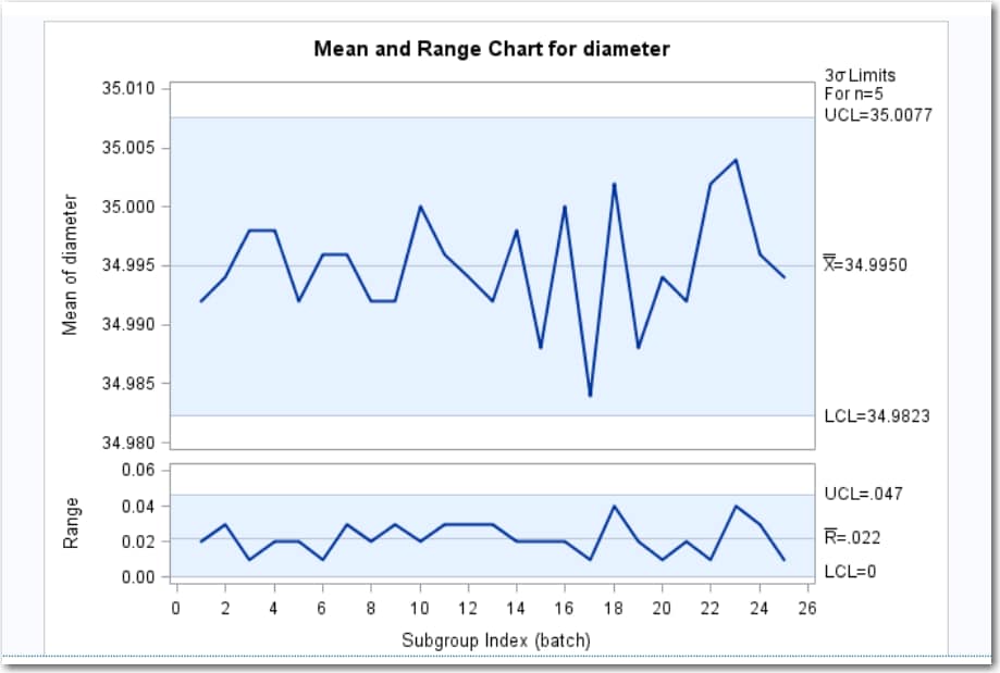
Mean and Range Chart
The Mean and Range chart
displays the subgroup means and the subgroup ranges. These charts
are useful for analyzing the central tendency and the variability
of a process.
Suppose that in the
manufacture of silicon wafers, batches of five wafers are sampled,
and their diameters are measured in millimeters. The measurements
for 25 batches are stored in a SAS data set, which is used to create
the mean and range charts. Each point on the mean chart represents
the average (mean) of the measurements for a particular batch. Each
point on the range chart represents the range of the measurements
for a particular batch. If all the points fall within the control
limits, you can conclude that the process is in statistical control.
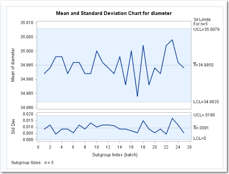
Mean and Standard Deviation Chart
The Mean and Standard
Deviation chart displays the subgroup means and the subgroup standard
deviations. These charts are useful for analyzing the central tendency
and the variability of a process.
You might want to use
this chart to find the distribution of the output and to determine
whether a process is in statistical control. For example, suppose
a petroleum company uses a turbine to heat water into steam that is
pumped into the ground to make oil less viscous and easier to extract.
This process occurs 20 times daily, and the amount of power (in kilowatts)
that is used to heat the water to the desired temperature is recorded.
Each point on the mean chart represents the mean of the measurements
for a particular day. Each point on the standard deviation chart represents
the standard deviation of the measurements for a particular day. If
all the points lie within the control limits, it can be concluded
that the process is in statistical control.
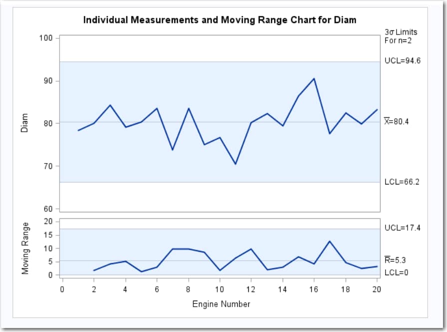
Individual Measurements
The Individual Measurements
chart displays the individual measurements and the moving ranges.
These charts are appropriate when only one measurement is available
for each subgroup sample and when the measurements are independently
and normally distributed. You might want to use this task to analyze
a manufacturing process.
Suppose that an aeronautics
company that manufactures jet engines measures the inner diameter
of the forward face of each engine (in centimeters). The diameter
measurements of 20 engines are stored in a SAS data set. Each point
on the individual measurements chart indicates the inner diameter
of a particular engine. Each point on the moving range chart indicates
the range of the two most recent measurements. If all the individual
measurements and moving ranges fall within the control limits, you
can conclude that the process is in statistical control.
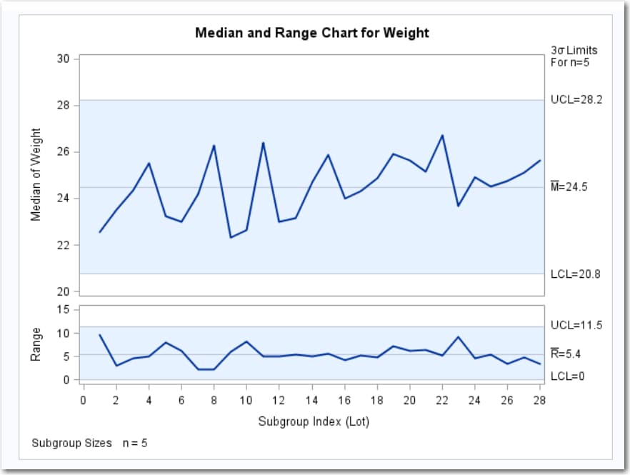
Median and Range Chart
The Median and Range
chart displays the subgroup medians and ranges, which are used to
analyze the central tendency and variability of a process.
A consumer products
company weighs detergent boxes (in pounds) to determine whether the
fill process is in control. The Detergent data set contains the weights
for five boxes in each of 28 lots. A lot is considered a rational
subgroup.
Each point on the median
chart represents the median of the measurements for a particular lot.
For example, the weights for the first lot are 17.39, 19.34, 22.56,
24.49, and 26.93, and consequently, the median plotted for this lot
is 22.56. Each point on the range chart represents the range of the
measurements for a particular batch. For example, the range plotted
for the first lot is 26.93–17.39=9.54. Because all of the points
lie within the control limits, you can conclude that the process is
in statistical control.
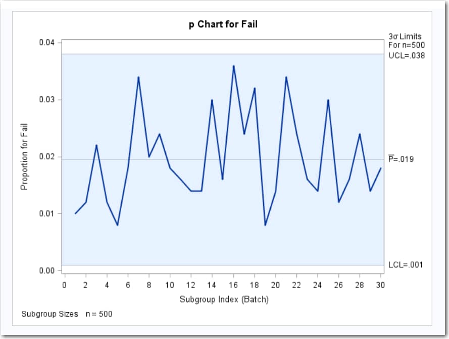
p Charts
p charts display proportions
of nonconforming (defective) items in the subgroup samples. You might
want to use this task to monitor the proportion of defects in a manufacturing
process.
Suppose that an electronics
company manufactures circuits in batches of 500 and uses a p chart
to monitor the proportion of failing circuits. Thirty batches are
examined, and the failures in each batch are counted. The failure
counts are stored in a SAS data set, which is used to create the p
chart. Each point on the p chart represents the proportion of nonconforming
items in a particular subgroup. For example, if the number of failures
in the first circuit is 5, then the value that is plotted for the
first batch is 5/500=0.01. If all the points fall within the control
limits, it can be concluded that the process is in statistical control.
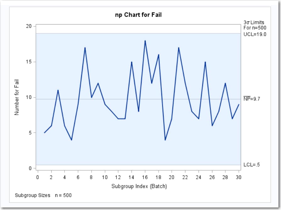
np Charts
np charts display the
numbers of nonconformities (defects) in the subgroup samples. You
might want to use this task to monitor the number of defects in a
manufacturing process.
Suppose that an electronics
company manufactures circuits in batches of 500 and uses an np chart
to monitor the number of failing circuits. Thirty batches are examined,
and the failures in each batch are counted. The failure counts are
stored in a SAS data set, which is used to create the np chart. Each
point on the np chart represents the number of nonconforming items
in a particular subgroup. For example, the value that is plotted for
the first batch is 5. If all the points fall within the control limits,
it can be concluded that the process is in statistical control.
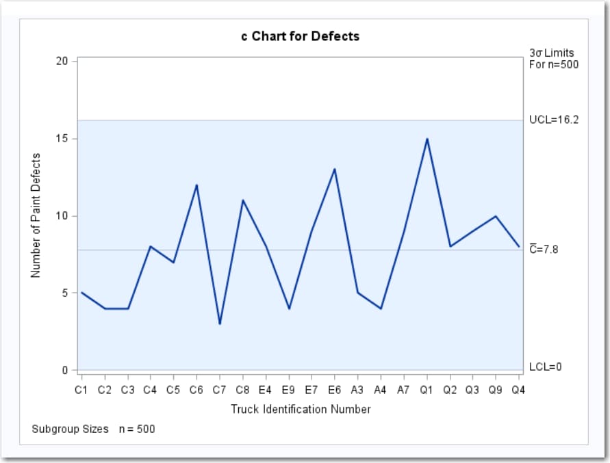
c Chart
c charts display the
numbers of nonconformities (defects) in the subgroup samples. You
might want to use a c chart to monitor the number of defects that
are found in a new product.
Suppose that an automobile
company wants to monitor the number of paint defects on its new trucks.
Twenty trucks of the same model are inspected, and the number of paint
defects per truck is recorded. Each point on the c chart represents
the number of defects for a given truck. If all the points fall within
the control limits, it can be concluded that the process is in statistical
control.
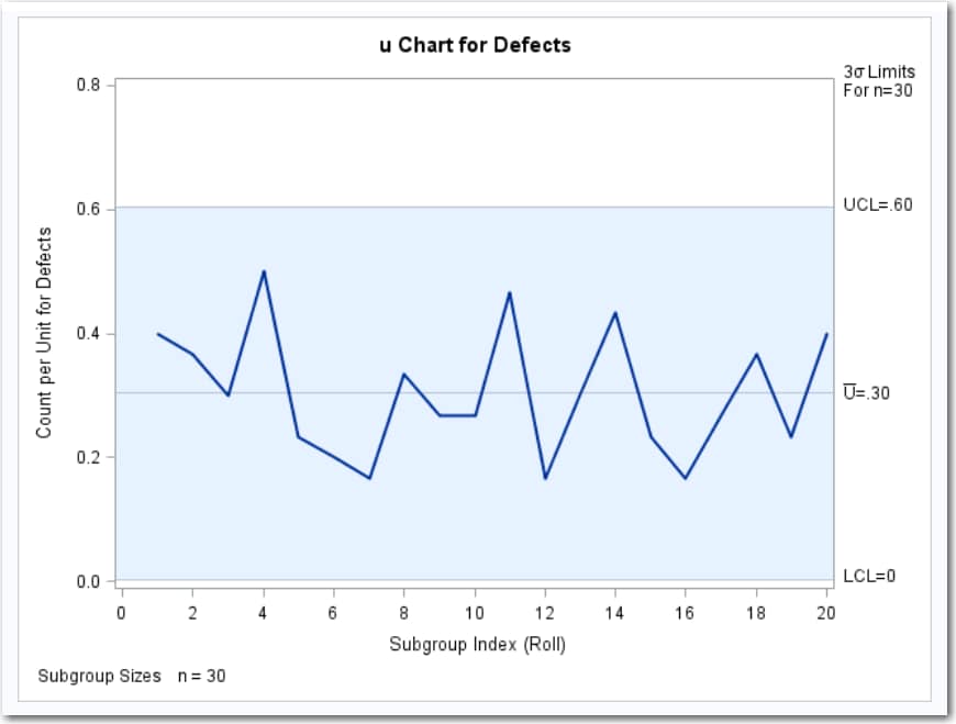
u Chart
u charts display the
numbers of nonconformities (defects) per inspection unit in the subgroup
samples that contain arbitrary numbers of units. You might want to
use this task to determine the number of defects per inspection unit
that resulted from a manufacturing process.
Suppose that a textile
company uses a u chart to monitor the number of defects per square
meter of fabric. The fabric is spooled onto rolls as it is inspected
for defects. Each piece of fabric is one meter wide and 30 meters
long. The defect counts for 20 rolls are saved in a SAS data set,
which is used to create the u chart. Each point on the u chart represents
the number of nonconformities per inspection unit for a particular
subgroup. For example, the value that is plotted for the first subgroup
is 12/30=0.4 (because there are 12 defects on the first roll and the
roll contains 30 square meters of fabric). If none of the points exceed
the control limit (which is 3 sigma by default), the u chart indicates
that the fabric manufacturing process is in statistical control.
Copyright © SAS Institute Inc. All rights reserved.