Working with the Options Element
About the Options Element
The
Options element
identifies the options that are required in order to run the task.
The Option tag, which is the only child of
the Options element, describes the assigned
option.
|
For more information,
see Supported Input Types.
|
|
|
applies to strings that
are used by input types (such as
combobox and select)
where the user has a selection of choices. If the returnValue attribute
is specified in other contexts, this attribute is ignored.
For more information,
see Specifying a Return Value Using the returnValue Attribute.
|
Supported Input Types
checkbox
This input type does
not have additional attributes. The valid values for
checkbox are 0 (unchecked)
and 1 (checked).
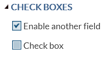
The code in the sample
task definition creates two check boxes.
<Option name="GROUP1" inputType="string">CHECK BOXES</Option>
<Option name="chkCheck" defaultValue=1" inputType="checkbox">
   Enable another field</Option>
<Option name="chkEXAMPLE" defaultValue="0" inputType="checkbox">
   Check box</Option>
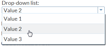
combobox
The code in the sample
task definition creates a combination box called Drop-down
list. This list contains three options: Value
1, Value 2, and Value
3.
<Option name="comboEXAMPLE" defaultValue="value2" inputType="combobox">
   Drop-down list:</Option>
<Option name="value1" inputType="string">Value 1</Option>
<Option name="value2" inputType="string">Value 2</Option>
<Option name="value3" inputType="string">Value 3</Option>
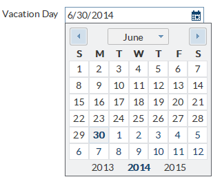
datepicker
If you specify the
defaultValue attribute
for this input type, the value must be in ISO8601 format (yyyy-mm-dd).
distinct
This input type has
these attributes:
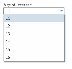
In this example, you
want the user of this task to see the first 15 distinct values for
the response variable.
In the code, you first
specify the
Datasources element because an
input data set is required to run this task. Then in the Roles element,
you specify that only one response variable is required to run this
task. The name attribute for this role is
VAR.
Now, you want to create
an option that lists the first 15 distinct values in the VAR variable.
The code for the distinct input type includes these attributes.
<DataSources>
   <DataSource name="DATASOURCE">
      <Roles>
         <Role type="A" maxVars="1" order="true" minVars="1"
            name="VAR">Response variable</Role>
      </Roles>
   </DataSource>
</DataSources>
<Options>
   <Option name="values" inputType="distinct" source="VAR"
      max="15">Age of interest:</Option>
</Options>
inputtext
The code in the sample
task definition creates a text box called Indented field
with default value. The default value for this option
is output.xls. If the user removes this text, the message “Enter
a filename” appears because a valid filename is required.
<Option name="txtEXAMPLE" defaultValue="output.xls" inputType="inputtext"
   width="100%"
   indent="1"
   required="true"
   promptMessage="Enter a filename"
   missingMessage="Missing filename">Indented field
      with default value:</Option>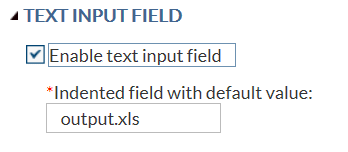
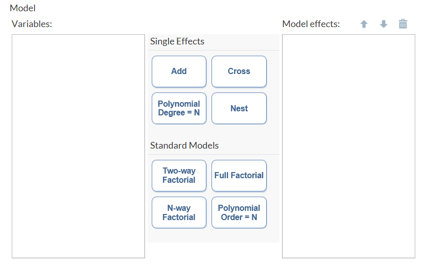
modelbuilder
A model is
an equation that consists of a dependent or response variable and
a list of effects. The user creates the list of effects from variables
and combinations of variables.
Note: At least one of the role
attributes (
roleContinuous or roleClassification)
is required. If both attributes are set to null, no variables are
available to create the model.
Here is some example
code for the
modelbuilder input type from
the Generalized Linear Model task: <Option excludeTools="THREEFACT,NFACTPOLY" inputType="modelbuilder" name="modelbuilder" roleClassification="classVariables" roleContinuous="continuousVariables" width="100%">Model</Option>
multientry
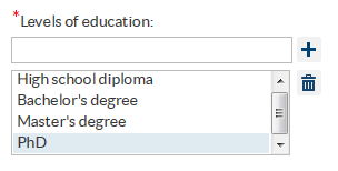
In this example, you
want a multi-entry control where users can specify the educational
degrees that they have earned. In the
Options element,
you define three values (High school diploma, Bachelor’s degree,
and Master’s degree) to appear in the list.
In the
UI element,
you use the OptionsChoice tag to assign default
values for the multi-entry control.<Options>
<Option name="multiExample" required="true"
inputType="multientry">Multi-Entry:</Option>
<Option name="ONE" inputType="string">High school diploma</Option>
<Option name="TWO" inputType="string">Bachelor's degree</Option>
<Option name="THREE" inputType="string">Master's degree</Option>
</Options>
<UI>
<Container option="OPTIONSTAB">
<Group option="GROUP2">
<OptionChoice option=multiExample">
<OptionItem option="ONE"/>
<OptionItem option="TWO"/>
<OptionItem option="THREE"/>
</Group>
...
</Container>
</UI>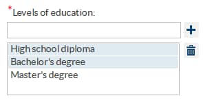
numbertext
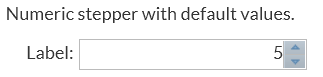
numstepper
The first example in
the sample task definition creates an option with an assigned default
value of 5.
<Option name="labelNumStepperEXAMPLE1" inputType="string">
   Numeric stepper with default values:</Option>
<Option name="basicStepperEXAMPLE" defaultValue="5" inputType="numstepper"
   indent="1">Label:</Option>
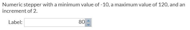
The second example in
the sample task definition creates an option with a specified minimum
value, maximum value, and increment.
<Option name="labelNumStepperEXAMPLE2" inputType="string">
   Numeric stepper with a minimum value of -10, a maximum value of 120, and
   an increment of 2.</Option>
<Option name="advancedStepperEXAMPLE" defaultValue="80" inputType="numstepper"
   increment="2"
   minValue="-10"
   maxValue="120"
   decimalPlaces="0,2"
   size="8em"
   indent="1">Label:</Option>
radio
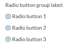
The second example
in the sample task definition creates an option called Radio
button group label with the Radio button
1 button selected by default.
<Option name="labelEXAMPLE2" inputType="string">Radio button group label:</Option>
<Option name="radioButton1" variable="radioEXAMPLE" defaultValue="radioButton1"
   inputType="radio">Radio button 1</Option>
<Option name="radioButton2" variable="radioEXAMPLE"
   inputType="radio">Radio button 2</Option>
<Option name="radioButton3" variable="radioEXAMPLE"
   inputType="radio">Radio button 3</Option>
select
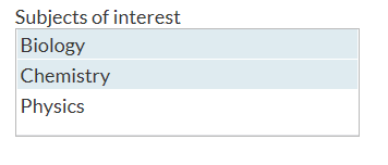
This example creates
a selection list called Subjects of interest and
has three choices: Biology, Chemistry, and Physics. The
defaultValue attribute
specifies the item or items that should be selected by default. Multiple
items are in a comma-separated list. In this example, item1 (Biology)
and item2 (Chemistry) are selected by default.<Option name="selectExample" inputType="select" multiple="true" defaultValue="item1, item2">Subjects of interest</Option> <Option name="item1" inputType="string">Biology</Option> <Option name="item2" inputType="string">Chemistry</Option> <Option name="item3" inputType="string">Physics</Option>
slider
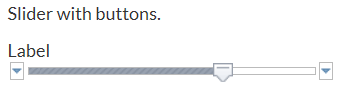
The first example in
the sample task definition creates a slider option with buttons.
<Option name="labelSliderEXAMPLE1" inputType="string">
      Slider with buttons.</Option>
<Option name="labelSliderEXAMPLE1" defaultValue="80.00"
   inputType="slider" discreteValues="14" minValue="-10"
   maxValue="120">Label</Option>
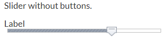
The second example in
the sample task definition creates a slider option without buttons.
<Option name="labelSliderEXAMPLE2"
   inputType="string">Slider without buttons.</Option>
<Option name="labelSliderEXAMPLE2" defaultValue="80.00"
   inputType="slider" discreteValues="14" minValue="-10"
   maxValue="120" showButtons="false">Label</Option>
string
The
string input
type can be used to display informational text to the user, to define
strings for the OptionChoice tags, and to
define string values that are used by the Velocity code.
The code for the sample
task definition contains several examples of the string input type.
In the code for the slider option, the explanatory text (Slider
with buttons) is created by the string input type.
<Option name="labelSliderEXAMPLE1" inputType="string">
   Slider with buttons.</Option>
<Option name="labelSliderEXAMPLE1" defaultValue="80.00"
   inputType="slider" discreteValues="14" minValue="-10"
   maxValue="120">Label</Option>
textbox
The
textbox input
type enables the user to enter multiple lines of text. This input
type has these attributes:
If you specify the
defaultValue attribute
with this input type, you can specify the initial string to display
in the text box. In this example, the text ’Enter
text here’ appears in the text box by default.
Note the use of single quotation marks around the text. This example
shows how you would include single quotation marks in your default
text. These quotation marks are not required.<Option name="textSimple" required="true" inputType="textbox"
defaultValue="'Enter text here'">Text Box</Option>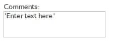
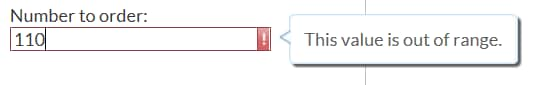
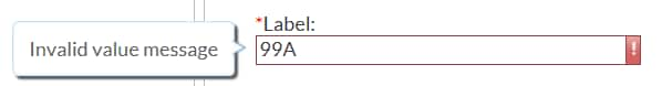
validationtext
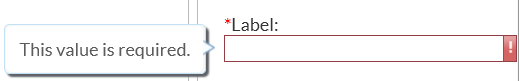
The code for the sample
task definition creates a text box called Label.
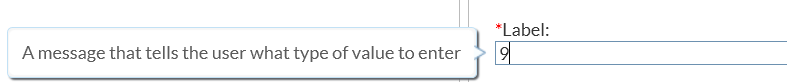
<Option name="validationTextExample" defaultValue="99999"
   inputType="validationtext"
   required="true"
   width="100%"
   promptMsg="A message that tells the user what type of value to enter"
   invalidMsg="Invalid value message"
   missingMsg="This value is required."
   regExp="\d{5}">Label:
</Option>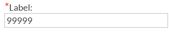
Specifying a Return Value Using the returnValue Attribute
For input types (such
as
combobox and select)
that enable users to select from a list of choices, the default behavior
is to return the name of the selected item in the list. However, because
the name attribute must be unique for every
option, this default behavior could be limiting in some scenarios.
When you specify the
returnValue attribute
on an Option element, the string that is
specified for the returnValue attribute is
returned instead of the name.
In this example, the
$vegetables Velocity variable has the value of 1, 2, or 3, depending
on what option item the user selected in the user interface. If you
do not specify the
returnValue attribute,
the Velocity variable returns carrots, peas, or corn.<Options>
<Option name="vegetables" inputType="select">Select a vegetable</Option>
<Option name="carrots" returnValue="1" inputType="string">Carrots</Option>
<Option name="peas" returnValue="2" inputType="string">Peas</Option>
<Option name="corn" returnValue="3" inputType="string">Corn</Option>
</Options>
<UI>
<Container option="OPTIONSTAB">
<Group option="GROUP1">
<OptionChoice option="vegetables">
<OptionItem option="carrots"/>
<OptionItem option="peas"/>
<OptionItem option="corn"/>
</OptionChoice>
</Group>
...
</Container>
</UI>
Populating the Values for a Select Control from a Source Control
About Data Linking
Data linking is a way
to populate a control based on the contents of another control. Data
linking is currently supported when a select control links to data
from a role or from the model effects builder. If the select control
links to anywhere else, any children in the
OptionChoice tag
are ignored.
Linking to a Role
If a select control
is linked to a role, the values in the select control are the current
list of roles in the roles option. In this example, the name of the
role variable is NUMVAR (specified in the
name attribute).
In the select control, the sourceLink attribute
links to NUMVAR.<DataSources>
<DataSource name="PRIMARYDATA">
<Roles>
<Role type="N" maxVars="0" order="true" minVars="0" name="NUMVAR"
exclude="VAR">Numeric Variable</Role>
</Roles>
</DataSource>
</DatatSources>
<Options>
<Option name="roleList" inputType="select" sourceLink="NUMVAR"/>
The Velocity variable
that is created for the select control is $roleList. The contents
of the $roleList variable mimic the output of a typical role control. For more information,
see How the Roles Elements Appear in the Velocity Code.
Linking to Effects from the Model Builder
If a select control
is linked to a
modelbuilder input type, the
values in the select control are the list of effects in the model
effects builder.
An additional attribute
called
sourceType can be used to set a filter
on the data that is sent to the select control. Currently, the only
defined filter is ‘filterClassification’. When this
filter is specified, only classification effects appear in the select
control.
In this example, the
modelbuilder control is named MEB. In the select control, the
sourceLink attribute
is linking to MEB, and the sourceType attribute
specifies the ‘filterClassification’ filter. As a result,
only classification effects appear in the source control.<Options>
<Option name="meb" inputType="modelbuilder" roleContinuous="CONTVARS"
roleClassification="CLASSVARS"/>
<Option name="mebList" inputType="select" sourceLink="MEB"
sourceType="filterClassification"/>
</Options>The Velocity variable
that is created for the select control is $mebList. The contents of
the $mebList variable mimic the output of the model effects builder. For more information,
see modelbuilder.
Another example is in
the Linear Regression task. In this task, the effects listed in the
model builder are the options for the Select the effects
to test option on the Options tab.
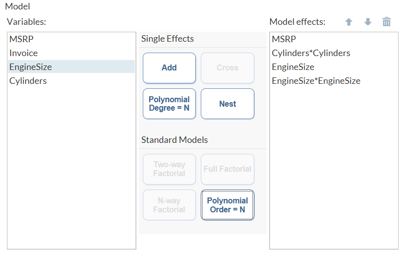
The Variables pane
in the model builder lists the variables that the user assigned to
either the Classification variables role
or the Continuous variables role. The user
can create main, crossed, nested, and polynomial effects. These effects
appear in the Model effects pane.
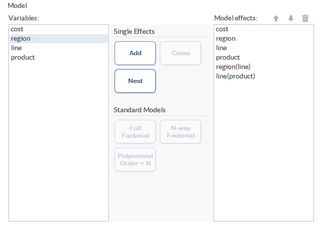
On the Options tab,
all classification effects are available from the Select
effects to test option.
Here are the relevant
portions of code from the Linear Regression task:
<Option inputType="string" name="modelGroup">MODEL EFFECTS</Option>
<Option inputType="string" name="modelTab">MODEL</Option>

1<Option inputType="modelbuilder" name="modelBuilder"
   excludeTools="POLYEFFECT,TWOFACT,THREEFACT,NFACTPOLY"
   roleClassification="classVariable"
   roleContinuous="continuousVariables"
   width="100%">Model</Option>
...
<Option inputType="string" name="multCompareGroup">Multiple Comparisons</Option>

2<Option indent="1" inputType="select" multiple="true" name="multCompareList"
   sourceLink="modelBuilder" sourceType="filterClassification">
   Select effects to test</Option>
| 1 | Creates the model builder on the Models tab. Classification variables and continuous variables can be used to create the model effects. |
| 2 | Creates
the Select effects to test option. The sourceLink attribute
specifies that the initial list of values for this option is the list
of model effects in the model builder. The sourceType attribute
filters the list generated by the sourceLink attribute.
The filterClassification filter specifies
that only effects that include the classification variable should
be available in the Select effects to test option.
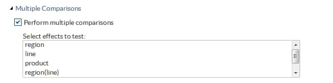
In the Perform
multiple comparisons option, the initial list of model
effects includes region, line, product, region(line), line(product),
and cost. However, cost is a continuous variable. When this list is
filtered, only the model effects that involve classification variables
(region, line, and product) are listed as values for the Select
effects to test option.
|
Copyright © SAS Institute Inc. All rights reserved.