Using Other Object Types in Reports
Use a Text Object
About Text Objects
Text objects display static text. You can use text to include company standards, such
as text that indicates confidentiality, in your reports. You can have hyperlinks in text. For more
information about links, see Create a Link from a Text Object. You can also use text to annotate
other objects in a report.
Specify Text Object Properties
To specify the properties
for a text object:
-
Update the general properties for the text. You can update the Name, Title, Format (for the title's font style), and Description.
-
(Optional) Update the object-specific properties for the text object. By default, the Enable selection in the viewers property is not selected for text objects. This means that users who view the report in the web viewer or a mobile device cannot select the text in a report.
Specify Text Object Styles
You can use the floating toolbar to change the font, font size, text color, and text background color. You can specify whether the text is bold,
italic, or underlined, and whether it is left-aligned, centered, or right-aligned.
You can also use the floating toolbar to create a link from a text object. For more
information, see Create a Link from a Text Object.
Tip
You can use the pop-up menu
to cut, copy, and delete text. However, you have to use the keyboard
shortcut (Ctrl+V) to paste text.
Note: You cannot change text styles
using the Styles tab.
Use an Image
About Images
You can use images to include your corporate logo or other graphics in your reports.
You can insert images from a repository or from your local machine. If you select an image from your local machine, it is saved to the repository. You
can also add tooltip text to an image.
Insert an Image into a Report
To insert an image
into a report:
-
Choose one of the following:
-
Drag the
 from the Objects tab in
the left pane and drop it onto the canvas. The Image Selection window
is displayed.
from the Objects tab in
the left pane and drop it onto the canvas. The Image Selection window
is displayed.
-
Select Insert
 OtherImage.
The Image Selection window is displayed. The image object is automatically placed in the canvas. If you
want the image to appear in a different location, then drag and drop it in a new location.
OtherImage.
The Image Selection window is displayed. The image object is automatically placed in the canvas. If you
want the image to appear in a different location, then drag and drop it in a new location.
-
-
Select the image from one of the following locations:Load from repositorySelect this option to choose an image that is stored on the same server as the reports.Load from local machineSelect this option to choose an image from your local machine. Click Browse to choose a file on your local machine. Specify a repository in the Save the local image to the repository field. If you click Browse, the Save As window is displayed. Select a folder and then click OK to return to the Image Selection window.A preview of the image is displayed.
-
(Optional) Specify the Scale type:NoneThe actual size of the image is maintained. The image might or might not fill the entire area of the image's visual container. If the image is larger than the visual container, then scroll bars are displayed.StretchThe height and width of image are set to the height and width of the image’s visual container. The image’s original aspect ratio is not maintained.Fit AllThe image is modified to fit best into the image's visual container. The image’s original aspect ratio is maintained.Fit WidthThe width of the image is set to the width of the image's visual container. The height maintains the image's original aspect ratio. Scroll bars are displayed if the set height of the image is greater than the height of the visual container.Fit HeightThe height of the image is set to the height of the image's visual container. The width maintains the image's original aspect ratio. Scroll bars are displayed if the set width of the image is greater than the width of the visual container.TileThe image is tiled in the visual container. The image’s original size is maintained. There are no scroll bars.
Specify Image Properties
To specify the properties
for an image:
-
Update the properties specific for the image. Your choices are Location, Scale type, and Tooltip text.By default, the Enable selection in the viewers property is not selected for images. This means that users who use the web viewer or a mobile device cannot select the image, and click
 to see the image name.
Use a Stored Process
About Stored Processes
A stored process is a SAS program that is stored on a server and that can be executed as requested
by client applications such as SAS Visual Analytics. The embedded SAS code can contain instructions for displaying report elements that include queries, prompted filters, titles, images, and statistical analyses.
You can add one or more stored processes to a report. You can edit the prompts for a stored process using the Properties tab in the designer. When you set the value for a prompt in the designer, that prompt value becomes the default value for the viewer.
Any prompts in a stored process must follow the guidelines for entering prompt values.
This is important if the stored process contains date values. See “Entering
Prompt Values in the SAS Stored Process Web Application” in the SAS Stored Processes: Developer's Guide.
You can also add a stored process report, which contains the predefined output from a stored process.
There are prerequisites for printing stored process output. For more
information, see Printing Reports.
There are limitations to where stored processes can be used in the designer:
-
A stored process cannot be used in the precision layout.
-
A stored process cannot be the source or target of an interaction in a report.
-
A stored process cannot be added to a container.
Note: Users who view stored processes
using SAS Mobile BI cannot be prompted. Instead, the stored process
runs using the prompt values that were added when the report was created.
Note: The stored process output
in a report is rendered as HTML regardless of the requested output
type.
For information about creating a stored process and registering it in metadata, see SAS Stored Processes: Developer's Guide.
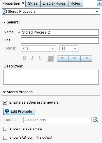
Specify Stored Process Properties
To specify the properties
for a stored process:
-
Update the properties specific to the stored process. Your choices are Show metadata view and Show SAS log in the output. If the stored process contains prompts, the Edit Prompts button is displayed.By default, the Enable selection in the viewers property is selected for stored processes. This means that users who use the web viewer or a mobile device can select the stored process, and click to see the stored process name.
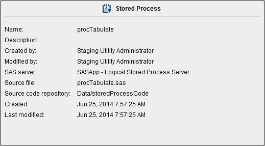
Click Edit Prompts to open a new window where you can edit the parameters for the stored process. Click OK to save your changes.Selecting the Show metadata view check box can make it easier to work with the stored process while you are designing a report. In the metadata view, you can see information about when the stored process was created and last modified. You can also see the name of the stored process file.Here is an example of the metadata view for a stored process:Selecting the Show SAS log in the output option means that both the log output and the stored process output are displayed in the report. This can assist you in debugging problems.
Use a Geo Map
About Geo Maps
Many types of data have
a spatial aspect, including demographics, marketing surveys, and customer
addresses. For example, if a user needs to evaluate population data
for U.S. Census tracts, a report designer could display the information
in a table. However, it would be easier and more effective for the
person using the report to see the information in the context of the
geography of the tracts. When evaluating information that has a spatial
component, users might find it easier to recognize relationships and
trends in the data if they see the information in a spatial context.
A geo map overlays your data on a geographic map. You can add a geo map only if the report uses data items from a data source that is enabled for geographic mapping.
You can create a filter or brush interaction between a geo map and another report
object in your report or dashboard. When you click on a specific region or city in the geo map, the other report object
filters or highlights to show the same location.
The following geo maps
are available in the designer:
Geo Bubble Map
A bubble plot that is overlaid on a geographic map. For a complete definition
and picture of a geo bubble map, see Other Report Objects.
A geo bubble map requires
a geography variable with the role type of geography.
Geo Coordinate Map
A simple scatter plot that is overlaid on a geographic map. For a complete definition
and picture of a geo coordinate map, see Geo Coordinate Maps.
A geo coordinate map
requires a geography variable with the role type of geography.
Geo Region Map
A two-dimensional map
that uses color combinations to represent different regions on the
map. For a complete definition and picture of a geo region map,
see Geo Region Maps.
A geo region map requires a geography variable with the role type of geography. However,
it does not support custom geography data items or ZIP code data.
Here are some key points
about geo maps:
-
Calculated data items and grouped category data items can be changed into geographic data items and used in geo maps.
-
When a Color data role and a display rule are applied to a geo bubble map or geo region map, the Color data role takes precedence over the display rule. The geo coordinate map does not have a Color data role. For more information about data roles, see Working with Data Role Assignments.
Specify Geo Map Properties
To specify the properties
for a geo bubble map, geo coordinate map, or geo region map:
-
Update the properties that are specific to the geo bubble map, geo coordinate map, or geo region map. You can update Show map navigation control, Transparency, and Show legend.Here are some details about the properties for geo maps:
-
Use the Map Service property to change the map provider for a geo bubble map, geo coordinate map, or geo region map after you have placed it on the canvas. This property changes the map type from OpenStreetMap to any available Esri service if an Esri service is available.
-
For a geo bubble map, you select the Transparency for the bubble plot. For a geo coordinate map, you select the Transparency for the scatter plot. For a geo region map, you select the Transparency for the regions.
-
Specify Styles for Geo Maps
To specify styles for
a geo bubble map, geo coordinate map, or geo region map:
Your custom colors are saved between SAS Visual Analytics sessions. Your custom colors are displayed in the color palette. For an example
of the color palette, see A Color Palette in the Designer.
Use a Gauge
About Gauges
A gauge is a dashboard indicator (also known as a KPI) that displays the status or measure
of a variable
or variables in relation to a target, goal, or interval. Gauges are designed to achieve
this goal in a way that is familiar to users. Many real-life objects use gauges, such as cars and machines. Gauges can be used to display a quantity, range, variable,
or status. They often appear in business intelligence dashboards.
Qualitative ranges are required for all gauges in the designer. You can populate the range intervals manually, or you can have them generated for you based on the
range of the actual data.
Gauges in the designer support high cardinality.
For a definition and a
picture of each gauge type, see Gauges.
Specify Gauge Properties
Starting in the 7.1 release, there is one gauge object on the Objects tab.
When the gauge is on the canvas, you can use Type on
the Properties tab to specify which type of gauge (bullet, dial, slider, speedometer, or thermometer) you want displayed in a report.
To specify properties
for a gauge:
-
Update the specific properties for the gauge. The available properties depend on the selected gauge type.Here are some details about the properties for gauges:
-
By default, the Enable selection in the viewers property is selected for gauges. This means that users who use the web viewer or a mobile device can select the gauge and click to see the gauge name and any incoming filter information.
-
(Optional) Clear Show value label, Show range labels, or both properties.
-
Select a Type for the gauge. You can choose Bullet, Dial, Slider, Speedometer, or Thermometer.
-
For the bullet, slider, and thermometer gauges, you can specify the Direction for displaying the gauge. The default for the bullet and slider gauges is Horizontal. The default for the thermometer gauge is Vertical.
-
Specify Gauge Styles
To specify styles for
gauges:
Your custom colors are saved between SAS Visual Analytics sessions. Your custom colors
are displayed in the color palette. For an example
of the color palette, see A Color Palette in the Designer.
Use a Word Cloud Object
About Word Cloud Objects
A word cloud displays a set of words from a character data item. Depending on the type of word cloud and your data roles, the size of each word in the cloud can indicate the relevance
of the word to a topic, the frequency of the word in a category, or the value of a
measure.
Every word cloud has a descending sort based on its size.
Tip
There is a limit of 100 rows
for a word cloud. To reduce the amount of data, add a rank for the
word cloud, and use a number less than 100. For more information,
see Add a New Rank.Word clouds support display rules and interactions.
Specify Word Cloud Properties
To specify the properties
for a word cloud:
-
Update the object-specific properties for the word cloud. Here are some details about the properties for word clouds:
-
By default, the Enable selection in the viewers property is selected for word clouds. This means that users who use the web viewer or a mobile device can select the word cloud, and click to see the word cloud name and any incoming filter
information.
-
Use the Arrangement property to specify how the words are displayed in the word cloud. Cloud is the default. Use Rows to display the words in rows as if you were reading text in a book.
-
Use the Font scale to control the difference in the size of the smallest and largest words. If you select 1, there is a one-to-one ratio, so the smallest and largest words are displayed as the same size.
-
By default, the word cloud has a limit of 100 terms. After the results of a query come back, only the top 100 terms, based on a descending sort of the size measure, will be displayed. Use the Word display limit property to display fewer terms. The slider can be set to a number between five and 100.
-
Specify Word Cloud Styles
To specify styles for
word clouds:
Your custom colors are saved between SAS Visual Analytics sessions. Your custom colors
are displayed in the color palette. For an example
of the color palette, see A Color Palette in the Designer.
Copyright © SAS Institute Inc. All rights reserved.