Working with Data Brushing

Overview of Data Brushing

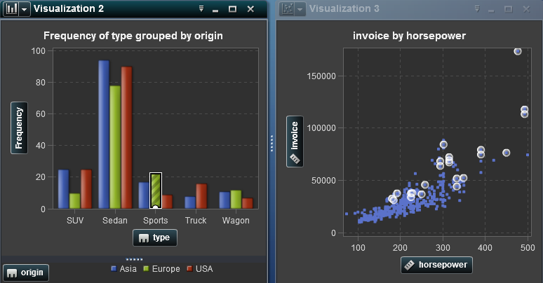
Data brushing is a feature of some visualizations that enables you to select data values in one visualization and highlight the corresponding data values in all of your other visualizations.
For example, you might have a bar chart and a scatter plot in your visual exploration. If you enable data brushing and you select a bar in the bar chart, then the markers in the scatter plot that correspond to the selected value in the bar chart are highlighted.
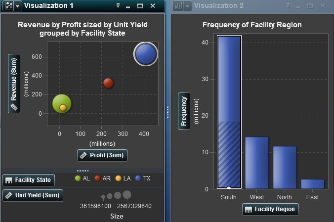
Data Brushing Example
A data brushing example
The following visualization types support data brushing:
  • bar chart
  • line chart
  • scatter plot
  • bubble plot (if the group role is assigned)
  • histogram
  • heat map (if categories are assigned to both axes)
  • geo map
  • treemap
For histograms, and for bar charts of frequency that are not grouped or latticed, data brushing can indicate the portion of a bar that corresponds to the brushed data. The bar is highlighted and then partially shaded to indicate the corresponding portion.
In Data Brushing with Partial Shading, a selection in a bubble plot highlights a portion of the corresponding bar in a bar chart.
Data Brushing with Partial Shading
Data Brushing Example Showing Partial Shading
For bar charts that have a measure assigned or that are grouped or latticed, the entire bar is highlighted.

Enable Data Brushing

To enable data brushing, select Viewthen selectData Brushing.

Select Values in a Visualization

You can select values in your visualization by using any of the following methods:
  • Click the data values. This is most useful for bar charts, histograms, and treemaps. To select multiple values, press the Ctrl key while clicking each value.
  • Click and drag to select values in a rectangular region. This is most useful for scatter plots and heat maps.
  • Select values in the table view for the visualization. Press Shift+click to select multiple adjacent values, or Ctrl+click to select or deselect individual values.