Overview of Analyzing Your Data
SAS Visual Analytics
enables you to perform two basic types of data analysis:
Both correlation and regression analysis are applied
together when you enable correlation analysis.
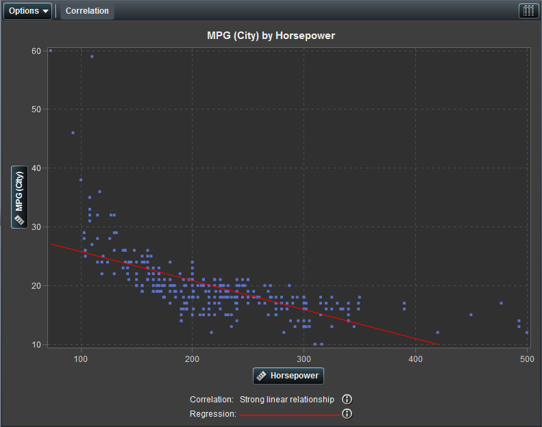
For visualizations that
contain a single plot, the correlation is identified by a text label
in the legend and the regression is identified by a red line.
A Basic Scatter Plot with Analysis Enabled displays a
scatter plot with analysis enabled.
A Basic Scatter Plot with Analysis Enabled
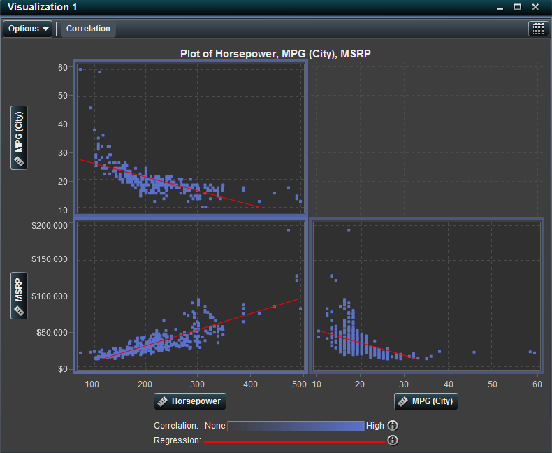
For visualizations that
contain a plot matrix, the correlation for plot is identified by a
colored border around the plot. The regression is identified by a
red line in each plot.
A Scatter Plot Matrix with Analysis Enabled displays a
scatter plot matrix with analysis enabled.
A Scatter Plot Matrix with Analysis Enabled