Working with Box Plots

About Box Plots

A box plot represents the distribution of data values by using rectangular box and lines called whiskers.
Parts of a Box Plot
Parts of a Box Plot
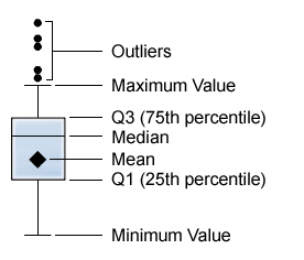
Parts of a Box Plot shows a diagram of a box plot. The bottom and top edges of the box indicate the interquartile range (IQR). That is, the range of values that are between the first and third quartiles (the 25th and 75th percentiles). The marker inside the box indicates the mean value. The line inside the box indicates the median value.
The whiskers (lines protruding from the box) indicate the range of values that are outside of the interquartile range but are close enough not to be considered outliers.
Outliers are data points whose distance from the interquartile range is greater than 1.5 times the size of the interquartile range.
Note: If there are a large number of outlier points, then the outliers are represented by a bar. The data tip for the bar displays additional information about the outlier points.

Specify Properties for a Box Plot

On the Properties tab, you can specify the following options:
Name
specifies the name of the visualization.
Graph title
specifies the title that appears above the graph.
Note: The Graph title is disabled if you select Generate graph titles.
Generate graph titles
specifies that the graph title is generated automatically based on the data items in the visualization.
Show grid lines
displays grid lines for each tick on the response axis.
Box direction
specifies whether the boxes are vertical or horizontal.
Overview
specifies whether the chart overview is enabled.
Measure layout
specifies whether the measures share a single response axis (Shared axis) or have separate response axes for each measure (Separate axes).
Note: The Measure layout option is disabled if your visualization contains exactly one measure.
Show averages
displays the mean value as a marker inside the box.
Show outliers
shows outlier points outside of the whiskers. Outliers are data points whose distance from the interquartile range is greater than 1.5 times the size of the interquartile range.
Category label policy
specifies how the values for the category axis are displayed when there is not enough space. Select one of the following options:
Automatic
specifies that the visualization will select the best label policy according to your data and the space requirements.
Stagger
places the labels with an alternating vertical offset.
Thin
displays a subset of the labels.
Rotate
displays the labels at an angle
Note: The Category label policy option has no effect when you select a horizontal box orientation.

Data Roles for a Box Plot

The basic data roles for a box plot are categories and measures. You can assign one category only, and the values of the category are plotted on the category axis. You can assign many measures, and the measure values are plotted on the response axis. At least one measure is required.
In addition to the basic data roles, you can assign additional roles:
Horizontal series
creates a horizontal series of charts for each value of the category data item that you assign.
Vertical series
creates a vertical series of charts for each value of the category data item that you assign.