| Exploring Data in Three Dimensions |
Example: A Rotating Scatter Plot
In this section you create a rotating plot to explore the relationships between the wind_kts, latitude, and longitude variables of the Hurricanes data set. The wind_kts variable gives the wind speed in knots for each observation.
None of the variables in this example have missing values. If an observation has a missing value for any of the three variables in the rotating plot, that observation is not plotted.
| Open the Hurricanes data set. |
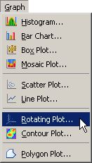
| Select Graph |
|
Figure 7.1: Selecting a Rotating Plot
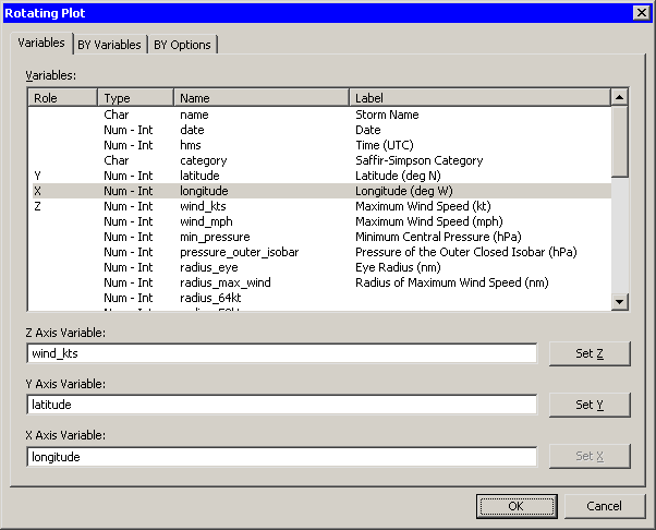
A dialog box appears as in Figure 7.2.
| Select the wind_kts variable, and click Set Z. |
| Select the latitude variable, and click Set Y. |
| Select the longitude variable, and click Set X. |
| Click OK. |
|
Figure 7.2: The Rotating Plot Dialog Box
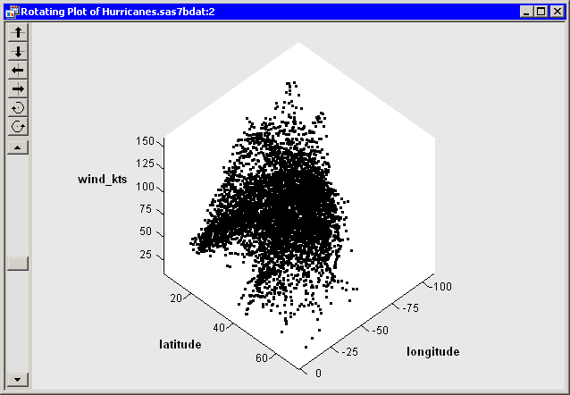
A rotating plot appears (Figure 7.3), showing a cloud of
points. You can rotate the plot by clicking the icons on the left side
of the plot. The top two buttons rotate the plot about a horizontal
axis. The next two buttons rotate the plot about a vertical axis. The
last two buttons rotate the plot clockwise and counterclockwise. The
slider below the buttons controls the speed of rotation.
Alternatively, you can rotate the plot by moving the mouse pointer
into a corner of the plot until the pointer changes (to
![]() ). You can interactively rotate the plot by holding
down the left mouse button while you move the mouse.
). You can interactively rotate the plot by holding
down the left mouse button while you move the mouse.
|
Figure 7.3: A Rotating Plot
You can click on an observation in a rotating plot to select the observation. You can click while holding down the CTRL key to select multiple observations. You can also drag out a selection rectangle to select multiple observations.
You can create rotating plots of any variables, numeric or character.
Because there are so many observations in the rotating plot, some observations obscure others - a phenomenon known as overplotting. It also can be difficult to discern the coordinates of observations as they are positioned in three-dimensional space. That is, which observations are "closer" to the viewer?
A visualization technique that sometimes helps distinguish observations with similar projected coordinates is to color the observations. For these data, you can color the observations according to the wind_kts variable.
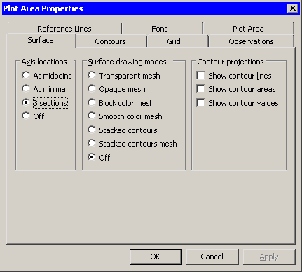
| Right-click near the center of the plot, and select Plot Area Properties from the pop-up menu. |
The dialog box in Figure 7.4 appears.
|
Figure 7.4: Plot Area Properties for a Rotating Plot
| Click the Observations tab, as shown in Figure 7.5. |
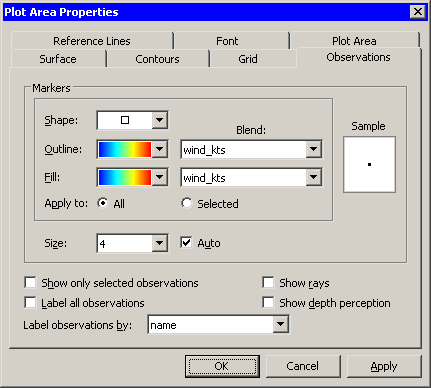
|
Figure 7.5: Observations Tab for a Rotating Plot
| Select wind_kts from the Outline: Blend list. |
| Select a gradient colormap from the Outline list. |
| Select the same options for the Fill: Blend and Fill lists. |
| Select name from the Label observations by list. |
The last step specifies that the name of the cyclone should appear when you click on an observation. By default the observation number is used as a label.
You can update the plot to apply the options you have selected so far.
| Click Apply. |
You can optionally use two additional features to aid in visualizing these data.
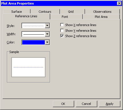
| Click the Reference Lines tab, as shown in Figure 7.6. |
| Select Show Z reference lines. |
| Click Apply. |
When you click Apply, the plot updates to show reference lines
at each tick on the axis for the Z variable (in this case,
wind_kts). The reference lines are displayed in Figure 7.8.
|
Figure 7.6: Reference Lines Tab for a Rotating Plot
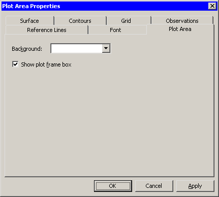
| Click the Plot Area tab, as shown in Figure 7.7. |
| Select Show plot frame box. |
| Click OK. |
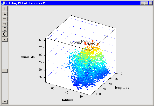
The rotating plot updates (Figure 7.8 ) to reflect the
options you selected. You can rotate the plot to observe how wind
speeds in these tropical cyclones vary according to latitude and
longitude. You can click on interesting observations and see the name
of the storms they represent.
|
Figure 7.7: Plot Area Tab for a Rotating Plot
You can see that
the storms with the strongest winds tend to occur west of 45 degrees west
latitude, and roughly between 12 and 32 degrees north latitude. You
can also see that many storm tracks appear to begin in southern
latitudes heading west or northwest, then later turn north and
northeast as they approach higher latitudes. The wind speed along a
track tends to increase over warm water and decrease over land or
cooler water.
|
Figure 7.8: A Rotating Plot with Selected Observations
Copyright © 2008 by SAS Institute Inc., Cary, NC, USA. All rights reserved.