| Axis Properties |
Example
You can change the default tick marks for the axis of an interval variable by following these steps.
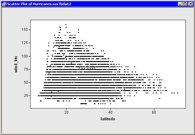
| Open the Hurricanes data set, and create a scatter plot of wind_kts versus latitude. |
The scatter plot appears as in Figure 10.1. Note that the
latitude axis has only a few tick marks. You might decide to add a
few additional tick marks.
|
Figure 10.1: A Scatter Plot
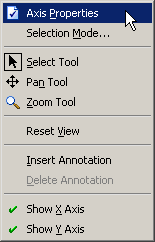
| Right-click on the horizontal axis of the plot, and select Axis Properties from the pop-up menu, as shown in Figure 10.2. |
|
Figure 10.2: The Axis Pop-up Menu
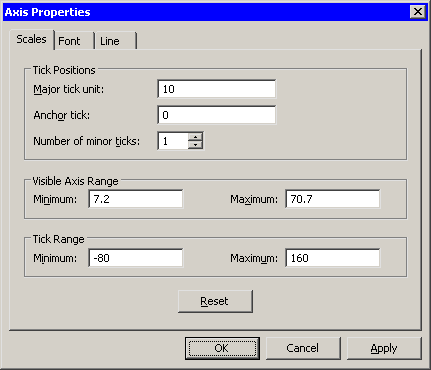
The Axis Properties dialog box appears, as shown in
Figure 10.3. Note that this is a quick way to determine the
anchor location, tick unit, and tick range for an axis.
|
Figure 10.3: Axis Properties Dialog Box
| Change the Anchor tick value to 0. |
| Change the Major tick unit value to 10. |
| Change the Number of minor ticks value to 1. |
| Click OK. |
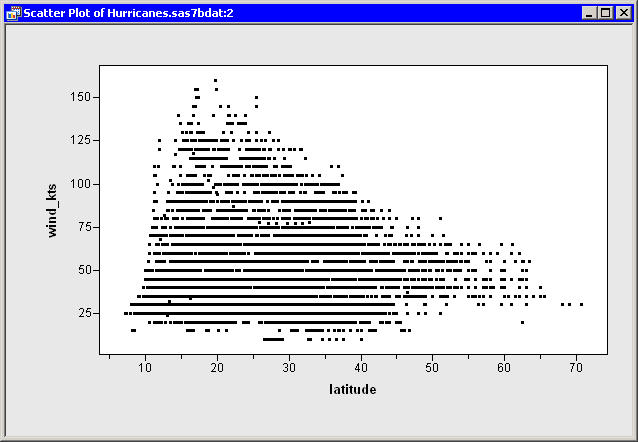
The latitude axis updates, as shown in Figure 10.4.
|
Figure 10.4: A Scatter Plot with Custom Tick Marks
Copyright © 2008 by SAS Institute Inc., Cary, NC, USA. All rights reserved.