| Exploring Data in One Dimension |
Example
In this section you create a bar chart of the category variable of the Hurricanes data set. The category variable gives the Saffir-Simpson wind intensity category for each observation.
The category variable is encoded according to the value of wind_kts, as shown in Table 5.1.
Table 5.1: The Saffir-Simpson Intensity Scale| Category | Description | Wind Speed (knots) |
|---|---|---|
| TD | Tropical Depression | 22 - 33 |
| TS | Tropical Storm | 34 - 63 |
| Cat1 | Category 1 Hurricane | 64 - 82 |
| Cat2 | Category 2 Hurricane | 83 - 95 |
| Cat3 | Category 3 Hurricane | 96 - 113 |
| Cat4 | Category 4 Hurricane | 114 - 134 |
| Cat5 | Category 5 Hurricane | 135 or greater |
The category variable also has missing values, representing weak intensities (wind speed less than 22 knots).
| Open the Hurricanes data set. |
| Select Graph |
|
Figure 5.1: Selecting a Bar Chart
A dialog box appears as in Figure 5.2.
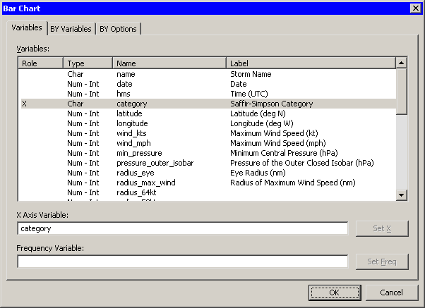
| Select the category variable, and click Set X. |
| Click OK. |
Note: The bar chart also supports an optional frequency variable.
|
Figure 5.2: The Bar Chart Dialog Box
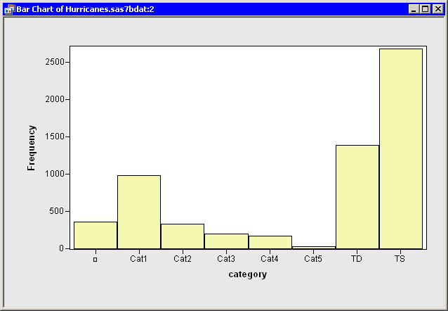
A bar chart appears (Figure 5.3), showing the unique values of the category
variable. The chart shows that most of the observations in the data
set are for tropical storms and tropical depressions. There are
relatively few category 5 hurricanes.
|
Figure 5.3: A Bar Chart
The category variable has missing values.
The set of
missing values are grouped together and represented by a bar labeled
with the ![]() symbol.
symbol.
You can click on a bar to select the observations contained in that bar. You can click while holding down the CTRL key to select observations in multiple bars. You can drag out a selection rectangle to select observations in contiguous bars.
You can create bar charts of any nominal variable, numeric or character.
Copyright © 2008 by SAS Institute Inc., Cary, NC, USA. All rights reserved.