| Multivariate Analysis: Correlation Analysis |
Example
In this example, you explore correlations and bivariate relationships between variables in the Hurricanes data set. The data are for North Atlantic tropical cyclones from 1988 to 2003. The data set includes information about each storm's latitude (in the latitude variable), its sustained low-level winds (wind_kts), its central atmospheric pressure (min_pressure), and the size of its eye (radius_eye). A full description of the Hurricanes data set is included in Appendix A, "Sample Data Sets."
| Open the Hurricanes data set. |
| Select Analysis |
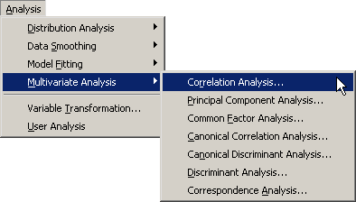
|
Figure 25.1: Selecting the Correlation Analysis
A dialog box appears as in Figure 25.2.
You can select variables for the analysis
by using the Variables tab.
| Select latitude. While holding down the CTRL key, select wind_kts, min_pressure, and radius_eye, and click Add Y. |
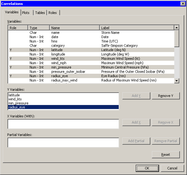
|
Figure 25.2: The Variables Tab
| Click the Plots tab. |
The Plots tab (Figure 25.3) becomes active.
| Select Matrix of pairwise scatter plots. |
| Click OK. |
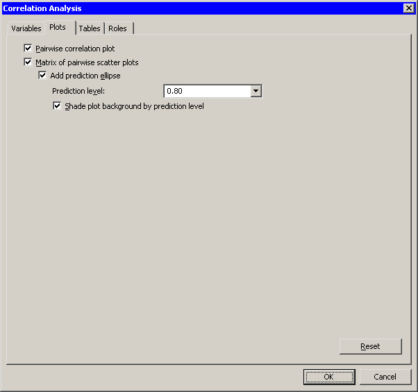
|
Figure 25.3: The Plots Tab
The analysis calls the CORR procedure, which uses the options
specified in the dialog box. The procedure displays tables in the
output document, as shown in Figure 25.4. The
"Simple Statistics" table (not shown in the figure) displays
basic statistics such as the mean, standard
deviation, and range of each variable.
The "Pearson Correlation Coefficients" table displays the correlation coefficients between pairs of variables. In addition, the table gives the number of nonmissing observations for each pair of variables, and tests the hypothesis that the coefficient is zero.
Note that the number of observations used to compute the correlation coefficients can vary. For example, there are no missing values in the latitude of wind_kts variables, so the correlation coefficient for this pair is computed using all 6188 observations in the data set. In contrast, only 745 values for radius_eye are nonmissing, reflecting the fact that not all cyclones have well-defined eyes.
For these data, the correlation between min_pressure and wind_kts is strong and negative, with a value near -0.93. This is not surprising, since winds are determined by a pressure gradient. Although not as strong, there is also negative correlation between latitude and min_pressure. In contrast, the correlation between latitude and radius_eye is positive. The correlation between the following pairs of variables is not significantly different from zero: latitude and wind_kts, radius_eye and wind_kts, and radius_eye and min_pressure.
These results are graphically summarized in the pairwise correlations
plot, shown in the upper-right corner of Figure 25.4.
This plot is not linked to the original data set because it has a
different number of observations.
However, you can view the data table
underlying this plot by pressing the F9 key when the plot is active.
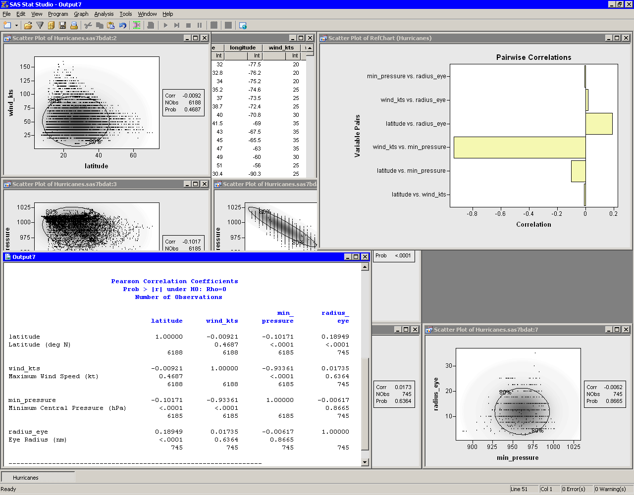
|
Figure 25.4: Output from a Correlation Analysis
Partly visible in Figure 25.4 is the matrix of pairwise scatter plots between the variables. Some of these plots are hidden by the output window and the pairwise correlation plot. You can use the Workspace Explorer to view all the scatter plots.
| Close the pairwise correlation plot. |
| Press ALT+X to open the Workspace Explorer. |
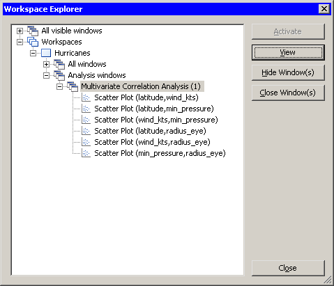
You can use the Workspace Explorer to manage the display of plots. The Workspace Explorer is described in the section "Workspace Explorer" of Chapter 11.
| Select the entry in the Workspace Explorer labeled Multivariate Correlation Analysis, as shown in Figure 25.5. |
| Click View. |
The scatter plots associated with the analysis appear in front of other windows.
| Click Close to close the Workspace Explorer. |
|
Figure 25.5: Selecting a Group of Plots
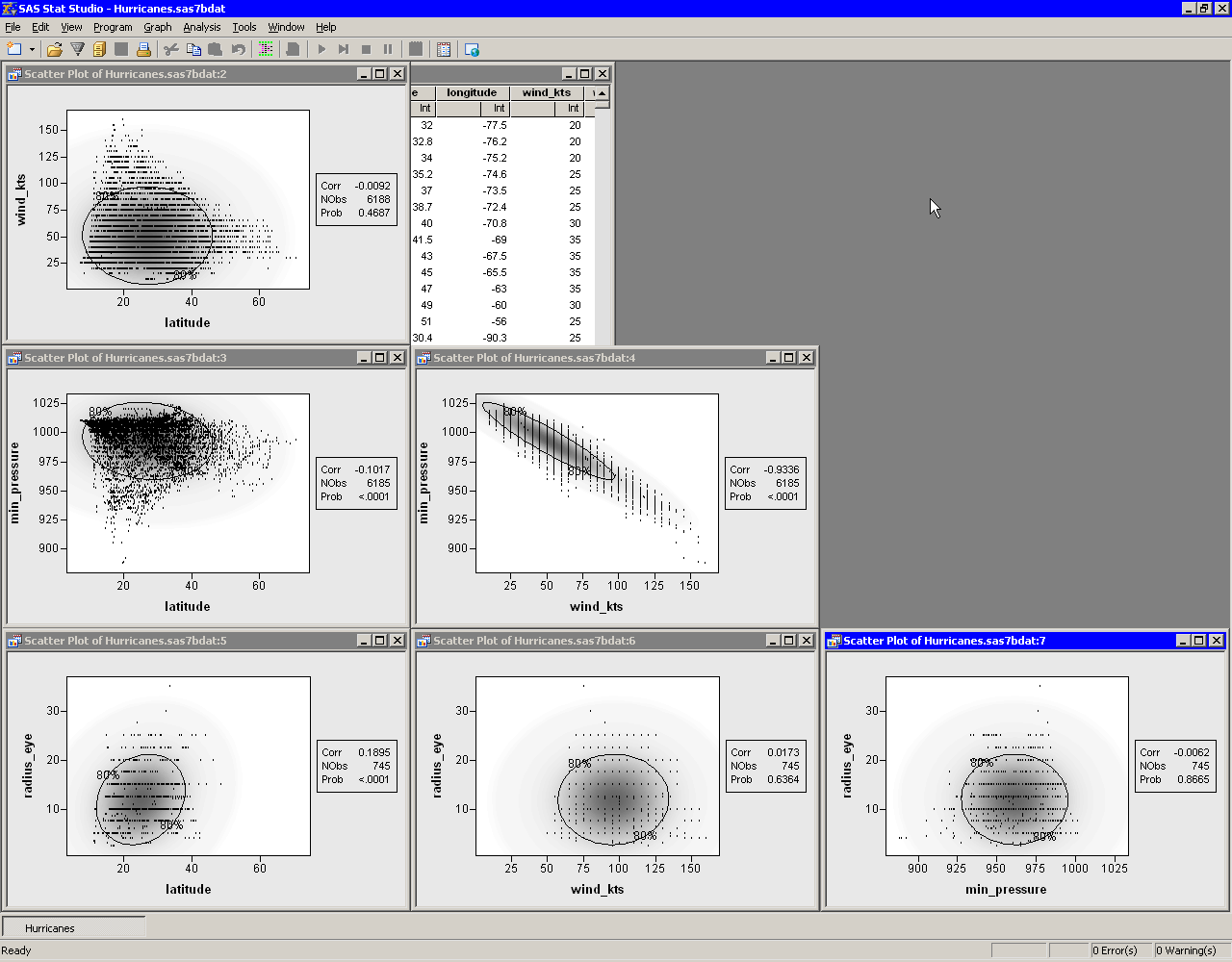
The workspace is now arranged as shown in Figure 25.6.
The ellipses show where
the specified percentage of the data should lie,
assuming a bivariate normal distribution.
Under bivariate normality, the percentage of
observations falling inside the ellipse should
closely agree with the specified level.
The plots also contain a gradient shading that indicates a
nested sequence of ellipses. The darkest shading occurs at
the bivariate means for each pair of variables. The lightest shading
corresponds to 0.9999 probability.
Variables that are bivariate normal have most of their observations
close to the bivariate mean and have a bivariate density that is
proportional to the gradient shading. The plot of wind_kts
versus latitude shows that these two variables are not bivariate
normal. Similarly, min_pressure and latitude are not
bivariate normal.
|
Figure 25.6: A Matrix of Scatter Plots
The variables wind_kts and min_pressure are highly
correlated and linearly related.
In contrast, wind_kts is not
correlated with latitude or radius_eye, although
you can still notice certain relationships:
- Cyclones with high wind speeds occur only at lower latitudes.
- Cyclones north of 43 degrees of latitude tend to have wind speeds less than 75 knots.
- The size of a cyclone's eye seems to be unrelated to the speed of its winds.
The matrix of scatter plots also reveals an aspect of the data that might not be apparent from univariate plots. The plots involving wind_kts and radius_eye show a granular appearance that indicates the data are rounded. Most of the wind speed measurements are rounded to the nearest five knots, whereas the values for the eye radius are rounded to the nearest 2.5 nautical miles. (You can also find observations for these variables that are not rounded.)
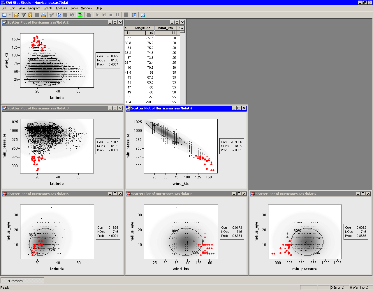
Figure 25.7 shows another use of the scatter plot
matrix. Some observations with extreme values of min_pressure
and wind_kts are selected. The marker shape and color for these
observations were changed to make them more noticeable. You can use
this technique to investigate whether outliers for one pair of
variables are, in fact, multivariate outliers with respect to
multivariate normality. Most of the selected data in
Figure 25.7 are inside the 80% ellipse for
the radius_eye versus latitude scatter plot. This
indicates that these data are not far from the mean in those
variables. However, a few observations (corresponding to Hurricane
Hugo when it was category 5) do appear to be multivariate outliers in
these variables.
|
Figure 25.7: Selecting Bivariate Outliers
Copyright © 2008 by SAS Institute Inc., Cary, NC, USA. All rights reserved.