| Multivariate Analysis: Correspondence Analysis |
Example
In this example, you examine data from 1991 about 127 companies from five nations in four industries. The companies are from Britain, France, Germany, Japan, and the United States. The companies are in the following industries: automobiles, electronics, food, and oil.
| Open the Business data set. |
Table 31.1 shows a contingency table of the number of companies in each Industry for each Nation. The goal of this example is to use correspondence analysis to examine relationships between and among the Nation and Industry variables.
Table 31.1: Contingency Table of Industry and Nation| Nation | |||||
| Industry | Britain | France | Germany | Japan | U.S. |
|---|---|---|---|---|---|
| Automobiles | 2 | 3 | 5 | 14 | 7 |
| Electronics | 1 | 3 | 1 | 12 | 11 |
| Food | 11 | 2 | 0 | 11 | 19 |
| Oil | 2 | 2 | 1 | 5 | 13 |
| Select Analysis |
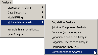
|
Figure 31.1: Selecting the Correspondence Analysis
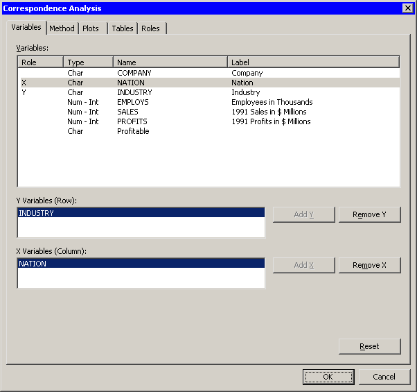
A dialog box appears as in Figure 31.2.
You can select variables for the analysis
by using the Variables tab. In Table 31.1,
the levels of Industry specify the rows of the table and are displayed along the vertical
dimension of the table. Thus Industry is the Y variable whose
values determine the rows. Similarly, Nation is the X variable
whose values determine the columns.
| Select Industry and click Add Y. |
| Select Nation and click Add X. |
|
Figure 31.2: The Variables Tab
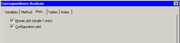
| Click the Plots tab. |
The Plots tab (Figure 31.3) becomes active.
| Select Mosaic plot (single Y only). |
|
Figure 31.3: The Plots Tab
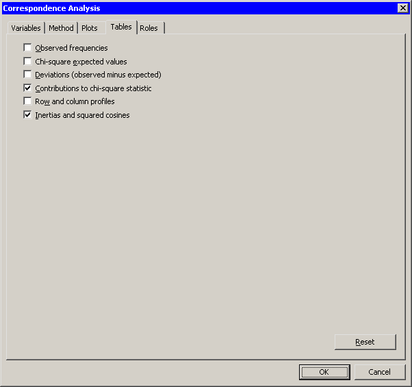
| Click the Tables tab. |
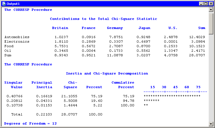
The Tables tab (Figure 31.3) becomes active. For this example, it is informative to see how each cell, column, and row of Table 31.1 contributes to the chi-square association statistic for the table.
| Select Contributions to chi-square statistic. |
|
Figure 31.4: The Tables Tab
| Click OK. |
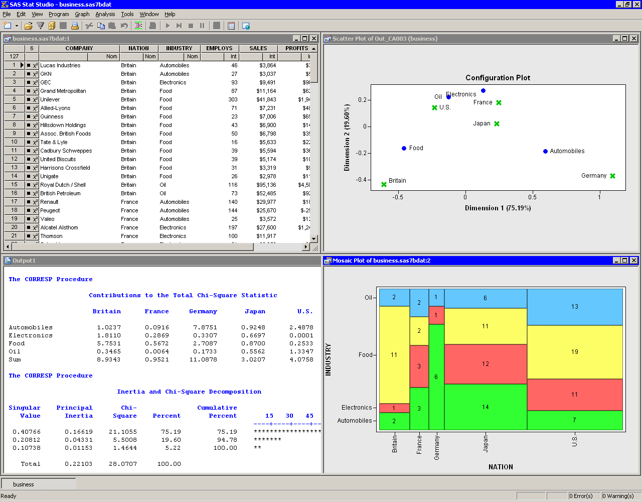
The analysis calls the CORRESP procedure. The procedure uses the options specified in the dialog box. The procedure displays tables in the output document, as shown in Figure 31.5. Two plots are also created.
The mosaic plot indicates the frequency count for each cell in the contingency table. You can add labels to the cells of the mosaic plot to make the frequency count more evident.
| Activate the mosaic plot. Press the "l" key (lowercase "L") to toggle labels. |
|
Figure 31.5: Output from a Correspondence Analysis
The mosaic plot shows several interesting facts. The British companies
are not evenly divided among industries; many British
companies in these data are food companies. Similarly, the lack of
German food companies is evident, as is the preponderance of German
automobile companies. The United States has the largest proportion of
oil companies.
Correspondence analysis plots all the categories in a Euclidean space. The first two dimensions of this space are plotted in a configuration plot, shown in the upper-right corner of Figure 31.5. As indicated by the labels for the axes, the first principal coordinate accounts for 75% of the inertia, while the second accounts for almost 20%. Thus, these two principal coordinates account for almost 95% of the inertia in this example. The plot should be thought of as two different overlaid plots, one for each categorical variable. Distances between points within a variable have meaning, but distances between points from different variables do not.
The configuration plot summarizes association between categories, and indicates the contribution to the chi-square statistic from each cell. To interpret the plot, start by interpreting the row points: the categories of Industry. The points for food and automobiles are farthest from the origin, so these industries contribute the most to the chi-square statistic. Oil and electronics contribute relatively less to the chi-square statistic.
For the column points, the points for the United States, France, and Japan are near the origin, so these countries contribute a relatively small amount to the chi-square statistic. The points for Britain and Germany are far from the origin; they make relatively large contributions to the chi-square statistic.
The "Contributions to the Total Chi-Square Statistic" table in Figure 31.6 displays the contributions to the chi-square statistic for each industry and country. The last column summarizes the contributions for industry. Automobiles (12.4) and food (10.15) contribute the most, a fact apparent from the configuration plot. Similarly, the last row summarizes the contributions for countries. Britain and Germany make the largest contributions.
The "Inertia and Chi-Square Decomposition" table summarizes the
chi-square decomposition. The first two components account for almost
95% of the chi-square association.
|
Figure 31.6: Contributions to the Chi-Square Statistic
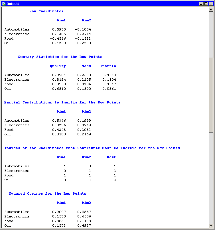
The next series of tables summarize the correspondence analysis for
the row variable (Industry). These tables are shown in
Figure 31.7.
The "Row Coordinates" table displays the coordinates of the various industries in the configuration plot. The "Summary Statistics" table displays various statistics, including the so-called quality of the representation. Categories with low quality values (for example, oil) are not well represented by the two principal coordinates. The quality statistic is equal to the sum of the squared cosines, which are displayed in the last table of Figure 31.7. The squared cosines are the square of the cosines of the angles between each axis and a vector from the origin to the point. Thus, points with a squared cosine near 1 are located near a principal coordinate axis, and so have high quality.
The "Partial Contributions to Inertia" table indicates how much of the total inertia is accounted for by each category in each dimension. This table corresponds to the spread of the points in the configuration plot in the horizontal and vertical dimensions. In the first principal coordinate, automobiles and food contribute the most. In the second principal coordinate, electronics contributes the most, although the contributions are more evenly spread across categories.
For further details, see the
"Algorithm and Notation" and "Displayed Output" sections
of the documentation for the CORRESP procedure.
|
Figure 31.7: Output from a Correspondence Analysis
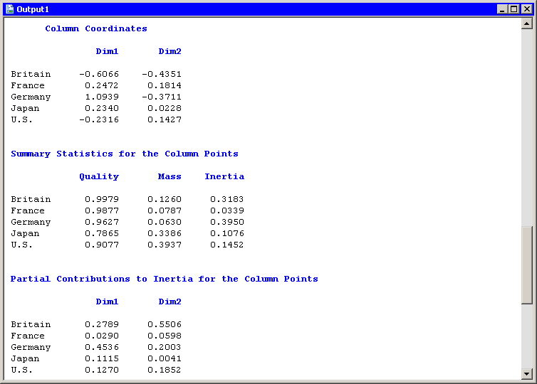
The analysis of the countries is similar. Figure 31.8
shows a partial view of the related statistics.
Note that the quality statistic helps explain a seeming discrepancy
in the configuration plot (Figure 31.5).
From the configuration plot (and from the ``Column
Coordinates'' table), it is apparent that the point representing Japan
is closer to the origin than the point representing France.
It is tempting to conclude that
Japan contributes less to the chi-square statistic than France. But
the "Contributions to the Total Chi-Square Statistic"
table in Figure 31.6 and the "Partial Contributions to Inertia"
table in Figure 31.8 show that the opposite is true.
The contradictory evidence can be resolved by noticing that the
quality statistic for Japan is only 0.787. That value is the sum of
the squared cosines for each dimension. The squared cosine for the
second dimension is nearly zero, indicating that Japan's
position is almost completely
determined by the first dimension.
|
Figure 31.8: Output from a Correspondence Analysis
Note that you cannot compare row points with column points in the
configuration plot. For example, you cannot compare the distance from
the origin for electronics to the distance for Japan and draw any
meaningful conclusions.
However, you can interpret associations between rows and columns. For example, the first principal coordinate shows a greater association with being British and being a food company than would be expected if these two categories were independent. Similarly, the association between being German and being an automobile company is greater than expected under the assumption of independence.
Copyright © 2008 by SAS Institute Inc., Cary, NC, USA. All rights reserved.