| Getting Started: Exploratory Data Analysis of Tropical Cyclones |
Modeling Variable Relationships
In this section you model the relationship between wind speed and atmospheric pressure for tropical cyclones. The scatter plot in Figure 2.13 shows a strong negative correlation between wind speed and pressure. To compute the correlation between these variables, you can run Stat Studio's correlation analysis. The results in this section assume that you have excluded observations with low wind speeds as described in the "Creating a Bar Chart" section.
Note: You can select from the Analysis or Graph menu only when the active window is a data table or a graph. Click on a window's title bar to make it the active window.
| Select Analysis |
The correlation dialog box appears as in Figure 2.14.
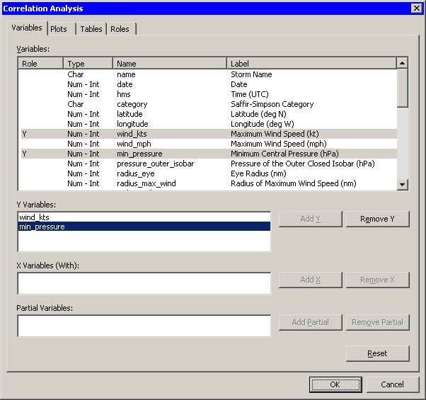
| Click on the wind_kts variable. Hold down the CTRL key, click on the min_pressure, and click Add Y. |
Both variables are added to the list of Y variables.
|
Figure 2.14: Correlations Analysis Dialog Box
| Click the Plots tab. |
| Clear the Pairwise correlation plot check box. |
| Click OK. |
See Chapter 25, "Multivariate Analysis: Correlation Analysis," for more information about the correlations analysis.
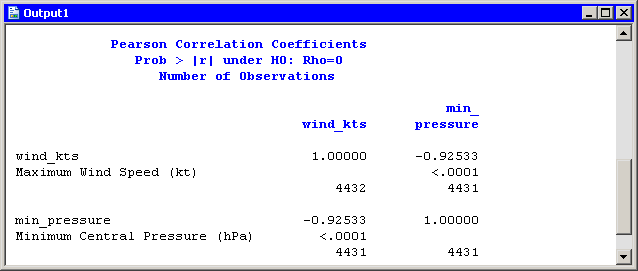
An output window appears (Figure 2.15), showing the results
from the CORR procedure. The output shows that the Pearson correlation
between wind_kts and min_pressure is - 0.92533.
|
Figure 2.15: Output from the CORR Procedure
Suppose you want to compute a linear model that relates wind_kts
to min_pressure. Several choices of parametric and
nonparametric models are available from the Analysis ![]() Model
Fitting menu. If you are interested in a response due to
a single explanatory variable, you can also choose from models
available from the Analysis
Model
Fitting menu. If you are interested in a response due to
a single explanatory variable, you can also choose from models
available from the Analysis ![]() Data Smoothing menu.
Data Smoothing menu.
Note: If the scatter plot of wind_kts
versus min_pressure is the active window prior to
your choosing an analysis from the Analysis ![]() Data Smoothing menu, then the
data smoother is added to the existing scatter plot. Otherwise, a new
scatter plot is created by the analysis.
Data Smoothing menu, then the
data smoother is added to the existing scatter plot. Otherwise, a new
scatter plot is created by the analysis.
| Activate the scatter plot of wind_kts
versus min_pressure. Select Analysis |
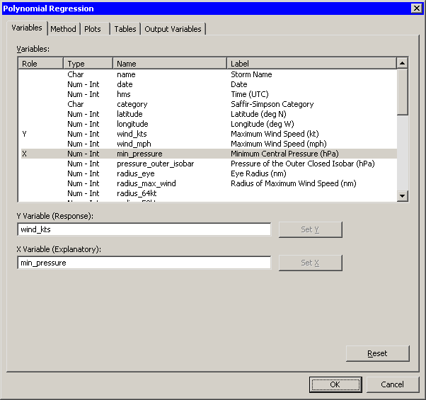
The polynomial regression dialog box appears as in
Figure 2.16.
|
Figure 2.16: Polynomial Smoother Dialog Box
| Select the variable wind_kts, and click Set Y. |
| Select the variable min_pressure, and click Set X. |
| Click OK. |
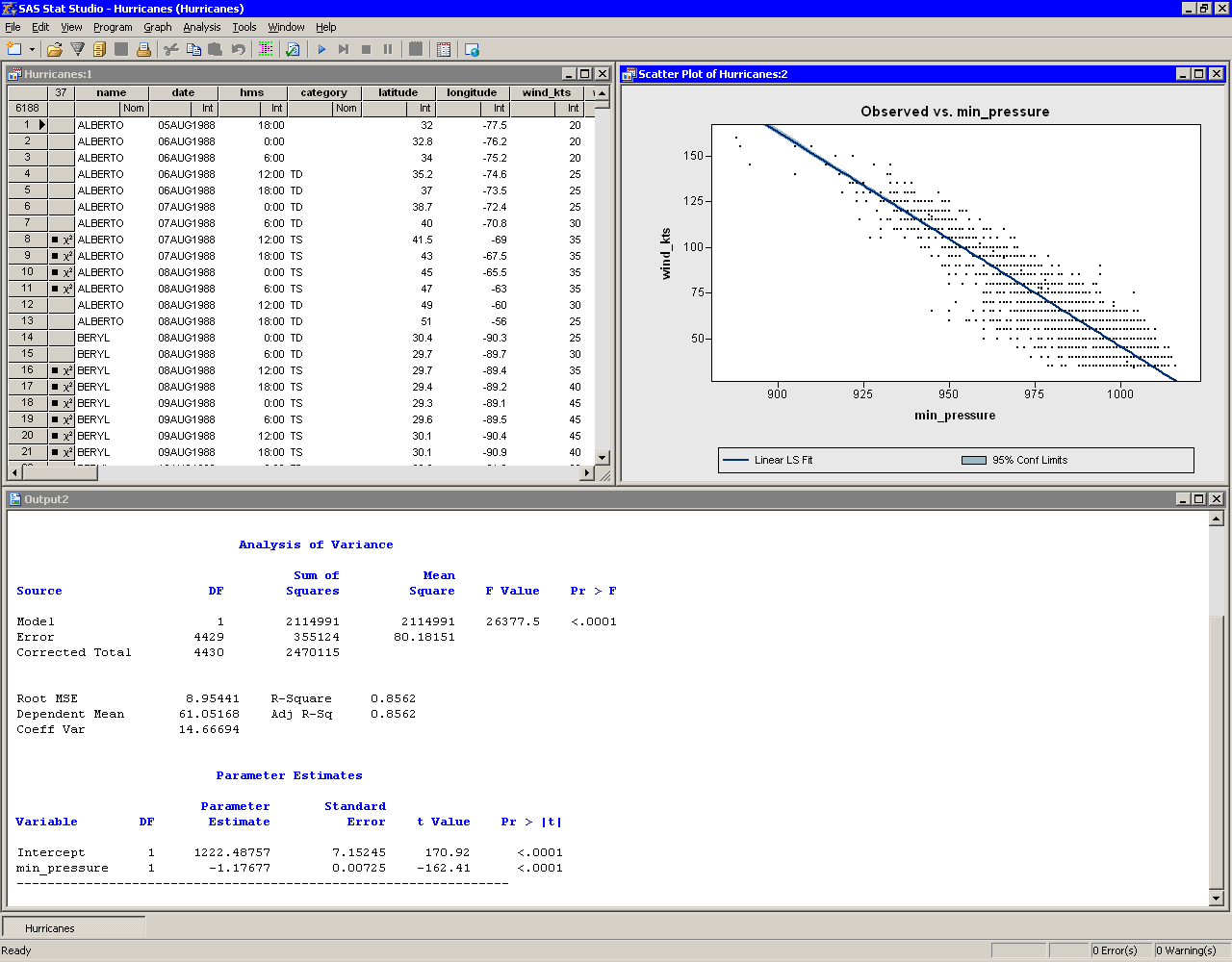
A scatter plot appears (Figure 2.17), and output from the REG
procedure is added at the bottom of the output window.
|
Figure 2.17: Least-Squares Regression
The output from the REG procedure indicates an R-square value of
0.8562 for the line of least squares given approximately by
![]() . The
scatter plot shows this line and a 95% confidence band for the
predicted mean. The confidence band is very thin, indicating high
confidence in the means of the predicted values.
. The
scatter plot shows this line and a 95% confidence band for the
predicted mean. The confidence band is very thin, indicating high
confidence in the means of the predicted values.
Copyright © 2008 by SAS Institute Inc., Cary, NC, USA. All rights reserved.