| Model Fitting: Generalized Linear Models |
Exploring the Data
You can use box plots to explore how blood pressure changes according to the levels of drug and disease. The section "Box Plots" describes how to create a box plot.
| Select Graph |
The following steps add an indicator of the mean and standard deviation of each group to the box plot.
| Right-click near the center of the scatter plot, and select Plot Area Properties from the pop-up menu. |
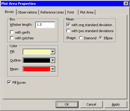
A dialog box appears, as shown in Figure 24.2. You can use the
Boxes tab to change attributes of the box plot.
|
Figure 24.2: The Box Plot Dialog Box
| Select Mean: with one standard deviation. |
| Click OK. |
Note: As a shortcut to the previous three steps, you can press the "m" key while the box plot window is active to toggle the display of means and standard deviations.
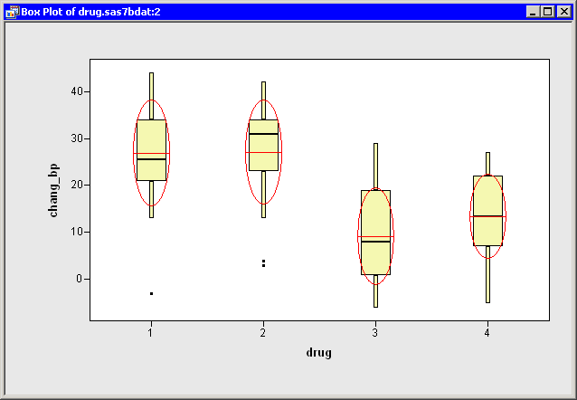
The box plot is shown in Figure 24.3.
The mean change in blood pressure for drug 1 and drug 2 is higher
than the mean change for drug 3 and drug 4
(averaged over all three levels of disease).
This difference might indicate that the main effect
for drug should be included in a model for predicting chang_bp.
|
Figure 24.3: Blood Pressure Grouped by Drug
| Repeat the previous steps to create a box plot of chang_bp versus disease. Add means and standard deviations to the plot. |
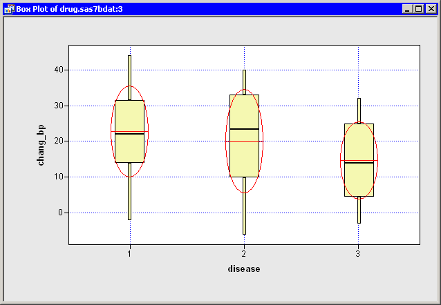
A box plot that groups the response by disease is shown in
Figure 24.4. The means for these groups vary
according to the values of disease.
The differences between the three disease levels
are not as pronounced as those observed for drug.
Still, the plot indicates that
disease might be a factor in predicting chang_bp.
|
Figure 24.4: Blood Pressure Grouped by Disease
Copyright © 2008 by SAS Institute Inc., Cary, NC, USA. All rights reserved.