| Model Fitting: Generalized Linear Models |
The Plots Tab
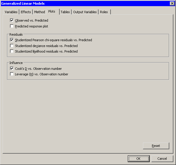
You can use the Plots tab (Figure 24.23) to create plots that graphically display results of the analysis. There are plots that help you to visualize the fit, the residuals, and various influence diagnostics.
Creating a plot often adds one or more variables to the data table. For a multinomial response, residuals and influence diagnostics are not available, so the only possible plot for multinomial data is the predicted response plot.
The following plots are available:
- Observed vs. Predicted
- creates a scatter plot of the Y variables versus the predicted values, overlaid with the diagonal line that represents a perfect fit.
- Predicted response plot
-
creates a line plot of the predicted probability versus the continuous
explanatory variable. This plot is created only if the following
conditions are satisfied:
- There is exactly one continuous explanatory variable.
- There are three or fewer classification variables.
- There are 12 or fewer joint levels of the classification variables.
 plots, where
  is the number of response levels.
- Pearson chi-square residuals vs. Predicted
- creates a scatter plot of the residuals versus the predicted probabilities.
- Deviance residuals vs. Predicted
- creates a scatter plot of the deviance residuals versus the predicted probabilities.
- Likelihood residuals vs. Predicted
- creates a scatter plot of the likelihood residuals versus the predicted probabilities.
- Cook's D vs. Observation number
-
creates a scatter plot of Cook's
 statistic for each observation.
- Leverage (H) vs. Observation number
- creates a scatter plot of the leverage statistic for each observation.
|
Figure 24.23: The Plots Tab
Copyright © 2008 by SAS Institute Inc., Cary, NC, USA. All rights reserved.