| Introduction to Power and Sample Size Analysis |
| Highly Customized Graphs (POWER, GLMPOWER) |
Example 68.8 of Chapter 68, The POWER Procedure, demonstrates various ways you can modify and enhance plots created in the GLMPOWER or POWER procedures:
assigning analysis parameters to axes
fine-tuning a sample size axis
adding reference lines
linking plot features to analysis parameters
choosing key (legend) styles
modifying symbol locations
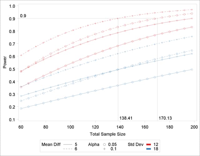
For example, replace the default PLOT statement with the following statement to modify the graphical results in Figure 18.2 to lower the minimum sample size to 60, show a reference line at power=0.9 with corresponding sample size values, distinguish standard deviation by color instead of panel, and swap the roles of  and mean difference:
   plot
      min=60
      yopts=(ref=0.9 crossref=yes)
      vary(color by stddev, linestyle by meandiff, symbol by alpha);
Figure 18.3 shows the results. The plot reveals that only the scenarios with the largest mean difference and smallest standard deviation achieve a power of at least 0.9 for this sample size range.
Copyright © SAS Institute, Inc. All Rights Reserved.