| The REG Procedure |
| Traditional Graphics |
This section provides examples of using options available with the traditional graphics that you request with the PLOT statement. An alternative is to use ODS Graphics to obtain plots relevant to the analysis. See Example 73.1, Example 73.2, and Example 73.5 for examples of obtaining graphical displays with ODS Graphics. Examples in this section use the Fitness data set that is described in Example 73.2.
Traditional Graphics for Simple Linear Regression
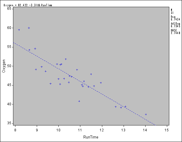
The following statements introduce the basic PLOT statement graphics syntax. A simple linear regression of Oxygen on RunTime is performed, and a plot of Oxygen RunTime is requested. The fitted model, the regression line, and the four default statistics are also displayed in Figure 73.43.
   proc reg data=fitness;
      model Oxygen=RunTime;
      plot Oxygen*RunTime / cframe=ligr;
   run;
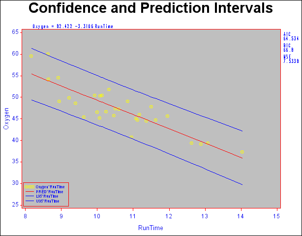
You can use shorthand commands to plot the dependent variable, the predicted value, and the 95% confidence or prediction intervals against a regressor. The following statements use the CONF and PRED options to create a plot with confidence and prediction intervals. Results are displayed in Figure 73.44. Note that the statistics displayed by default in the margin are suppressed while three other statistics are exhibited. Furthermore, global graphics LEGEND and SYMBOL statements and PLOT statement options are used to control the appearance of the plot. For more information about the global graphics statements, see SAS/GRAPH Software: Reference.
   legend1 position=(bottom left inside)
           across=1 cborder=red offset=(0,0)
           shape=symbol(3,1) label=none
           value=(height=.8);
   title 'Confidence and Prediction Intervals';
   symbol1 c=yellow v=- h=1;
   symbol2 c=red;
   symbol3 c=blue;
   symbol4 c=blue;

   proc reg data=fitness;
      model Oxygen=RunTime / noprint;
      plot Oxygen*RunTime / pred nostat mse aic bic
           caxis=red ctext=blue cframe=ligr
           legend=legend1 modellab='         ';
   run;
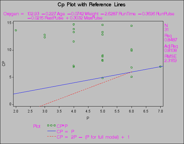
Traditional Graphics for Variable Selection
When you use the SELECTION= option in the MODEL statement, you can produce plots showing model fit summary statistics for the models examined. The following statements produce the plot shown in Figure 73.45 of the  statistic for model selection plotted against the number of parameters in the model; the CHOCKING= and CMALLOWS= options draw useful reference lines.
   goptions ctitle=black   htitle=3.5pct ftitle=swiss
            ctext =magenta htext =3.0pct ftext =swiss
            cback =ligr    border;
   symbol1 v=circle c=red h=1 w=2;
   title 'Cp Plot with Reference Lines';
   symbol1 c=green;
   proc reg data=fitness;
      model Oxygen=Age Weight RunTime RunPulse RestPulse MaxPulse
            / selection=rsquare noprint;
      plot cp.*np.
           / chocking=red  cmallows=blue
             vaxis=0 to 15 by 5;
   run;
In the GOPTIONS statement,
- BORDER
frames the entire display.
- CBACK=
specifies the background color.
- CTEXT=
selects the default color for the border and all text, including titles, footnotes, and notes.
- CTITLE=
specifies the title, footnote, note, and border color.
- HTEXT=
specifies the height for all text in the display.
- HTITLE=
specifies the height for the first title line.
- FTEXT=
selects the default font for all text, including titles, footnotes, notes, the model label and equation, the statistics, the axis labels, the tick values, and the legend.
- FTITLE=
specifies the first title font.
For more information about the GOPTIONS statement and other global graphics statements, see SAS/GRAPH Software: Reference.
Plot with Reference Lines
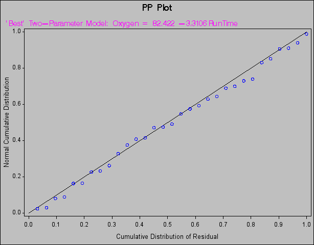
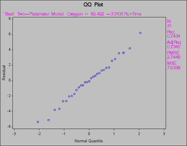
Traditional Normal Quantile and Normal Probability Plots
The following statements create probability-probability plots and quantile-quantile plots of the residuals (Figure 73.46 and Figure 73.47, respectively). An annotation data set is created to produce the (0,0) (1,1) reference line for the P-P plot. Note that the NOSTAT option for the P-P plot suppresses the statistics that would be displayed in the margin.
   data annote1;
      length function color $8;
      retain ysys xsys '2' color 'black';
      function='move';
         x=0;
         y=0;
         output;
      function='draw';
         x=1;
         y=1;
         output;
   run;

   symbol1 c=blue;
   proc reg data=fitness;
      title 'PP Plot';
      model Oxygen=RunTime / noprint;
      plot npp.*r.
           / annotate=annote1 nostat cframe=ligr
             modellab="'Best' Two-Parameter Model:";
   run;
      title 'QQ Plot';
      plot r.*nqq.
           / noline mse cframe=ligr
             modellab="'Best' Two-Parameter Model:";
   run;
Copyright © 2009 by SAS Institute Inc., Cary, NC, USA. All rights reserved.