XCHART Statement: SHEWHART Procedure

Creating Charts for Means from Raw Data
Note: See Mean (X-BAR) Chart Examples in the SAS/QC Sample Library.
Subgroup samples of five parts are taken from the manufacturing process at regular intervals, and the width of a critical
gap in each part is measured in millimeters. The following statements create a SAS data set named Partgaps, which contains the gap width measurements for 21 samples:
data Partgaps;
   input Sample @;
   do i=1 to 5;
      input Partgap @;
      output;
   end;
   drop i;
   label Partgap='Gap Width'
         Sample ='Sample Index';
   datalines;
 1 255 270 268 290 267
 2 260 240 265 262 263
 3 238 236 260 250 256
 4 260 242 281 254 263
 5 268 260 279 289 269
 6 270 249 265 253 263
 7 280 260 256 256 243
 8 229 266 250 243 252
 9 250 270 245 273 262
10 248 258 247 266 256
11 280 251 252 270 287
12 245 253 243 279 245
13 268 260 289 275 273
14 264 286 275 271 279
15 271 257 263 247 247
16 291 250 273 265 266
17 228 253 240 260 264
18 270 260 269 245 276
19 259 257 246 271 257
20 252 244 230 266 248
21 254 251 239 233 263
;
A partial listing of Partgaps is shown in Figure 18.96.
Figure 18.96: Partial Listing of the Data Set Partgaps
The data set Partgaps is said to be in "strung-out" form, because each observation contains the sample number and gap width measurement for a single
part. The first five observations contain the gap widths for the first sample, the second five observations contain the gap
widths for the second sample, and so on. Because the variable Sample classifies the observations into rational subgroups, it is referred to as the subgroup-variable. The variable Partgap contains the gap width measurements and is referred to as the process variable (or process for short).
The within-subgroup variability of the gap widths is known to be stable. You can use an  chart to determine whether their mean level is in control. The following statements create the chart shown in Figure 18.97:
ods graphics off;
title 'Mean Chart for Gap Widths';
proc shewhart data=Partgaps;
   xchart Partgap*Sample;
run;
This example illustrates the basic form of the XCHART statement. After the keyword XCHART, you specify the process to analyze (in this case, Partgap) followed by an asterisk and the subgroup-variable (Sample). The input data set is specified with the DATA=
option in the PROC SHEWHART statement.
Each point on the chart represents the average (mean) of the measurements for a particular sample. For instance, the mean plotted for the first
sample is
![\[ \frac{255 + 270 + 268 + 290 + 267}{5} = 270 \; \]](images/qcug_shewhart0257.png)
Figure 18.97: Chart for Gap Width Data (Traditional Graphics)
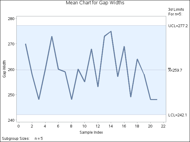
Because all of the subgroup means lie within the control limits, it can be concluded that the mean level of the process is in statistical control.
By default, the control limits shown are  limits estimated from the data; the formulas for the limits are given in Table 18.55. You can also read control limits from an input data set; see Reading Preestablished Control Limits.
For computational details, see Constructing Charts for Means. For details on reading raw measurements, see DATA= Data Set.