PROBPLOT Statement: CAPABILITY Procedure

Dictionary of Options
The following sections provide detailed descriptions of options specific to the PROBPLOT statement. See Dictionary of Common Options: CAPABILITY Procedure for detailed descriptions of options common to all the plot statements.
General Options
You can specify the following options whether you are producing ODS Graphics output or traditional graphics:
- ALPHA=value-list|EST
-
specifies values for a mandatory shape parameter

 for probability plots requested with the BETA
, GAMMA
, PARETO
, and POWER
options. A plot is created for each value specified. For examples, see the entries for the distribution options. If you specify
ALPHA=EST, a maximum likelihood estimate is computed for .
for probability plots requested with the BETA
, GAMMA
, PARETO
, and POWER
options. A plot is created for each value specified. For examples, see the entries for the distribution options. If you specify
ALPHA=EST, a maximum likelihood estimate is computed for .
- BETA(ALPHA=value-list|EST BETA=value-list|EST <beta-options>)
-
creates a beta probability plot for each combination of the shape parameters
and  given by the mandatory ALPHA=
and BETA=
options. If you specify ALPHA=EST and BETA=EST, a plot is created based on maximum likelihood estimates for and . In the following examples, the first PROBPLOT statement produces one plot, the second statement produces four plots, the
third statement produces six plots, and the fourth statement produces one plot:
given by the mandatory ALPHA=
and BETA=
options. If you specify ALPHA=EST and BETA=EST, a plot is created based on maximum likelihood estimates for and . In the following examples, the first PROBPLOT statement produces one plot, the second statement produces four plots, the
third statement produces six plots, and the fourth statement produces one plot:
proc capability data=measures;
   probplot width / beta(alpha=2 beta=2);
   probplot width / beta(alpha=2 3 beta=1 2);
   probplot width / beta(alpha=2 to 3 beta=1 to 2 by 0.5);
   probplot width / beta(alpha=est beta=est);
run;
To create the plot, the observations are ordered from smallest to largest, and the ith ordered observation is plotted against the quantile
 , where
  is the inverse normalized incomplete beta function, n is the number of nonmissing observations, and and are the shape parameters of the beta distribution. The horizontal axis is scaled in percentile units.
The point pattern on the plot for ALPHA=
and BETA= tends to be linear with intercept  and slope
  if the data are beta distributed with the specific density function
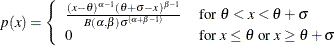
where
 and
and  lower threshold parameter
  scale parameter
 first shape parameter
  second shape parameter
The intercept and slope are based on the quantile scale for the horizontal axis, which is displayed on a Q-Q plot; see QQPLOT Statement: CAPABILITY Procedure.
To obtain graphical estimates of
and , specify lists of values for the ALPHA=
and BETA=
options, and select the combination of and that most nearly linearizes the point pattern.
To assess the point pattern, you can add a diagonal distribution reference line corresponding to
 and
and  with the beta-options THETA= and SIGMA=. Alternatively, you can add a line corresponding to estimated values of and with the beta-options THETA=EST and SIGMA=EST. Specify these options in parentheses, as in the following example:
proc capability data=measures;
   probplot width / beta(alpha=2 beta=3 theta=4 sigma=5);
run;
Agreement between the reference line and the point pattern indicates that the beta distribution with parameters
, , and is a good fit. You can specify the SCALE=
option as an alias for the SIGMA=
option and the THRESHOLD= option as an alias for the THETA=
option.
- BETA=value-list|EST
-
specifies values for the shape parameter
for probability plots requested with the BETA
distribution option. A plot is created for each value specified with the BETA= option. If you specify BETA=EST, a maximum
likelihood estimate is computed for . For examples, see the preceding entry for the BETA
option.
- C=value(-list)|EST
-
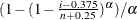
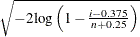
specifies the shape parameter c (c > 0) for probability plots requested with the WEIBULL and WEIBULL2 options. You must specify C= as a Weibull-option with the WEIBULL option; in this situation it accepts a list of values, or if you specify C=EST, a maximum likelihood estimate is computed for c. You can optionally specify C=value or C=EST as a Weibull2-option with the WEIBULL2 option to request a distribution reference line; in this situation, you must also specify SIGMA=value or SIGMA=EST.
For example, the first PROBPLOT statement below creates three three-parameter Weibull plots corresponding to the shape parameters c = 1, c = 2, and c = 3. The second PROBPLOT statement creates a single three-parameter Weibull plot corresponding to an estimated value of c. The third PROBPLOT statement creates a single two-parameter Weibull plot with a distribution reference line corresponding to
 and
and  .
.
proc capability data=measures;
   probplot width / weibull(c=1 2 3);
   probplot width / weibull(c=est);
   probplot width / weibull2(c=2 sigma=3);
run;
-
EXPONENTIAL<(exponential-options)>
EXP(<exponential-options>) -
creates an exponential probability plot. To create the plot, the observations are ordered from smallest to largest, and the ith ordered observation is plotted against the quantile
 , where n is the number of nonmissing observations. The horizontal axis is scaled in percentile units.
The point pattern on the plot tends to be linear with intercept
and slope if the data are exponentially distributed with the specific density function
where
is a threshold parameter, and is a positive scale parameter.
The intercept and slope are based on the quantile scale for the horizontal axis, which is displayed on a Q-Q plot; see QQPLOT Statement: CAPABILITY Procedure.
To assess the point pattern, you can add a diagonal distribution reference line corresponding to
and with the exponential-options THETA= and SIGMA=. Alternatively, you can add a line corresponding to estimated values of and with the exponential-options THETA=EST and SIGMA=EST.
Specify these options in parentheses, as in the following example:
proc capability data=measures;
   probplot width / exponential(theta=4 sigma=5);
run;
Agreement between the reference line and the point pattern indicates that the exponential distribution with parameters
and is a good fit. You can specify the SCALE=
option as an alias for the SIGMA=
option and the THRESHOLD= option as an alias for the THETA=
option.
- GAMMA(ALPHA=value-list|EST <gamma-options> )
-
creates a gamma probability plot for each value of the shape parameter
given by the mandatory ALPHA=
option. If you specify ALPHA=EST, a plot is created based on a maximum likelihood estimate for .
For example, the first PROBPLOT statement below creates three plots corresponding to
 ,
,  , and
, and  . The second PROBPLOT statement creates a single plot.
proc capability data=measures;
   probplot width / gamma(alpha=0.4 to 0.6 by 0.2);
   probplot width / gamma(alpha=est);
run;
To create the plot, the observations are ordered from smallest to largest, and the ith ordered observation is plotted against the quantile
 , where
  is the inverse normalized incomplete gamma function, n is the number of nonmissing observations, and is the shape parameter of the gamma distribution. The horizontal axis is scaled in percentile units.
The point pattern on the plot for ALPHA=
tends to be linear with intercept and slope if the data are gamma distributed with the specific density function
 where threshold parameter scale parameter shape parameter
The intercept and slope are based on the quantile scale for the horizontal axis, which is displayed on a Q-Q plot; see QQPLOT Statement: CAPABILITY Procedure.
To obtain a graphical estimate of
, specify a list of values for the ALPHA=
option, and select the value that most nearly linearizes the point pattern.
To assess the point pattern, you can add a diagonal distribution reference line corresponding to
and with the gamma-options THETA= and SIGMA=. Alternatively, you can add a line corresponding to estimated values of and with the gamma-options THETA=EST and SIGMA=EST.
Specify these options in parentheses, as in the following example:
proc capability data=measures;
   probplot width / gamma(alpha=2 theta=3 sigma=4);
run;
Agreement between the reference line and the point pattern indicates that the gamma distribution with parameters
, and is a good fit. You can specify the SCALE=
option as an alias for the SIGMA=
option and the THRESHOLD= option as an alias for the THETA=
option.
- GRID
-
draws reference lines perpendicular to the percentile axis at major tick marks.
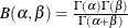
- GUMBEL(<Gumbel-options>)
-
creates a Gumbel probability plot. To create the plot, the observations are ordered from smallest to largest, and the ith ordered observation is plotted against the quantile
 , where n is the number of nonmissing observations. The horizontal axis is scaled in percentile units.
The point pattern on the plot tends to be linear with intercept
 and slope if the data are Gumbel distributed with the specific density function
![\[ p(x) = \frac{e^{-(x-\mu )/\sigma }}{\sigma } \exp \left( -e^{-(x-\mu )/\sigma }\right) \]](images/qcug_capability0622.png)
where
is a location parameter and is a positive scale parameter.
The intercept and slope are based on the quantile scale for the horizontal axis, which is displayed on a Q-Q plot; see QQPLOT Statement: CAPABILITY Procedure.
To assess the point pattern, you can add a diagonal distribution reference line corresponding to
 and with the Gumbel-options MU=
and SIGMA=
. Alternatively, you can add a line corresponding to estimated values of and with the Gumbel-options MU=EST and SIGMA=EST.
Specify these options in parentheses following the GUMBEL option.
and with the Gumbel-options MU=
and SIGMA=
. Alternatively, you can add a line corresponding to estimated values of and with the Gumbel-options MU=EST and SIGMA=EST.
Specify these options in parentheses following the GUMBEL option.
Agreement between the reference line and the point pattern indicates that the Gumbel distribution with parameters
and is a good fit.
-
LOGNORMAL(SIGMA=value-list|EST <lognormal-options>)
LNORM(SIGMA=value-list|EST <lognormal-options>) -
creates a lognormal probability plot for each value of the shape parameter
given by the mandatory SIGMA=
option or its alias, the SHAPE=
option. If you specify SIGMA=EST, a plot is created based on a maximum likelihood estimate for .
For example, the first PROBPLOT statement below produces two plots, and the second PROBPLOT statement produces a single plot:
proc capability data=measures;
   probplot width / lognormal(sigma=1.5 2.5 l=2);
   probplot width / lognormal(sigma=est);
run;
To create the plot, the observations are ordered from smallest to largest, and the ith ordered observation is plotted against the quantile
 , where
  is the inverse standard cumulative normal distribution, n is the number of nonmissing observations, and is the shape parameter of the lognormal distribution. The horizontal axis is scaled in percentile units.
The point pattern on the plot for SIGMA=
tends to be linear with intercept and slope  if the data are lognormally distributed with the specific density function
 where threshold parameter
  scale parameter shape parameter
The intercept and slope are based on the quantile scale for the horizontal axis, which is displayed on a Q-Q plot; see QQPLOT Statement: CAPABILITY Procedure.
To obtain a graphical estimate of
, specify a list of values for the SIGMA=
option, and select the value that most nearly linearizes the point pattern.
To assess the point pattern, you can add a diagonal distribution reference line corresponding to
and  with the lognormal-options THETA= and ZETA=. Alternatively, you can add a line corresponding to estimated values of and with the lognormal-options THETA=EST and ZETA=EST.
Specify these options in parentheses, as in the following example:
proc capability data=measures;
   probplot width / lognormal(sigma=2 theta=3 zeta=0);
run;
Agreement between the reference line and the point pattern indicates that the lognormal distribution with parameters
, , and is a good fit. See Example 5.20 for an example.
You can specify the THRESHOLD= option as an alias for the THETA= option and the SCALE= option as an alias for the ZETA= option.
- MU=value|EST
-
specifies the mean
for a probability plot requested with the GUMBEL
and NORMAL
options. If you specify MU=EST, is equal to the sample mean for the normal distribution. For the Gumbel distribution, a maximum likelihood estimate is calculated.
See Example 5.19.
- NADJ=value
-
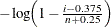
specifies the adjustment value added to the sample size in the calculation of theoretical percentiles. The default is
 , as recommended by Blom (1958). Also refer to Chambers et al. (1983) for additional information.
- NOLEGEND
-
suppresses legends for specification limits, fitted curves, distribution lines, and hidden observations.
-
NOLINELEGEND
NOLINEL -
suppresses the legend for the optional distribution reference line.
-
NORMAL<(normal-options)>
NORM<(normal-options)> -
creates a normal probability plot. This is the default if you do not specify a distribution option. To create the plot, the observations are ordered from smallest to largest, and the ith ordered observation is plotted against the quantile
 , where is the inverse cumulative standard normal distribution, and n is the number of nonmissing observations. The horizontal axis is scaled in percentile units.
The point pattern on the plot tends to be linear with intercept
and slope
if the data are normally distributed with the specific
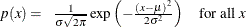
where
is the mean and is the standard deviation ( ).
).
The intercept and slope are based on the quantile scale for the horizontal axis, which is displayed on a Q-Q plot; see QQPLOT Statement: CAPABILITY Procedure.
To assess the point pattern, you can add a diagonal distribution reference line corresponding to
and with the normal-options MU= and SIGMA=. Alternatively, you can add a line corresponding to estimated values of and with the normal-options MU=EST and SIGMA=EST; the estimates of and are the sample mean and sample standard deviation.
Specify these options in parentheses, as in the following example:
proc capability data=measures;
   probplot length / normal(mu=10 sigma=0.3);
   probplot length / normal(mu=est sigma=est);
run;
Agreement between the reference line and the point pattern indicates that the normal distribution with parameters
and is a good fit.
-
NOSPECLEGEND
NOSPECL -
suppresses the legend for specification limit reference lines.
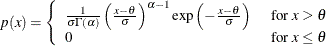
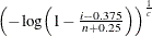
- PARETO(<Pareto-options>)
-
creates a generalized Pareto probability plot for each value of the shape parameter
given by the mandatory ALPHA=
option. If you specify ALPHA=EST, a plot is created based on a maximum likelihood estimate for .
To create the plot, the observations are ordered from smallest to largest, and the ith ordered observation is plotted against the quantile
 (
( ) or
) or 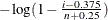 (
( ), where n is the number of nonmissing observations and is the shape parameter of the generalized Pareto distribution. The horizontal axis is scaled in percentile units.
The point pattern on the plot for ALPHA=
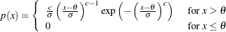
tends to be linear with intercept and slope if the data are generalized Pareto distributed with the specific density function
![\[ p(x) = \left\{ \begin{array}{ll} \frac{1}{\sigma }{(1 - \alpha (x-\theta )/\sigma )}^{1/\alpha -1} & \mbox{if $ \alpha \neq 0$} \\ \frac{1}{\sigma }\exp (-(x-\theta )/\sigma ) & \mbox{if $ \alpha = 0$} \end{array} \right. \]](images/qcug_capability0635.png)
where
threshold parameter scale parameter shape parameter
The intercept and slope are based on the quantile scale for the horizontal axis, which is displayed on a Q-Q plot; see QQPLOT Statement: CAPABILITY Procedure.
To obtain a graphical estimate of
, specify a list of values for the ALPHA=
option, and select the value that most nearly linearizes the point pattern.
To assess the point pattern, you can add a diagonal distribution reference line corresponding to
and with the Pareto-options THETA=
and SIGMA=
. Alternatively, you can add a line corresponding to estimated values of and with the Pareto-options THETA=EST and SIGMA=EST.
Specify these options in parentheses following the PARETO option.
Agreement between the reference line and the point pattern indicates that the generalized Pareto distribution with parameters
, , and is a good fit.
- PCTLORDER=value-list
-
specifies the tick mark values labeled on the theoretical percentile axis. Because the values are percentiles, the labels must be between 0 and 100, exclusive. The values must be listed in increasing order and must cover the plotted percentile range. Otherwise, a default list is used. For example, consider the following:
proc capability data=measures;
   probplot length / pctlorder=1 10 25 50 75 90 99;
run;
Note that the ORDER= option in the AXIS statement is not supported by the PROBPLOT statement.
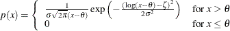
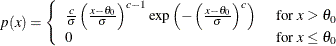
- POWER(<power-options>)
-
creates a power function probability plot for each value of the shape parameter
given by the mandatory ALPHA=
option. If you specify ALPHA=EST, a plot is created based on a maximum likelihood estimate for .
To create the plot, the observations are ordered from smallest to largest, and the ith ordered observation is plotted against the quantile
 , where
  is the inverse normalized incomplete beta function, n is the number of nonmissing observations, is one shape parameter of the beta distribution, and the second shape parameter,
  . The horizontal axis is scaled in percentile units.
The point pattern on the plot for ALPHA=
tends to be linear with intercept and slope if the data are power function distributed with the specific density function
![\[ p(x) = \left\{ \begin{array}{ll} \frac{\alpha }{\sigma }\left(\frac{x-\theta }{\sigma }\right)^{\alpha -1} & \mbox{for } \theta < x < \theta + \sigma \\ 0 & \mbox{for } x \leq \theta \mbox{ or } x \geq \theta + \sigma \end{array} \right. \]](images/qcug_capability0638.png)
where
threshold parameter scale parameter shape parameter
The intercept and slope are based on the quantile scale for the horizontal axis, which is displayed on a Q-Q plot; see QQPLOT Statement: CAPABILITY Procedure.
To obtain a graphical estimate of
, specify a list of values for the ALPHA=
option, and select the value that most nearly linearizes the point pattern.
To assess the point pattern, you can add a diagonal distribution reference line corresponding to
and with the power-options THETA=
and SIGMA=
. Alternatively, you can add a line corresponding to estimated values of and with the power-options THETA=EST and SIGMA=EST.
Specify these options in parentheses following the POWER option.
Agreement between the reference line and the point pattern indicates that the power function distribution with parameters
, , and is a good fit.
- RANKADJ=value
-
specifies the adjustment value added to the ranks in the calculation of theoretical percentiles. The default is
 , as recommended by Blom (1958). Also refer to Chambers et al. (1983) for additional information.
- RAYLEIGH(<Rayleigh-options>)
-
creates a Rayleigh probability plot. To create the plot, the observations are ordered from smallest to largest, and the ith ordered observation is plotted against the quantile
 , where n is the number of nonmissing observations. The horizontal axis is scaled in percentile units.
The point pattern on the plot tends to be linear with intercept
and slope if the data are Rayleigh distributed with the specific density function
![\[ p(x) = \left\{ \begin{array}{ll} \frac{x-\theta }{\sigma ^2}\exp (-(x-\theta )^2/(2\sigma ^2)) & \mbox{for } x \geq \theta \\ 0 & \mbox{for } x <\theta \end{array} \right. \]](images/qcug_capability0641.png)
where
is a threshold parameter, and is a positive scale parameter.
The intercept and slope are based on the quantile scale for the horizontal axis, which is displayed on a Q-Q plot; see QQPLOT Statement: CAPABILITY Procedure.
To assess the point pattern, you can add a diagonal distribution reference line corresponding to
and with the Rayleigh-options THETA=
and SIGMA=
. Alternatively, you can add a line corresponding to estimated values of and with the Rayleigh-options THETA=EST and SIGMA=EST.
Specify these options in parentheses after the RAYLEIGH option.
Agreement between the reference line and the point pattern indicates that the Rayleigh distribution with parameters
and is a good fit.
- ROTATE
-
switches the horizontal and vertical axes so that the theoretical percentiles are plotted vertically while the data are plotted horizontally. Regardless of whether the plot has been rotated, horizontal axis options (such as HAXIS= ) still refer to the horizontal axis, and vertical axis options (such as VAXIS= ) still refer to the vertical axis. All other options that depend on axis placement adjust to the rotated axes.
- SIGMA=value-list|EST
-
specifies the value of the parameter
, where  . Alternatively, you can specify SIGMA=EST to request a maximum likelihood estimate for . The interpretation and use of the SIGMA= option depend on the distribution option with which it is specified, as indicated
by the following table.
. Alternatively, you can specify SIGMA=EST to request a maximum likelihood estimate for . The interpretation and use of the SIGMA= option depend on the distribution option with which it is specified, as indicated
by the following table.
Distribution Option
Use of the SIGMA= Option
THETA=
and SIGMA= request a distribution reference
line corresponding to
and .
MU=
and SIGMA= request a distribution reference line corresponding to and .
SIGMA=
 requests n probability plots with shape parameters . The SIGMA= option must be specified.
MU=
and SIGMA= request a distribution reference line corresponding to and . SIGMA=EST requests a line with equal to the sample standard deviation.
SIGMA=
and C= request a distribution reference line corresponding to and .
In the following example, the first PROBPLOT statement requests a normal plot with a distribution reference line corresponding to
 and
and  , and the second PROBPLOT statement requests a lognormal plot with shape parameter
  :
:
proc capability data=measures;
   probplot length / normal(mu=5 sigma=2);
   probplot width  / lognormal(sigma=3);
run;
- SLOPE=value|EST
-
specifies the slope for a distribution reference line requested with the LOGNORMAL and WEIBULL2 options. The intercept and slope are based on the quantile scale for the horizontal axis, which is displayed on a Q-Q plot; see QQPLOT Statement: CAPABILITY Procedure.
When you use the SLOPE= option with the LOGNORMAL option, you must also specify a threshold parameter value
with the THETA=
lognormal-option to request the line. The SLOPE= option is an alternative to the ZETA=
lognormal-option for specifying , because the slope is equal to  .
.
When you use the SLOPE= option with the WEIBULL2 option, you must also specify a scale parameter value
with the SIGMA=
Weibull2-option to request the line. The SLOPE= option is an alternative to the C=
Weibull2-option for specifying , because the slope is equal to  . See Location and Scale Parameters.
For example, the first and second PROBPLOT statements below produce the same set of probability plots as the third and fourth PROBPLOT statements:
proc capability data=measures;
   probplot width / lognormal(sigma=2 theta=0 zeta=0);
   probplot width / weibull2(sigma=2 theta=0 c=0.25);
   probplot width / lognormal(sigma=2 theta=0 slope=1);
   probplot width / weibull2(sigma=2 theta=0 slope=4);
run;
- SQUARE
-
displays the probability plot in a square frame. For an example, see Output 5.20.1. The default is a rectangular frame.
-
THETA=value|EST
THRESHOLD=value -
specifies the lower threshold parameter
for probability plots requested with the BETA
, EXPONENTIAL
, GAMMA
, LOGNORMAL
, PARETO
, POWER
, RAYLEIGH
, WEIBULL
, and WEIBULL2
options. When used with the WEIBULL2 option, the THETA= option specifies the known lower threshold , for which the default is 0. When used with the other distribution options, the THETA= option specifies for a distribution reference line; alternatively in this situation, you can specify THETA=EST to request a maximum likelihood
estimate for . To request the line, you must also specify a scale parameter. See Output 5.20.1 for an example of the THETA= option with a lognormal probability plot.
-
WEIBULL(C=value-list|EST <Weibull-options>)
WEIB(C=value-list <Weibull-options>) -
creates a three-parameter Weibull probability plot for each value of the shape parameter c given by the mandatory C= option or its alias, the SHAPE= option. If you specify C=EST, a plot is created based on a maximum likelihood estimate for c. In the following example, the first PROBPLOT statement creates four plots, and the second PROBPLOT statement creates a single plot:
proc capability data=measures;
   probplot width / weibull(c=1.8 to 2.4 by 0.2 w=2);
   probplot width / weibull(c=est);
run;
To create the plot, the observations are ordered from smallest to largest, and the ith ordered observation is plotted against the quantile
 , where n is the number of nonmissing observations, and c is the Weibull distribution shape parameter. The horizontal axis is scaled in percentile units.
The point pattern on the plot for C=c tends to be linear with intercept
and slope if the data are Weibull distributed with the specific density function
 where threshold parameter scale parameter
  shape parameter
The intercept and slope are based on the quantile scale for the horizontal axis, which is displayed on a Q-Q plot; see QQPLOT Statement: CAPABILITY Procedure.
To obtain a graphical estimate of c, specify a list of values for the C= option, and select the value that most nearly linearizes the point pattern.
To assess the point pattern, you can add a diagonal distribution reference line corresponding to
and with the Weibull-options THETA= and SIGMA=. Alternatively, you can add a line corresponding to estimated values of and with the Weibull-options THETA=EST and SIGMA=EST.
Specify these options in parentheses, as in the following example:
proc capability data=measures;
   probplot width / weibull(c=2 theta=3 sigma=4);
run;
Agreement between the reference line and the point pattern indicates that the Weibull distribution with parameters c,
, and is a good fit. You can specify the SCALE=
option as an alias for the SIGMA=
option and the THRESHOLD= option as an alias for the THETA=
option.
-
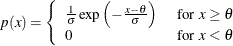
WEIBULL2<(Weibull2-options)>
W2<(Weibull2-options)> -
creates a two-parameter Weibull probability plot. You should use the WEIBULL2 option when your data have a known lower threshold
. You can specify the threshold value with the THETA= Weibull2-option or its alias, the THRESHOLD= Weibull2-option. The default is  .
.
To create the plot, the observations are ordered from smallest to largest, and the log of the shifted ith ordered observation
 , denoted by
  , is plotted against the quantile
 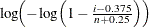 , where n is the number of nonmissing observations. The horizontal axis is scaled in percentile units. Note that the C=
shape parameter option is not mandatory with the WEIBULL2 option.
, where n is the number of nonmissing observations. The horizontal axis is scaled in percentile units. Note that the C=
shape parameter option is not mandatory with the WEIBULL2 option.
The point pattern on the plot for THETA=
tends to be linear with intercept  and slope
  if the data are Weibull distributed with the specific density function
 where
where  known lower threshold scale parameter shape parameter
An advantage of the two-parameter Weibull plot over the three-parameter Weibull plot is that the parameters c and
can be estimated from the slope and intercept of the point pattern. A disadvantage is that the two-parameter Weibull distribution
applies only in situations where the threshold parameter is known.
To assess the point pattern, you can add a diagonal distribution reference line corresponding to
and  with the Weibull2-options SIGMA= and C=. Alternatively, you can add a distribution reference line corresponding to estimated values of and with the Weibull2-options SIGMA=EST and C=EST.
Specify these options in parentheses, as in the following example:
with the Weibull2-options SIGMA= and C=. Alternatively, you can add a distribution reference line corresponding to estimated values of and with the Weibull2-options SIGMA=EST and C=EST.
Specify these options in parentheses, as in the following example:
proc capability data=measures;
   probplot width / weibull2(theta=3 sigma=4 c=2);
run;
Agreement between the distribution reference line and the point pattern indicates that the Weibull distribution with parameters
, and is a good fit. You can specify the SCALE=
option as an alias for the SIGMA=
option and the SHAPE=
option as an alias for the C=
option.
- ZETA=value|EST
-
specifies a value for the scale parameter
 for lognormal probability plots requested with the LOGNORMAL
option. Specify THETA= and ZETA= to request a distribution reference line with intercept and slope . See Output 5.20.1 for an example.
for lognormal probability plots requested with the LOGNORMAL
option. Specify THETA= and ZETA= to request a distribution reference line with intercept and slope . See Output 5.20.1 for an example.
Options for Traditional Graphics
You can specify the following options if you are producing traditional graphics:
Options for Legacy Line Printer Plots
You can specify the following options if you are producing legacy line printer plots: